
The short answer
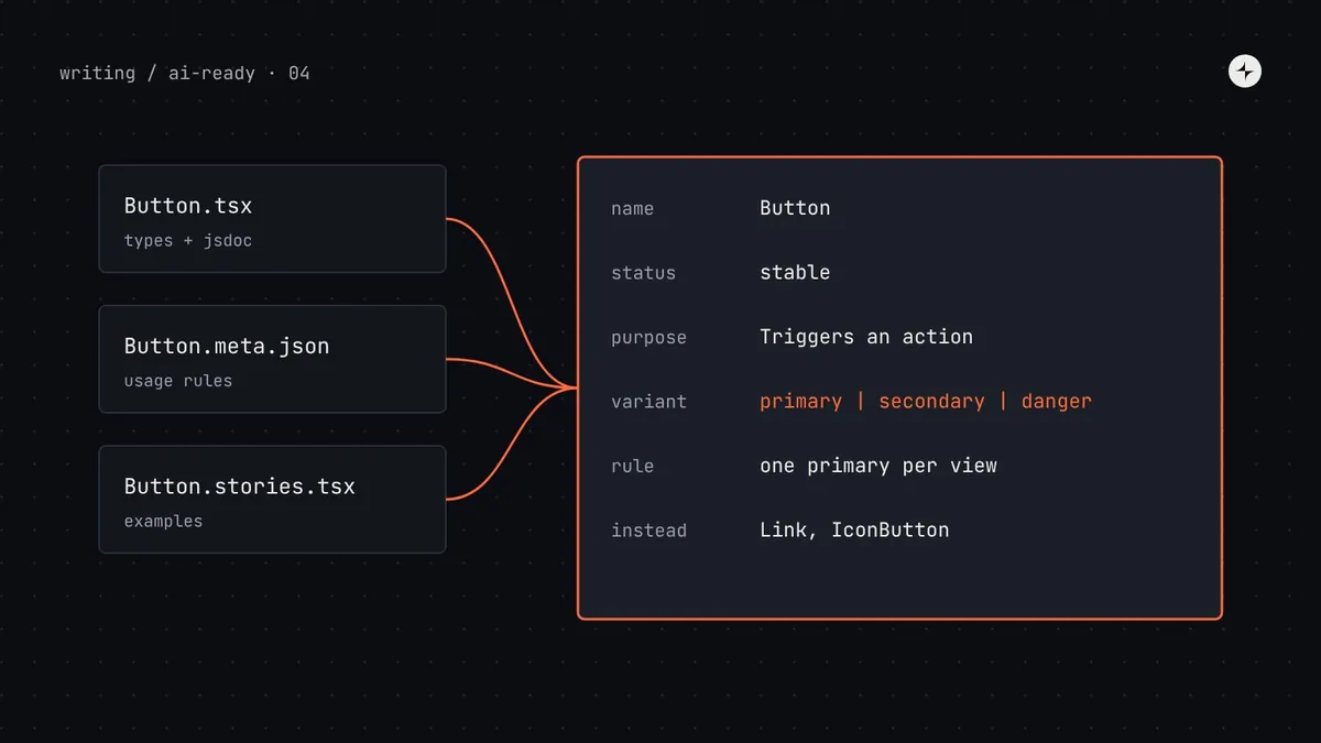
Component metadata is a machine-readable description of each component: its status (stable, beta, deprecated), purpose, props with types, allowed values and defaults, variants and when to use each, composition rules (what it must sit inside, what it accepts as children), accessibility requirements, alternatives and examples. Generate everything you can from code (TypeScript types and JSDoc, extracted by tools such as react-docgen-typescript, Storybook's component manifest or the Custom Elements Manifest), and add a small hand-written file for the judgement that types can't hold. Agents use this metadata to pick the right component, use the right variant, and catch their own mistakes.
- Types are the strongest metadata: a union of allowed values turns an invented prop into a compile error.
- Usage rules ("one primary button per view") need words, so they go in a metadata file.
- Part 4 of 20 in the series on AI-ready design systems.
The problem: the right component, the wrong way
In part 3 we fixed how agents choose tokens. Components are harder, because choosing is only the start. The agent also has to pick a variant, pass valid props, nest it correctly, and meet accessibility rules. Here's a typical failure in Harbor, the made-up system we follow through this series.
An illustration: removing an employee
"Add a 'Remove from payroll' action to the employee page. Ask for confirmation first."
<Modal> from the legacy folder, a <Button variant="destructive"> (Harbor's value is danger), and a primary "Cancel" button. Harbor's ConfirmDialog, built for exactly this job, was never considered.
Harbor has Modal, Dialog, AlertDialog and ConfirmDialog. Their docs pages show what each looks like but not when to use which. Button's variant prop is typed as string, so nothing caught "destructive"; the button silently rendered with no styles.
A designer at Kestrel would know that "confirming a destructive action" means ConfirmDialog with tone="danger". That knowledge is real, it's just stored in people. Component metadata is where you write it down so an agent can use it.
Metadata: data that describes something else. Here, structured facts about a component, as opposed to the component's code itself. Schema: a formal description of what valid data looks like, such as "variant must be one of primary, secondary or danger". JSON Schema is a widely used standard for writing schemas for JSON data.
What component metadata should contain
Think of metadata as the answers to every question a careful new engineer would ask before using a component. Here are the fields we recommend, why each matters to an agent, and where its value should come from.
| Field | Example (Harbor's Button) | Why agents need it | Source |
|---|---|---|---|
| name, import | Button from @kestrel/harbor | Exact import path, so it doesn't import a lookalike | Code |
| status | stable · beta · deprecated | Avoids retired components; treats beta with care | Code (@deprecated) + meta |
| purpose | "Triggers an action. For navigation use Link." | Matching a task to a component | JSDoc |
| props | variant: "primary" | "secondary" | "danger" | Valid props and values; no invented APIs | Types |
| usage rules | "At most one primary per view." | Choosing the right variant | Meta file |
| composition | "Inside a Form, use type=submit." | Nesting things correctly | Meta file |
| accessibility | "Icon-only buttons require aria-label." | Output people can actually use | Meta file + types |
| alternatives | Link, IconButton, MenuItem | Recovering from a wrong first choice | Meta file |
| examples | Story code for each common case | Copyable, correct starting points | Stories |
Layer 1: make the code describe itself
The best metadata can't go out of date because it is the code. Start by making your component types as precise as possible and adding JSDoc comments, which tools can extract.
Loose types, no comments
type ButtonProps = {
  variant?: string;
  size?: string;
  icon?: any;
  onClick?: () => void;
};
Any string passes. variant="destructive" compiles fine and renders an unstyled button. Nothing tells the agent it guessed wrong.
Precise types, documented
type ButtonProps = {
  /** Visual weight. One primary
   *  per view. Use danger only for
   *  destructive actions. */
  variant?: "primary" | "secondary"
    | "ghost" | "danger";
  /** @default "md" */
  size?: "sm" | "md";
  …
};
Wrong values are compile errors, and the agent sees the rule when it opens the file.
Here's the full component file Kestrel's team ended up with. Note the @deprecated tag on the old export: TypeScript editors and many agents show it, and lint rules can enforce it.
// packages/harbor/src/Button/Button.tsx
import * as React from "react";

export type ButtonProps = Omit<React.ButtonHTMLAttributes<HTMLButtonElement>, "type"> & {
  /**
   * Visual weight of the button.
   * - primary: the single main action in a view. Never more than one.
   * - secondary: any other action. The default choice.
   * - ghost: low-emphasis actions in toolbars and table rows.
   * - danger: actions that delete or remove data. Pair with ConfirmDialog.
   * @default "secondary"
   */
  variant?: "primary" | "secondary" | "ghost" | "danger";
  /** @default "md". Use "sm" only inside dense tables and toolbars. */
  size?: "sm" | "md";
  /** Shows a spinner and blocks clicks. Keep the label unchanged. */
  loading?: boolean;
  /** Use "submit" when the button submits a Form. @default "button" */
  type?: "button" | "submit";
  children: React.ReactNode;
};

/**
 * Triggers an action on the current page.
 * For moving to another page use Link; for icon-only actions use IconButton.
 */
export function Button({ variant = "secondary", size = "md", type = "button", ...rest }: ButtonProps) { /* … */ }

/** @deprecated Use Button with variant="primary". Removed in Harbor 7.0. */
export const BtnPrimary = (p: Omit<ButtonProps, "variant">) => <Button variant="primary" {...p} />;Make secondary the default variant, not primary. When an agent omits the prop, the safe, low-emphasis choice wins, and primary becomes a deliberate decision rather than an accident repeated on every button.
Layer 2: extract it into data
Agents can read source files, but reading forty component files to find the right one fills the context window (see part 2). It's better to extract the types and comments into one compact JSON document per component. There are several established tools for this; which one you use depends on your stack.
| Tool | For | What it produces | Choose it when |
|---|---|---|---|
| react-docgen-typescript | React + TypeScript | Component descriptions, props, types, allowed values, defaults | You want full control and a simple build step |
| Storybook component manifest | Storybook 10.3+ with React | Names, descriptions, props and usage examples from stories, served by the MCP addon | You already have good stories; you want an MCP server with little code |
| Custom Elements Manifest | Web components | custom-elements.json: attributes, properties, events, slots, CSS parts | Your system is built with Lit, Stencil or plain custom elements |
| Hand-written schema | Anything | Exactly the fields you design | You support several frameworks, or need fields no tool extracts |
Here's a short extraction script using react-docgen-typescript. The option shouldExtractLiteralValuesFromEnum turns a union like "primary" | "secondary" into a list of allowed values, which is exactly what an agent needs.
// scripts/extract-props.mjs
import { withDefaultConfig } from "react-docgen-typescript";
import { globSync, writeFileSync } from "node:fs";

const parser = withDefaultConfig({
  shouldExtractLiteralValuesFromEnum: true,
  shouldRemoveUndefinedFromOptional: true,
  propFilter: (prop) => !prop.parent?.fileName.includes("node_modules"), // skip inherited HTML props
});

const docs = parser.parse(globSync("src/*/[A-Z]*.tsx"));
writeFileSync("dist/props.json", JSON.stringify(docs, null, 2));(globSync from node:fs needs Node 22 or later; on older versions use the glob package.) The propFilter matters: without it, every button inherits around 250 HTML attributes, burying the four props that matter.
Layer 3: write down the judgement
Types say what's allowed. They can't say what's right: one primary per view, use ConfirmDialog for destructive actions, put help text below a field and not in a tooltip. That judgement goes in a small metadata file next to each component, written by the system team and reviewed like code.
// packages/harbor/src/ConfirmDialog/ConfirmDialog.meta.json
{
  "$schema": "../../schema/component-meta.schema.json",
  "name": "ConfirmDialog",
  "status": "stable",
  "category": "feedback",
  "purpose": "Asks the user to confirm an action before it happens, especially one that deletes data or can't be undone.",
  "useWhen": [
    "Deleting, removing or cancelling something",
    "An action affects other people (e.g. running payroll)"
  ],
  "avoidWhen": [
    { "case": "The action is easy to undo", "use": "Toast with an Undo action" },
    { "case": "You need a form inside the dialog", "use": "Dialog" }
  ],
  "rules": [
    "Title is a question naming the action: 'Remove Ana Silva from payroll?'",
    "Confirm label repeats the verb: 'Remove', never 'OK' or 'Yes'",
    "Use tone='danger' for destructive actions; the confirm button then renders as variant='danger'",
    "Cancel is always secondary and receives focus first"
  ],
  "accessibility": [
    "Renders role='alertdialog' and traps focus; don't wrap it in another Dialog"
  ],
  "alternatives": ["Dialog", "Toast"],
  "replaces": ["Modal (legacy)", "AlertDialog"],
  "examples": ["ConfirmDialog.stories.tsx#DestructiveRemove"]
}
Keep these files short. If a rule needs a paragraph of explanation, it belongs in the docs (see part 5), and the metadata can link to it.
A schema for the metadata itself
If forty people write metadata files by hand, they'll invent forty shapes. A JSON Schema for the metadata file makes editors autocomplete the fields and lets CI reject malformed files. Here's a compact version:
{
  "$schema": "https://json-schema.org/draft/2020-12/schema",
  "$id": "https://harbor.kestrel.example/schema/component-meta.json",
  "type": "object",
  "required": ["name", "status", "purpose", "useWhen"],
  "additionalProperties": false,
  "properties": {
    "$schema": { "type": "string" },
    "name": { "type": "string", "pattern": "^[A-Z][A-Za-z]+$" },
    "status": { "enum": ["stable", "beta", "deprecated"] },
    "category": { "enum": ["actions", "forms", "feedback", "navigation", "data-display", "layout", "overlays"] },
    "purpose": { "type": "string", "minLength": 20, "maxLength": 240 },
    "useWhen": { "type": "array", "items": { "type": "string" }, "minItems": 1 },
    "avoidWhen": { "type": "array", "items": {
      "type": "object", "required": ["case", "use"],
      "properties": { "case": { "type": "string" }, "use": { "type": "string" } } } },
    "rules": { "type": "array", "items": { "type": "string" } },
    "accessibility": { "type": "array", "items": { "type": "string" } },
    "alternatives": { "type": "array", "items": { "type": "string" } },
    "replaces": { "type": "array", "items": { "type": "string" } },
    "replacedBy": { "type": "string" },
    "examples": { "type": "array", "items": { "type": "string" } }
  },
  "if": { "properties": { "status": { "const": "deprecated" } } },
  "then": { "required": ["replacedBy"] }
}
The last two lines encode a rule worth enforcing: a deprecated component must name its replacement. That's the single field that most often rescues an agent that found the old component first.
Putting it together: one inventory for agents
The build combines the three layers into a single file: a short entry per component for discovery, and full detail available on request. This is what your rules file points to (part 6) and what an MCP server serves (part 7).
// dist/components.agent.json (the index, abridged)
{
  "package": "@kestrel/harbor",
  "version": "6.4.0",
  "components": [
    { "name": "Button", "status": "stable", "category": "actions",
      "purpose": "Triggers an action on the current page. For navigation use Link." },
    { "name": "ConfirmDialog", "status": "stable", "category": "feedback",
      "purpose": "Asks the user to confirm an action, especially one that deletes data." },
    { "name": "Modal", "status": "deprecated", "replacedBy": "Dialog or ConfirmDialog" }
  ]
}
How an agent discovers and selects a component
With the inventory in place, here's the "Remove from payroll" task again, step by step. The agent's choices are now driven by your written rules rather than by whichever file it opened first.
// What the agent writes
<ConfirmDialog
  open={confirming}
  tone="danger"
  title={`Remove ${employee.name} from payroll?`}
  description="They won't be included in future pay runs. Past payslips are kept."
  confirmLabel="Remove"
  onConfirm={removeEmployee}
  onCancel={() => setConfirming(false)}
/>
Composition and dependencies
Many agent mistakes aren't about one component but about how components fit together: a TextField outside a FormField loses its label association; a Tab outside Tabs does nothing. Write these relationships down, and, where possible, enforce them in code.
| Relationship | Example | Write it as | Enforce it with |
|---|---|---|---|
| Must be inside | Tab inside Tabs | "rules": ["Only inside Tabs"] | A runtime error in development if context is missing |
| Accepts only | Menu accepts MenuItem | A rule, plus a typed children | Compound components (Menu.Item) that make the right thing obvious |
| Requires a prop when | Icon-only IconButton needs aria-label | An accessibility rule | Make aria-label required in the type |
| Peer dependency | Toasts need <ToastProvider> at the app root | A setup note in the index | A clear error message naming the provider |
How to check your metadata works
Validate every file in CI
Compile the schema with a validator such as Ajv and fail the build if any
.meta.jsonis invalid or any exported component has no metadata file.Check coverage
Every stable component has a purpose, at least one
useWhen, and an example. Every deprecated one hasreplacedBy.Run a selection test
Write 20 short tasks ("show three key figures with an action", "pick one date") with the expected component for each. Give an agent only the index and ask it to choose. Aim for 18 or more correct.
Look for near-misses
When the selection test picks wrongly, compare the two components' purposes. Usually they overlap. Sharpen the wording, or merge the components.
// scripts/validate-meta.mjs
import Ajv2020 from "ajv/dist/2020.js";
import { readFileSync, globSync } from "node:fs";

const ajv = new Ajv2020({ allErrors: true });
const validate = ajv.compile(JSON.parse(readFileSync("schema/component-meta.schema.json", "utf8")));
let failed = false;
for (const file of globSync("src/**/*.meta.json")) {
  if (!validate(JSON.parse(readFileSync(file, "utf8")))) {
    failed = true;
    console.error(file, validate.errors);
  }
}
process.exit(failed ? 1 : 0);
Common mistakes
Metadata that repeats the types
Hand-writing prop lists that the code already declares means two sources that will disagree. Generate props; hand-write only judgement.
Purposes that describe looks
"A rounded box with a shadow" doesn't help an agent choose. "Groups related content about one subject" does.
Overlapping components left alone
If you can't write purposes for Dialog and Modal that don't overlap, you have one component too many. Metadata work often surfaces this.
Huge index entries
If the index includes every prop of every component, it's too big to load each time. Keep the index to a line per component.
The short version
- Component metadata answers: what is it for, is it current, what props are valid, when to use which variant, how it fits with others.
- Make code describe itself first: precise union types, JSDoc,
@deprecatedwith a replacement. - Extract types into data with react-docgen-typescript, Storybook's manifest or the Custom Elements Manifest.
- Hand-write judgement in a small, schema-validated metadata file per component.
- Publish a short index for choosing and a detail file for using, and test that agents choose correctly.
Next: Writing documentation AI agents can use, for the knowledge that's too rich for metadata: patterns, content guidelines and the reasoning behind decisions.
Frequently asked questions
What is component metadata in a design system?
Structured, machine-readable facts about each component: its status, purpose, props and allowed values, usage rules, composition rules, accessibility requirements, alternatives and examples. It lets tools and AI agents choose and use components correctly without reading every source file.
How do AI agents know which component variant to use?
Only if the rule is written somewhere they read: in JSDoc on the prop, in a metadata file, or in a tool result. Precise union types tell them which variants exist; usage rules tell them which one fits the task.
Should I use JSON Schema for component props?
You can, but if your components are written in TypeScript, the types are already a schema. Extract them with a tool such as react-docgen-typescript, and use JSON Schema to validate your hand-written metadata files instead.
What is a Custom Elements Manifest?
A community standard JSON file, custom-elements.json, that describes web components: their attributes, properties, events, slots and CSS parts. Tools generate it from source code, and it's a ready-made metadata source for web component design systems.
How do I mark a component as deprecated for AI agents?
Add a JSDoc @deprecated tag naming the replacement, set status to deprecated with replacedBy in its metadata, list it in your rules file's "never use" section, and add a lint rule that blocks new imports.
Further reading
- react-docgen-typescriptExtracts component and prop documentation from TypeScript.
- Storybook: component manifestsStorybook's structured description of documented components.
- Custom Elements ManifestThe metadata standard and analyzer for web components.
- JSON Schema: getting startedA step-by-step introduction to writing schemas.
- Component props best practicesDesigning APIs that are hard to misuse, for people and agents.