
The short answer
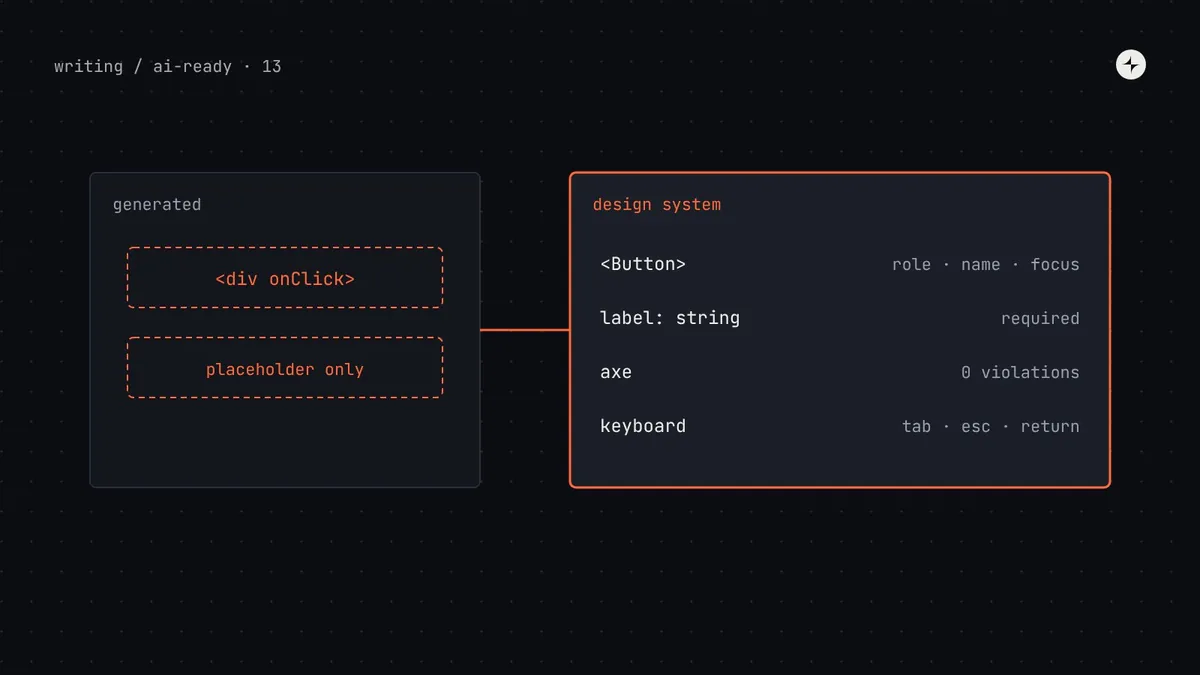
AI-generated UI is often inaccessible because models reproduce the most common code they've seen, and a lot of web code is inaccessible: clickable <div>s, inputs without labels, missing focus handling, ARIA used wrongly. Studies from 2025 and 2026 find that asking for accessibility in the prompt helps but doesn't solve it, and results vary with the prompt and the model. A design system fixes most of this structurally: build accessibility into components so agents can't easily get it wrong (labels required by type, focus handled inside dialogs, correct roles built in), write accessibility rules into metadata agents read, steer agents to system components instead of hand-built markup, and test every output with automated checks plus people for keyboard and screen reader behaviour.
- The most reliable accessibility fix for agents is a component that's accessible by default and hard to misuse.
- Automated tools find a meaningful share of issues, not all. Keep human checks.
- Part 13 of 20 in the series on AI-ready design systems.
Why AI-generated UI so often fails accessibility
A designer generates a prototype in an AI tool, it looks finished, and an accessibility review finds a dozen problems: the "button" is a <div> with a click handler, the form fields have placeholder text but no labels, the modal doesn't trap focus, and the error message is red text with nothing announced to screen readers. None of this is visible in a screenshot, which is exactly why it slips through.
The reasons are structural:
Models copy what's common
Much of the web's code has accessibility problems, and models learn from it. Without guidance, the most common pattern wins, not the correct one.
Problems don't show in screenshots
Agents and reviewers judge UI visually. Missing labels, roles and focus order look identical to correct code.
Agents rebuild what exists
When an agent doesn't find your accessible Dialog, it builds a new one, and complex widgets are where accessibility is hardest.
Nothing fails
Type checks and visual review pass. Without an accessibility check in the loop, the agent has no reason to change anything.
Research Recent peer-reviewed work supports this picture. A W4A 2025 study of LLM-generated interfaces found that explicitly asking for accessibility made a large difference but wasn't sufficient on its own; a CHI 2026 paper analysing hundreds of LLM-generated web UIs found recurring semantic problems such as heading and label mismatches; and an ASSETS 2026 benchmark found accessibility in generated code varied with how the prompt was written and the circumstances of generation, so it can't be treated as a stable capability. The exact rates differ by model and method; the direction is consistent.
Where the design system can help, and where it can't
| Issue | Can the design system prevent it? | How |
|---|---|---|
| Clickable divs instead of buttons | Mostly | Agents use Button and Link; lint flags click handlers on non-interactive elements |
| Inputs without labels | Yes | Make label a required prop; render it correctly inside the component |
| Low colour contrast | Yes | Semantic tokens whose pairs are checked; no raw colours |
| Dialogs without focus trap or Escape | Yes | Behaviour built into Dialog; agents never build their own |
| Errors not announced | Mostly | Form components wire error messages with aria-describedby and live regions |
| Icon-only buttons without names | Yes | IconButton requires aria-label in its type |
| Wrong heading order | Partly | Page patterns state heading levels; a rule in the pattern page |
| Meaningless link text, poor alt text | Partly | Content guidelines; review |
| Confusing flows, unclear instructions | No | Design and research; human review |
Step 1: make components accessible by default and hard to misuse
For agents, the strongest accessibility rule is one enforced by the component's API. An agent that forgets a label gets a type error; a component that handles focus can't have focus handled wrongly.
type TextFieldProps = {
  label?: string;
  placeholder?: string;
  error?: string;
};

type IconButtonProps = {
  icon: ReactNode;
  "aria-label"?: string;
};
An agent can render a field with only a placeholder and an icon button with no name, and nothing complains.
type TextFieldProps = {
  /** Visible label. Required. Use
   *  hideLabel only in search bars. */
  label: string;
  hideLabel?: boolean;
  /** Shown below the field and
   *  announced to screen readers. */
  error?: string;
};

type IconButtonProps = {
  icon: ReactNode;
  /** Required: the action, e.g.
   *  "Delete payslip". */
  "aria-label": string;
};
Required props turn a missing label into a compile error, which the agent sees and fixes.
Inside the component, the system team handles the parts agents get wrong most often: associating labels with inputs, wiring error text with aria-describedby, trapping and restoring focus in dialogs, Escape to close, roving focus in menus and tabs. Headless libraries can provide much of this behaviour; see build, borrow or buy.
Step 2: write accessibility rules where agents read them
Some requirements can't be enforced by types. Put them in the component's metadata (part 4) so they reach the agent with the props:
// Dialog.meta.json (excerpt)
"accessibility": [
  "Always pass title; it becomes the dialog's accessible name.",
  "Focus moves into the dialog on open and returns to the trigger on close. Don't manage focus yourself.",
  "Put the primary action last in Dialog.Actions so keyboard order matches reading order.",
  "Never open a Dialog from another Dialog. Use a step inside the same Dialog."
]
And add a short, universal accessibility section to the AGENTS.md design system block (part 6):
### Accessibility
- Never put click handlers on div or span. Use Button or Link from Harbor.
- Every form field uses Harbor's field components with a visible label.
- Don't add ARIA attributes to Harbor components unless their docs say to.
- Images: meaningful alt text, or alt="" if decorative.
- Run pnpm check: it includes accessibility tests."Don't add ARIA unless the docs say to" matters. Models often sprinkle ARIA attributes to look accessible: role="button" on a real button, aria-label that replaces a visible label with different words, aria-hidden on focusable elements. Incorrect ARIA can be worse than none.
Step 3: steer agents to system components, not hand-built markup
Every hand-built widget is an accessibility risk. The work in earlier parts, finding components (part 7) and blocking legacy ones (part 9), is also accessibility work. Add lint rules that catch the most common hand-built patterns. The eslint-plugin-jsx-a11y plugin has rules for many of them:
// eslint.config.js (excerpt)
import jsxA11y from "eslint-plugin-jsx-a11y";

export default [
  jsxA11y.flatConfigs.recommended,
  {
    rules: {
      "jsx-a11y/click-events-have-key-events": "error",
      "jsx-a11y/no-static-element-interactions": "error",
      "jsx-a11y/label-has-associated-control": "error",
    },
  },
];
Step 4: test every output
Automated checks in the agent's loop catch a meaningful portion of problems and give the agent something to fix. People catch the rest.
// a keyboard check with Playwright
test("remove dialog is keyboard-operable", async ({ page }) => {
  await page.goto("/employees/42");
  const trigger = page.getByRole("button", { name: "Remove from payroll" });
  await trigger.focus();
  await page.keyboard.press("Enter");
  await expect(page.getByRole("alertdialog")).toBeVisible();
  await expect(page.getByRole("button", { name: "Cancel" })).toBeFocused();
  await page.keyboard.press("Escape");
  await expect(trigger).toBeFocused();   // focus returns to the trigger
});
Queries like getByRole double as accessibility checks: if the test can't find a button by its role and name, neither can a screen reader user.
Prompting for accessibility: helpful, not sufficient
Research and experience agree that stating accessibility requirements in the prompt improves results. Make it specific rather than general:
"Make it accessible."
"Use Harbor components only. Every field has a visible label. The dialog must be operable by keyboard. Run pnpm check and fix any accessibility errors."
But don't rely on prompts. People forget to include them, and results vary between runs. Components, lint and tests apply every time.
For designers using AI prototyping tools
Prototypes generated in tools like Figma Make, v0 or Lovable (part 15) often move toward production quickly. A few habits keep accessibility from being lost on the way:
- Include accessibility rules in the tool's guidelines for your design system, the same ones as in AGENTS.md.
- Tab through every prototype before sharing it. It takes a minute and catches the worst problems.
- Check contrast on anything that isn't a system token. AI tools often invent tints for hover states and badges.
- Label prototypes as prototypes. Generated code should go through the same checks as any other code before it ships.
Common mistakes
Trusting a clean axe report
Automated tools can't judge whether alt text is meaningful or a flow makes sense. Treat a pass as "no obvious problems".
Optional labels "for flexibility"
Every optional accessibility prop will be omitted by someone, human or agent. Require it, and offer a visually hidden option.
Letting agents "fix" accessibility with ARIA
Asking an agent to "make it accessible" often adds ARIA to broken markup. Ask it to use the right component instead.
Accessibility only at the end
If checks only run before release, hundreds of agent-generated screens pile up first. Run them on every change.
The short version
- AI-generated UI copies common, often inaccessible patterns, and the problems don't show in screenshots.
- Build accessibility into components and make misuse a type error: required labels and names, built-in focus handling.
- Write accessibility rules into metadata and AGENTS.md; tell agents not to add ARIA to system components.
- Run lint, axe and keyboard checks in the agent's loop; keep human checks with assistive technology.
- Specific prompts help, but components and checks apply every time.
Next: Figma variables out of sync with code tokens? Fix the drift before AI copies it.
Frequently asked questions
Is AI-generated code accessible?
Often not by default. Studies from 2025 and 2026 find recurring problems such as missing labels, wrong semantics and ARIA misuse, and results vary with the prompt and model. Treat generated UI as untested until it passes accessibility checks.
How do I make AI generate accessible UI?
Steer it to accessible design system components, make accessibility props required in their types, include specific rules in your rules file, and run lint, axe and keyboard checks so the agent sees and fixes errors.
Does asking for accessibility in the prompt work?
It helps, especially when specific, but research shows it isn't sufficient on its own. Back prompts with components that are accessible by default and with automated checks.
Can automated tests catch all accessibility problems?
No. Tools like axe-core find a meaningful share of issues, such as contrast and missing names, but not problems like unclear content or awkward flows. Keyboard and screen reader testing by people is still needed.
Should AI tools add ARIA attributes?
Only when the component's documentation says so. Native HTML elements and well-built components already provide roles and names; extra or incorrect ARIA can make things worse.
Further reading
- Prompt and circumstance (ASSETS 2026)A benchmark of accessibility in LLM-generated code.
- WAI-ARIA Authoring Practices GuideKeyboard and ARIA patterns for common widgets.
- eslint-plugin-jsx-a11yLint rules for accessible JSX.
- axe-coreThe automated accessibility engine used in the tests.
- Accessibility in a design systemThe wider practice, beyond AI.