
The short answer
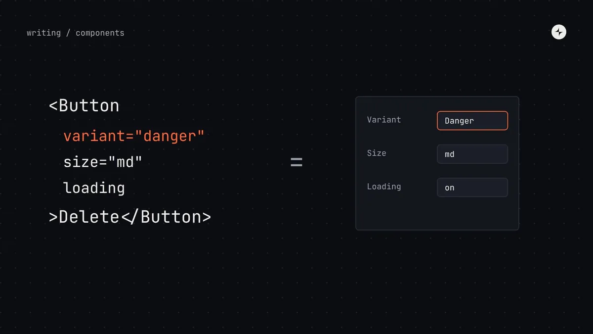
Component props are the API designers and engineers use every day, and a promise you'll have to keep for years. Good props: use one choice instead of several switches (variant="danger", not isPrimary isDanger); use the same names everywhere (variant, size, tone, disabled); make the default the right answer; never let props bypass the system with raw colours or pixel values; and only require what's essential. Keep the same properties, names and defaults in Figma and code.
- Every prop you add is one you'll have to support. Add it only when it earns its place.
- Information flows down through props; news flows up through events.
- Name controlled and uncontrolled values the same way in every component.
Props are a promise
Think of a TV remote. A good one has a few clearly labelled buttons that do exactly what they say. Now imagine one where "volume up" only works if "mode B" is on, and pressing "mute" on input 2 changes the channel. That's what a component with badly designed props feels like.
Props matter for three reasons. They're the interface people use every day, so clarity saves time on every screen. They decide consistency: if a prop lets anyone pick any colour, they will, and the product drifts. And they're a promise: once teams use a prop, changing or removing it breaks their screens. That's a breaking change, with all the cost that implies.
The eight kinds of props
Almost every prop in every component library falls into one of eight kinds. Knowing them helps you spot what a component needs, and props that don't belong.
| Kind | What it does | Example in code | In Figma |
|---|---|---|---|
| Variant | Picks one approved version from a fixed list | variant="primary" | Variant property |
| Size | Picks one approved size | size="sm" | "md" | "lg" | Variant property |
| Switch | Turns one thing on or off | disabled, loading | Boolean property |
| Content | Text or information to show | label="Email" | Text property |
| Slot | Lets you put other components inside | icon={<SendIcon />}, children | Instance swap or slot |
| State | The current value, and its starting value | value, defaultValue, open | Usually a "state" variant |
| Event | What to do when something happens | onClick, onChange | Not represented (prototype only) |
| Accessibility | Extra information for assistive technology | aria-label="Close dialog" | A note in the spec |
Five rules for good props
1. Prefer one choice over many switches
The most common mistake is using several on/off switches for what's really one choice. If a button has isPrimary, isDanger and isGhost, what happens when someone turns on two? Nobody knows. One variant prop with a list of allowed values makes impossible combinations impossible.
// ✕ Three switches, eight combinations, most of them meaningless
<Button isPrimary isDanger>Delete</Button>

// ✓ One choice, three valid options
<Button variant="danger">Delete</Button>
2. Use the same names everywhere
If buttons use variant, badges shouldn't use type and alerts shouldn't use kind. If buttons use size="sm", inputs shouldn't use size="small". Write down a short list of standard prop names and use it across the library. People then learn the library once, not component by component.
3. Make the default the right answer
The value a prop takes when nobody sets it should be the most common, safest choice. A button should default to medium and secondary, so the big primary button is a deliberate decision. A text field should default to a visible label, not a hidden one.
4. Don't let props bypass the system
Props like color="#FF3300" or padding={13} let anyone escape the foundations, and someone always will. Offer choices from the system (tone="critical", size="lg"), never raw values.
5. Only require what's essential
A component should work with as few props as possible. A button needs a label and something to do when pressed; everything else should have a sensible default. Every required prop is something someone will forget.
How props work: down, then up
In most modern frameworks, information flows down through props and news flows up through events. The screen tells the component what to show; when something happens inside it, the component tells the screen, which decides what to do.
tab = "invoices"value="invoices"onValueChange("payments")Controlled and uncontrolled
An uncontrolled component takes a defaultValue and looks after itself. A controlled component takes a value plus an event like onValueChange, and the screen stays in charge. Good libraries name these the same way in every component that has a value, so engineers learn the pattern once.
Passing things through
Components should pass along standard attributes they don't use themselves (an ID for testing, a data attribute, an extra ARIA attribute) to the underlying element. It means the system doesn't block teams from doing ordinary, legitimate things.
Keep Figma and code in step
| Code prop | Values | Default | Figma property | What it's for |
|---|---|---|---|---|
variant | primary · secondary · danger | secondary | Variant: Variant | The importance of the action. One primary per area. |
size | sm · md · lg | md | Variant: Size | Match the density of the surrounding UI. |
icon | icon name | none | Boolean + instance swap | An optional icon before the label. |
loading | true / false | false | Boolean: Loading | Shows progress and prevents double clicks. |
disabled | true / false | false | Variant: State = Disabled | Can't be used right now. Explain why nearby. |
children | text | — | Text: Label | The label. Start with a verb: "Send invoice". |
Put a table like this on every component's documentation page. See design system documentation for the full page template.
A props review checklist
- Could two of these switches be one variant?
- Does every name match the standard list used across the library?
- Is the default the most common, safest choice?
- Can any prop accept a raw colour, size or spacing value?
- Is every required prop genuinely essential?
- Are controlled and uncontrolled values named consistently?
- Does the Figma component expose the same properties, names and defaults?
- Are we sure we want to support this prop for years?
The short version
- Props are an interface and a promise; add them sparingly.
- One variant over many switches; the same names everywhere; good defaults.
- Offer choices from the system, never raw values.
- Props down, events up; consistent controlled and uncontrolled patterns.
- Keep Figma properties and code props as twins, and document both.
Frequently asked questions
Should a component accept a className or style prop?
Usually yes for layout (positioning, width), as an escape hatch passed to the root element. Don't use it as the way to change colours or spacing; offer system choices for those.
How do I rename a prop safely?
Add the new name in a minor release alongside the old one, deprecate the old with a warning and a codemod, then remove it in the next major.
variant, kind, type or appearance?
The specific word matters less than using one everywhere. variant is the most common and maps well to Figma's variant properties.
Should slots or props be preferred?
Props for constrained choices; slots where teams need to compose content, such as a card's body. Slots give flexibility; props give consistency.
Further reading
- Explore component propertiesFigma Help Center.
- Sharing state between componentsreact.dev, on controlled and uncontrolled components.
- Component complexityHow options and composition add effort.