
The short answer
There are two ways to make a component flexible. Configuration gives one component many settings (showImage, footerAlign); composition gives several small parts that fit together (Card.Header, Card.Footer), with slots where any content can go. Use configuration for small, frequent components with limited options (button, checkbox, badge), because consistency matters most there. Use composition for containers whose content varies (card, dialog, table, page layout), because every new need would otherwise add another setting. Most mature libraries use both, deliberately.
- A component with more than about ten settings is usually a sign that it should be composed instead.
- Compound components (tabs, menus, selects) are composition with shared state: the parts coordinate behind the scenes.
- Slots give freedom inside a frame the system still controls: spacing, order, accessibility.
The forty-setting card
Every library has one. It starts as a simple card with a title and some text. One team needs an image, so showImage is added. Another needs a menu, then a footer, then the footer aligned right, then two buttons in the footer. Two years later the card has forty settings, half of them interact in ways nobody remembers, and teams still copy it to make the version they need.
An illustration: the card nobody could change
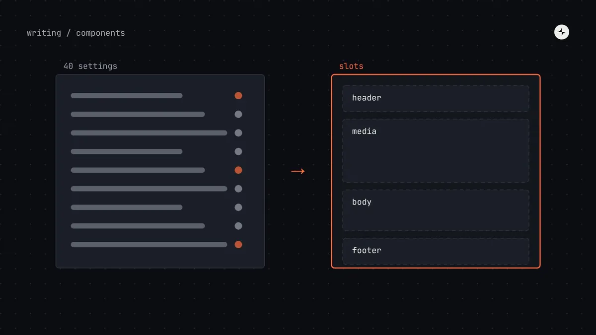
A card component has grown to 38 props. Every team's request was reasonable, so every one became a setting.
Changing the footer spacing breaks three combinations nobody tested. New engineers can't tell which settings work together. A redesign is estimated at a quarter.
The card becomes a frame with header, media, body and footer parts. Teams put what they need in each slot. The card itself has four props.
Configuration and composition, side by side
One component, many settings
Easy to start and easy to use for common cases. Every new need adds another setting; combinations multiply; testing gets harder.
Small parts that fit together
Handles needs nobody predicted. Each part stays simple. Asks a little more of the person using it, and needs good examples.
// Configuration: one component, many settings
<Card
  title="Revenue"
  showMenu
  image={chart}
  footerText="Updated 4 min ago"
  footerAlign="right"
  primaryAction="View report"
  // …and the next team will need one more
/>

// Composition: small pieces that fit together
<Card>
  <Card.Header title="Revenue"><Menu … /></Card.Header>
  <Card.Media>{chart}</Card.Media>
  <Card.Footer>
    Updated 4 min ago
    <Button>View report</Button>
  </Card.Footer>
</Card>
Which to use, by component
| Component | Approach | Why |
|---|---|---|
| Button, link, badge, checkbox, switch | Configuration | Few options; consistency matters most; used constantly |
| Text field, select | Mostly configuration | Label, hint and error are fixed parts; allow a slot for a prefix or suffix |
| Tabs, menu, accordion, select options | Compound components | A fixed family of parts that coordinate selection and focus |
| Card, dialog, side panel | Composition with slots | Content varies endlessly; the frame stays consistent |
| Table, page layout, app frame | Composition | Too many shapes of content for settings to cover |
Three composition techniques
1 · Slots: spaces for any content
A slot is a named space in a component where any content can go, while the component controls the frame around it: spacing, order, borders and accessibility. In Figma, slots are usually made with an instance-swap property or a nested placeholder component that designers replace. In code, a slot is a child or a named prop.
2 · Compound components: a family that works together
Some components are a small family of parts that only make sense together. Tabs are the classic example: a list of tabs, the tabs themselves, and a panel for each. The parts share information quietly (which tab is selected, where focus goes), so the person using them doesn't have to wire it up.
<Tabs defaultValue="invoices">
  <Tabs.List>
    <Tabs.Tab value="invoices">Invoices</Tabs.Tab>
    <Tabs.Tab value="payments">Payments</Tabs.Tab>
  </Tabs.List>
  <Tabs.Panel value="invoices">…</Tabs.Panel>
  <Tabs.Panel value="payments">…</Tabs.Panel>
</Tabs>
3 · Recipes: proven combinations, ready to copy
Composition gives freedom, which can mean ten slightly different filter bars. Recipes close the gap: documented, copyable combinations of components for common problems, like a filter bar or an invoice summary card. They aren't new components; they're examples with the decisions already made. When a recipe is copied into many products unchanged, it may be ready to become a component.
Keeping composition safe
The risk of composition is that teams can put anything anywhere. Three habits keep it consistent:
- The frame owns spacing and order. Slots don't take margin props; the parent applies spacing tokens between them.
- The frame owns accessibility. A dialog manages focus and its title, whatever goes in the body slot.
- Document what belongs in each slot. "Footer: metadata on the left, up to two actions on the right" prevents most misuse.
- Watch for repeated combinations. If ten teams compose the same thing, write a recipe; if it keeps spreading, make it a component.
Signs a component should be split
- It has more than about ten props, or props that only work in certain combinations.
- Props are named after layout (
footerAlign,showDivider) rather than meaning. - Teams detach it in Figma or copy it in code to add one thing.
- Changing one part regularly breaks another.
Splitting a configured component into composed parts is a breaking change. Do it in a major release with a migration guide, or ship the composed version alongside and deprecate the old one. See design system versioning.
At CARS24, the mobile component system was built as 44 composable pieces that teams in India, the UAE and Australia assembled into their own screens. Read the case study.
The short version
- Configuration for small, frequent components; composition for containers.
- Slots give freedom inside a frame the system controls.
- Compound components share state between parts that belong together.
- Recipes stop composition from producing ten versions of the same thing.
- More than ten props, or layout-named props, means it's time to compose.
Frequently asked questions
What is a slot in a design system component?
A named space in a component where any content can go, such as a card's header or footer. The component controls the frame (spacing, order, accessibility); the team supplies the content.
What are compound components?
A family of parts that work together and share state, like Tabs, Tabs.List, Tabs.Tab and Tabs.Panel. They read like a sentence and avoid one component with dozens of settings.
How do slots work in Figma?
Usually with instance-swap properties or a placeholder component inside the main component that designers replace with their own content.
Is composition harder for product teams?
A little, at first. Good examples and recipes make it as quick as configuration for common cases, and far more flexible for the rest.
Further reading
- Atomic DesignBrad Frost. Building larger parts from smaller ones.
- Component props best practicesDesigning the settings you do keep.
- Component complexityWhy composites and systems take longer.