
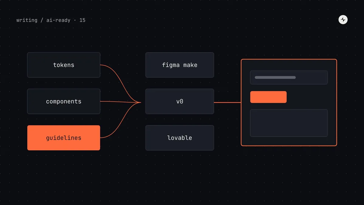
The short answer
AI prototyping tools (Figma Make, v0, Lovable and similar) use your design system when you give them two things: your actual components and tokens, in a form the tool supports, and written guidelines that tell it how to use them. In Figma Make that means a Make kit built from your React package plus library variables and guidelines. In v0 it means a design system set up from your registry or code sources. In Lovable it means a design system project whose components and knowledge files are attached to other projects. Without both parts, these tools fall back to their defaults, usually shadcn/ui-style components and Tailwind colours. Most of the preparation is the same work as the rest of this series: clean tokens, typed components, clear usage rules.
- Most of these tools expect React. If your system isn't React, give them tokens and guidelines at minimum.
- Guidelines matter as much as code: write them as you would onboard a new engineer.
- Part 15 of 20 in the series on AI-ready design systems.
"The prototype looks nothing like our product"
A designer opens an AI prototyping tool, describes a payroll settings screen, and gets something polished, plausible and completely off-brand: rounded grey cards, a blue primary button, a font that isn't yours. It's often worse when they've already "connected" their library: the tool imports it, then quietly uses its own components anyway.
This is the most common design system complaint from designers using AI tools, and the reasons are the same as for coding agents (part 11), with one extra: each tool has its own way of accepting a design system, its own supported formats and its own limits. This guide covers the three tools we're asked about most, as of late 2026. They change quickly, so check each tool's documentation for current details.
AI prototyping tool (or app builder): a tool that generates a working interface, usually React code running in the browser, from a prompt, an image or a design. Registry: a published list of components with their source code and dependencies, in a format tools can install from; shadcn/ui popularised the format. Guidelines (or knowledge files): written instructions the tool reads alongside your code.
What every tool needs from your design system
Figma Make: Make kits
Figma Make generates interactive prototypes and apps inside Figma. To use your design system, you create a Make kit: a reusable bundle of your code package, styles and guidelines that designers in your organisation can start from.
Check your package fits
Make kits currently support React design system packages. Figma's docs say Make builds with Vite and React 18, so confirm your package builds in that setup. Private packages can be published to Figma's private npm registry for your organisation on paid plans; public npm packages can be imported by anyone.
Add the package to a kit
Import the package so Make can inspect its components. Add your published Figma library's variables and styles too, so colours, type and spacing match.
Write guidelines
Figma's documentation is clear that Make can inspect packages but needs guidelines to use them well. Write them like onboarding notes for a new engineer: which components to use for which jobs, what never to use, how layouts and forms are built. If your system spans several packages, add an overview.
Test with real prompts
Generate five screens your teams actually build. Check whether Make used your components or substituted its own.
<!-- Guidelines for Harbor in Figma Make (excerpt) -->
# Harbor design system

Build every screen with components from @kestrel/harbor. Don't create new
components or use other UI libraries.

## Layout
- Pages use PageLayout with a PageHeader. Content sits in Card or StatCard.
- Spacing comes from tokens: space-inset-md inside cards, space-stack-lg between sections.

## Components for common jobs
- Actions: Button. One variant="primary" per screen; everything else secondary.
- Confirming a destructive action: ConfirmDialog with tone="danger".
- Forms: Form + TextField / Select / Checkbox. Every field has a visible label.
- Key numbers on dashboards: StatCard (1–4 stats).
- Lists of records: Table with TableToolbar for search and filters.

## Never
- Raw colours or pixel values. Use the CSS variables from @kestrel/harbor/tokens.css.
- Modal (deprecated): use Dialog.Community reports describe Make falling back to generic or shadcn-style components when it can't make sense of a library, or when no components are extracted from it. If that happens, check that the package builds cleanly on its own, that components have clear exported names and types, and that the guidelines name the components to use for each job.
v0: design systems
v0, from Vercel, generates React and Next.js interfaces. It has long supported custom design systems through a registry: you publish your components in the shadcn registry format, and v0 can build with them (shadcn/ui's "Open in v0" buttons use the same mechanism). v0's newer design system features also accept other sources of context, such as code repositories and packages. Check v0's design systems documentation for what's currently supported on your plan.
The registry route is worth understanding because other tools use the same format (part 16 covers it in detail):
// registry.json: a minimal registry for Harbor
{
  "$schema": "https://ui.shadcn.com/schema/registry.json",
  "name": "harbor",
  "homepage": "https://harbor.kestrel.example",
  "items": [
    {
      "name": "harbor-theme",
      "type": "registry:style",
      "description": "Harbor tokens as CSS variables, light and dark.",
      "files": [{ "path": "registry/harbor/tokens.css", "type": "registry:file", "target": "app/harbor-tokens.css" }]
    },
    {
      "name": "stat-card",
      "type": "registry:component",
      "title": "StatCard",
      "description": "Shows 1–4 key figures with an optional action. Use for dashboard summaries.",
      "registryDependencies": ["button"],
      "files": [{ "path": "registry/harbor/stat-card.tsx", "type": "registry:component" }]
    }
  ]
}
Notice the description field: it's the same purpose sentence as the component metadata in part 4. Generate it from there rather than writing it twice.
Lovable: design system projects
Lovable builds full-stack web apps from prompts. Its design system feature works differently: a design system is a project of its own. When you attach it to another project, its components are copied into that project and its knowledge files, Lovable's word for guidelines, are added to the rules Lovable reads on every generation. Connected projects receive updates from the design system project. According to Lovable's documentation at the time of writing, wrapping an existing npm package as a design system is available on Enterprise plans, and Lovable reads the package's published type definitions to understand its components.
- Publish good type definitions, because that's how Lovable sees your package's components and props.
- Write knowledge files like the guidelines above: jobs to components, never-use lists, layout and content rules.
- Use its enforcement: Lovable's docs describe catching raw colours and custom components that deviate from the design system. Treat its warnings like lint errors.
Comparing the three
| Figma Make | v0 | Lovable | |
|---|---|---|---|
| How the system arrives | Make kit: npm package plus Figma library styles and variables | Registry, plus newer design system sources | Design system project attached to app projects |
| Guidelines | Guidelines in the kit | Instructions and registry descriptions | Knowledge files |
| Framework | React | React / Next.js | React |
| Private code | Private npm in Figma on paid plans | See v0's docs for private registries | Private packages with a token; npm wrapping on Enterprise |
| Best for | Designers prototyping inside Figma | Teams already using shadcn-style registries and Next.js | Teams building internal tools or full apps from prompts |
If your design system isn't React
Many design systems are built for Angular, Vue, web components or native platforms. Most AI prototyping tools generate React. You still have useful options:
Tokens + guidelines
Give the tool your tokens as CSS variables and your written rules. Prototypes match your look even if the components are the tool's own.
A thin React layer
Web components can be wrapped for React. A small wrapper package can give prototyping tools your real components.
Prototype vs product
Agree that prototypes show intent and flow; production code is built with your real framework, by your real pipeline.
A test before you roll it out
Before telling a whole design team "use the kit", check that it works. Score five prompts, the same way as the agent audit in part 2:
| Check | Pass when |
|---|---|
| Components | Every visible component comes from your system |
| Tokens | No invented colours, radii or spacing; dark mode works if you have it |
| Rules | One primary action; correct dialog for destructive actions; labelled fields |
| Accessibility | Keyboard works through the main flow (part 13) |
| Gaps | When nothing fits, the tool says so rather than inventing a component |
Common mistakes
Importing the package without guidelines
The tool sees 60 components and no rules. It guesses, or falls back to defaults. Guidelines are half the setup.
Guidelines that contradict the code
Guidelines say "use Dialog" while the package still exports Modal without a deprecation. Clean the package first.
A different setup per tool
Writing separate rules for Make, v0 and Lovable by hand means three versions that drift. Generate them from one source, the same as AGENTS.md.
Shipping prototypes as product
Generated prototypes skip your lint, tests and review. Route them through the normal pipeline before they reach customers.
The short version
- AI prototyping tools need your real components and tokens and written guidelines; without both they use their defaults.
- Figma Make uses Make kits (React packages plus library styles and guidelines); v0 uses design systems and registries; Lovable uses design system projects with knowledge files.
- Write guidelines like onboarding notes: jobs to components, never-use lists, layout and content rules.
- If your system isn't React, give tools tokens and guidelines at minimum.
- Test five real prompts before rolling a kit out, and keep prototypes out of production until they pass your checks.
Next: Is shadcn/ui better for AI?
Frequently asked questions
How do I use my design system in Figma Make?
Create a Make kit: add your React design system package (public npm, or Figma's private registry on paid plans), add your Figma library's variables and styles, and write guidelines explaining which components to use for which jobs. Then test it with real prompts.
Why does Figma Make not use my components?
Common causes are a package that doesn't build cleanly in Make's React and Vite setup, components without clear exported names and types, and missing guidelines. Make can inspect a package, but it needs guidelines to use it well.
Can v0 use a custom design system?
Yes. v0 supports custom design systems, including components published as a shadcn-compatible registry, and newer features accept other sources such as code repositories. Check v0's documentation for what your plan supports.
How do design systems work in Lovable?
A design system is its own Lovable project. Attaching it to another project copies its components in and adds its knowledge files to the rules Lovable reads on every generation. Wrapping an existing npm package is available on Enterprise plans.
What if my design system is Angular or web components?
Most AI prototyping tools generate React. Provide tokens and written guidelines so prototypes match your look, consider a thin React wrapper for web components, and treat prototypes as intent rather than production code.
Further reading
- Figma: bring your design system packageMake kits, packages and requirements.
- Figma: write design system guidelinesHow to write guidelines Make can use.
- v0: design systemsCustom design systems and registries in v0.
- Lovable: design systemsDesign system projects and knowledge files.
- shadcn/ui: registryThe registry format several tools share.