
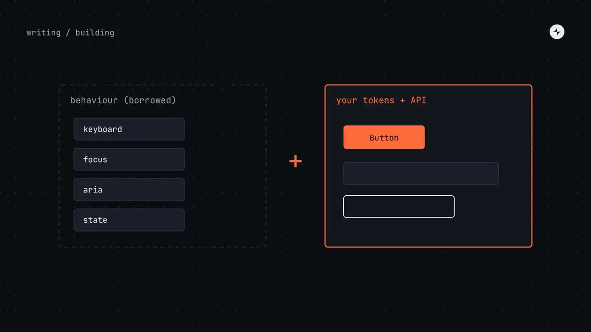
The short answer
There are three ways to get components: build your own (full control, slowest), use a headless library (tested behaviour and accessibility, your own look) or theme a fully styled library (fastest start, hardest to make yours). For most product companies we recommend a mix: build simple components yourself (buttons, badges, cards) and use a headless library for complex interactive ones (menus, dialogs, comboboxes, date pickers), because the behaviour is the hard part. Either way, keep your tokens and your component API your own, so the choice stays reversible.
- A headless component handles keyboard, focus and screen reader support but has no visual style.
- Wrap whatever you borrow in your own components, with your own prop names.
- A fully styled library suits early-stage products and internal tools.
Why this decision matters
Building accessible behaviour for complex components is genuinely hard. A combobox needs the right ARIA roles, focus management, keyboard support for arrow keys, Home and End, typing to search, and announcements for screen readers. The W3C's ARIA Authoring Practices Guide documents these patterns, and it runs to dozens of pages. Getting them right from scratch takes months; getting them wrong ships accessibility bugs to every product that uses the system.
At the same time, your design system has to look and feel like your product, and its API has to suit your teams. The decision is how to get both.
A headless component handles behaviour (keyboard use, focus, accessibility, state) but comes with no visual styling, so you apply your own with your tokens. Radix Primitives and React Aria are well-known examples. It's like buying a well-engineered chassis and designing your own body for it.
The three approaches
| Approach | Good for | Watch out for | Speed |
|---|---|---|---|
| Build your own | Full control; exactly your needs; no outside dependency | Slowest; accessible behaviour for complex components is hard to get right | Slow |
| Headless library + your tokens | Correct, accessible behaviour out of the box; your own look | You depend on the library's updates and conventions | Fast |
| Fully styled library, themed | Fastest start; early-stage products; internal tools | Hard to make it truly yours; heavy theming can be harder than building | Fastest |
What we usually recommend
Match the approach to the component's complexity level:
Build
Badge, avatar, divider, icon, tag. Mostly visual; quick to build; you'll want full control.
Build, carefully
Button, text field, checkbox, radio, switch. Native HTML elements do most of the accessibility work if you use them.
Borrow behaviour
Select, menu, tabs, dialog, combobox, date picker. Use a headless library; style it with your tokens.
Evaluate case by case
Data tables, rich text, charts. Often a specialised library (headless table, editor framework) wrapped in your API.
Wrap what you borrow
Whatever you use underneath, product teams should import your components with your props, never the library directly. That gives you three things: a consistent API across built and borrowed components, the freedom to swap the underlying library later, and one place to enforce your tokens and accessibility rules.
// Product teams use the system's Dialog…
import { Dialog } from "@acme/ui";

<Dialog open={open} onOpenChange={setOpen} title="Delete invoice?">…</Dialog>

// …which wraps a headless primitive, styled with semantic tokens.
// Swapping the primitive later doesn't change a single product screen.
Keep your prop names consistent with the rest of your library (variant, size, open, onOpenChange) even where the underlying library uses different ones. See component props best practices.
How to evaluate a library
- Accessibility: does it follow the ARIA Authoring Practices patterns? Test with a keyboard and a screen reader, not just the docs.
- Styling model: can you apply your own tokens cleanly, without fighting built-in styles?
- Framework fit: does it match your framework and rendering approach (server rendering, React Native, web components)?
- Maintenance: release cadence, open issues, who maintains it and how it's funded.
- Breaking changes: how often has it had major releases, and how painful were they?
- Escape hatches: can you control state yourself (controlled props) and compose parts (slots), or is it all-or-nothing?
- Bundle size and licence fit your product's constraints.
When to theme a fully styled library
A fully styled library, themed with your tokens, is often the right answer for an early-stage product still finding its shape, or for internal tools where speed matters more than distinctiveness. The cost comes later: when you need your product to look truly like yours, heavy overrides can be harder than building. Plan to re-evaluate when the product settles or a brand refresh is coming.
At CARS24 the internal tools system set up tokens and Storybook with engineers new to design systems, and reached 93 component sets in a 3–4 month runway to a beta for leadership. Read the case study.
Keep the decision reversible
Libraries come and go. Two habits keep you free to change your mind:
Own your tokens
Store them in the vendor-neutral DTCG format in your own repository. Styles come from your tokens, not the library's theme object.
Own your API
Product teams only ever import your components. The library is an implementation detail behind them.
The short version
- Build simple components; borrow behaviour for complex interactive ones.
- Headless libraries give you tested accessibility with your own look.
- Fully styled libraries suit early-stage products and internal tools.
- Wrap everything in your own components and props.
- Own your tokens and API so you can swap libraries later.
Frequently asked questions
What is a headless UI library?
A library of components that provide behaviour and accessibility (keyboard, focus, ARIA, state) without visual styles, so you can style them with your own design tokens.
Is it cheating to use a headless library in a design system?
No. Behaviour is the hardest and least visible part of complex components. Borrowing well-tested behaviour lets your team spend its time on what's specific to your product.
Should product teams import the library directly?
No. Wrap it in your own components with your own props, so you can enforce tokens and accessibility and change the library later.
What about web components?
Web components work across frameworks, which suits organisations with several front-end stacks. The same rule applies: own the API and style with your tokens.
Further reading
- ARIA Authoring Practices GuideW3C. The behaviour patterns to test against.
- Web ComponentsMDN.
- Which components to build firstThe prioritisation method.