
The short answer
A design system is the most effective place to make a product accessible: every accessibility problem in a component is copied into every screen that uses it, and every fix is inherited by all of them. Build accessibility in at three levels: foundations (colour contrast, readable type, focus styles, motion), components (keyboard support, focus management, names, roles and states, target sizes, error messages) and patterns (forms, navigation, feedback). Then be honest about the limit: the system makes accessible products easier, not automatic. Product teams still own page structure, headings, alt text, the words they write and the way they combine components.
- Aim for WCAG 2.2 AA as the minimum for every component and pattern.
- For menus, tabs, dialogs and comboboxes, follow the W3C ARIA Authoring Practices Guide rather than inventing keyboard behaviour.
- Document what each component handles and what the product team must still add.
Accessible by default, not by audit
Accessibility audits at the end of a project find hundreds of issues, most of them repeated: the same unlabelled icon button, the same dialog that traps nobody, the same low-contrast placeholder, on every page. A design system turns that around. Fix the icon button once, and every product inherits the fix.
An illustration: the dialog you couldn't escape
A team builds its own confirmation dialog. It looks great and works perfectly with a mouse.
Keyboard users press Tab and focus goes behind the dialog into the page. Escape doesn't close it. Screen readers don't announce it. It ships in 40 places before anyone notices.
One dialog component with focus kept inside, Escape to close, focus returned afterwards and a proper announcement. Fixed once; every one of the 40 dialogs inherits it.
Three levels of accessibility in the system
Foundations
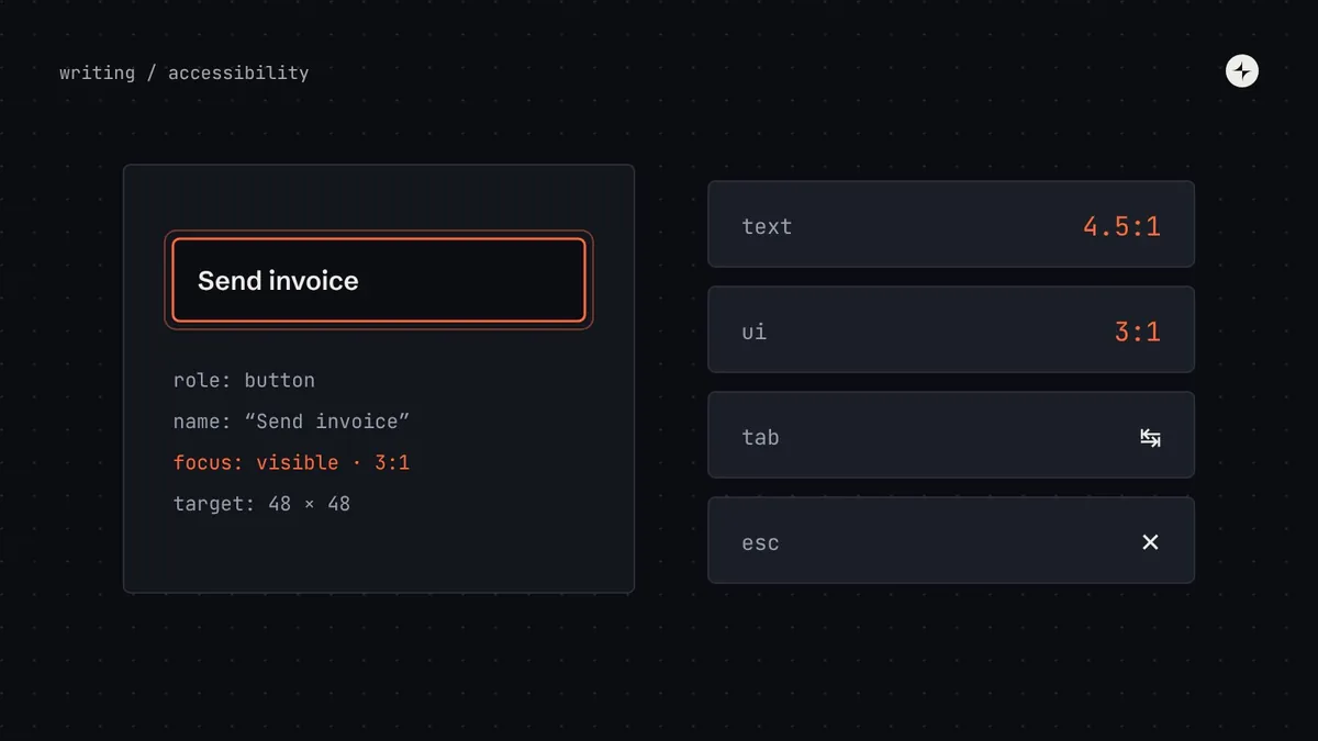
- Contrast built into the palette: text pairs at 4.5:1, UI parts and focus at 3:1 (WCAG 1.4.3 and 1.4.11). Name colours by job so passing pairs are the obvious choice. See colour contrast in design systems.
- Readable type: a 16px body size, line heights that support reading, and sizes in rem so text respects the reader's settings.
- One focus style: a token-based focus ring, visible on every surface, used by every interactive component.
- Motion tokens that respect "reduce motion": durations that drop to zero or a fade when people ask for less movement.
- Never colour alone: status always has an icon or a word as well. See the contrast checker to simulate colour blindness.
Components
| Everyone can… | Which means | WCAG 2.2 |
|---|---|---|
| See it | Text at 4.5:1; edges of fields and buttons at 3:1; never colour alone | 1.4.3, 1.4.11, 1.4.1 |
| Use it with a keyboard | Every action reachable with Tab and triggered with Enter or Space; standard patterns for menus and dialogs | 2.1.1 |
| See where they are | A clear focus indicator that isn't hidden by sticky headers or other content | 2.4.7, 2.4.11 |
| Hear what it is | Screen readers announce its role ("button"), name ("Send invoice") and state ("expanded") | 4.1.2 |
| Hit it | Targets at least 24 × 24px (44–48px on touch screens is better) | 2.5.8 |
| Understand errors | Errors say what's wrong and how to fix it, connected to the field | 3.3.1, 3.3.3 |
| Avoid discomfort | Animation respects the reduce-motion setting | 2.3.3 (AAA), good practice |
Patterns
Some accessibility only exists in combination: an error summary that links to each field, a page with one main landmark and a skip link, a toast that's announced without stealing focus. Write these into your patterns, especially forms.
What the system covers, and what product teams own
Overselling is the most common accessibility mistake design system teams make. "Use our components and you're accessible" isn't true, and teams who believe it stop checking. Be explicit about the split:
Inside every component
Contrast of its own colours, keyboard behaviour, focus management, roles and states, target sizes, connecting labels, hints and errors, reduced motion.
Everything around them
Page titles and headings, landmarks and reading order, alt text for their images, the words in labels, buttons and errors, which component they choose, and testing their own flows.
Put a short "What you must add" list on every component's documentation page. For an icon button: "Give it a label that says what it does: aria-label="Delete invoice", not "Delete" or "Icon"." Those few lines prevent most of the issues audits find in system-built products.
Making it stick
Set a standard
WCAG 2.2 AA as the minimum for every component and pattern, written into the definition of done.
Automate what can be automated
Contrast checks on token changes, automated accessibility rules on every component story, lint rules for missing labels.
Test the rest by hand
A keyboard and screen reader script for every interactive component. See testing a design system.
Document responsibilities
"What this handles" and "What you must add" on every component page.
Include disabled people in research
For complex components, test with assistive technology users. Expert review finds a lot; real use finds more.
Accessibility is increasingly a legal requirement as well as good practice. The European Accessibility Act has applied to many consumer products and services in the EU since June 2025, and public-sector rules in many countries reference WCAG. A system that meets WCAG 2.2 AA by default makes compliance far cheaper across every product.
The short version
- Fix accessibility once in the system, and every product inherits it.
- Build it into foundations, components and patterns.
- Follow WCAG 2.2 AA and the ARIA Authoring Practices for complex widgets.
- Be explicit about what product teams still own.
- Automate checks, test by hand, and include disabled people in research.
Frequently asked questions
Does using a design system make my product accessible?
It makes it much easier, not automatic. Components can handle keyboard support, focus and contrast, but product teams still own headings, reading order, alt text, wording and how they combine components.
Which WCAG level should a design system meet?
WCAG 2.2 AA as the minimum for every component and pattern. Some teams go further for specific criteria, like larger touch targets.
How do I make complex components accessible?
Follow the W3C ARIA Authoring Practices Guide for menus, tabs, dialogs and comboboxes, or use a headless library that already does, and test with a keyboard and screen reader.
What's the minimum touch target size?
WCAG 2.2 AA asks for at least 24 × 24 CSS pixels, with some exceptions. Platform guidelines recommend 44–48px on touch screens.
Further reading
- Web Content Accessibility Guidelines (WCAG) 2.2W3C.
- ARIA Authoring Practices GuideW3C. Keyboard and screen reader patterns.
- Build, borrow or buyUsing headless libraries for accessible behaviour.