
The short answer
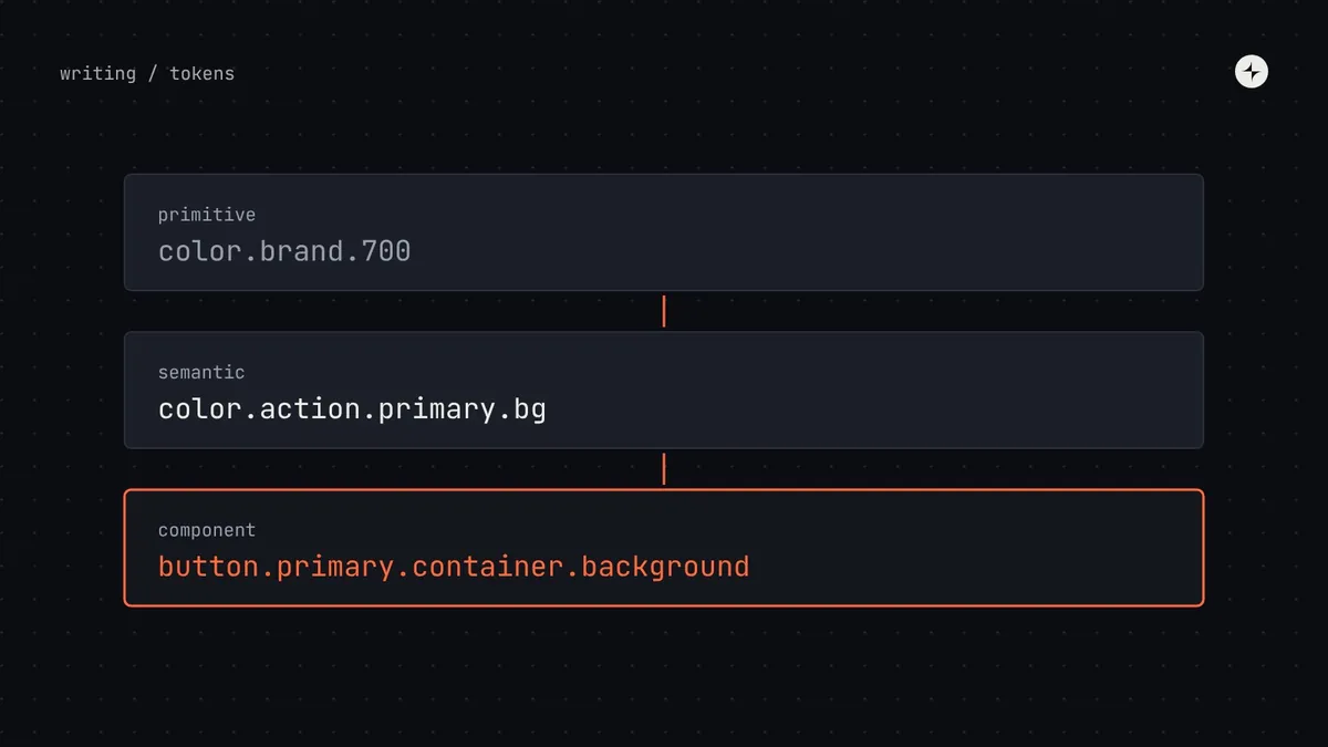
Component tokens are the third tier of design tokens: names for one property of one component, like button.primary.container.background, that point to a semantic token like color.action.primary.bg. Most single-brand products with light and dark mode don't need them: components can use semantic tokens directly. Create component tokens when you have a reason: brands that style specific components differently, white-label products where customers adjust components, a component that genuinely departs from the semantic rule, or platform-specific sizes. Then create them only for the properties that vary.
- Never let components use primitive tokens or raw values. That's where dark mode breaks first.
- Name them {component}.{variant}.{part}.{property}.{state}, using the anatomy's part names.
- Component tokens multiply fast: ten components with ten tokens each is already a hundred names to maintain.
Where component tokens fit
Raw values with neutral names. Components never use these directly.
color.brand.700radius.4Names a purpose and points to a primitive. Enough for most components.
color.action.primary.bgradius.controlNames one property of one component and points to a semantic token. Optional.
button.primary.container.backgroundbutton.container.radiusThere are two good ways for a component to get its values, and one bad one:
Semantic tokens
The button's background is action.primary.bg. Simple, and enough for most single-brand products.
Its own tokens
The background is button.primary.container.background, pointing to action.primary.bg. More flexible, more to maintain.
Primitives or raw values
The background is brand.700 or #AB2800. Dark mode and theming break here first.
An illustration: dark mode works everywhere except the date picker
A product launches dark mode. Every screen looks right except the date picker, whose selected day stays bright orange on a white square.
The date picker was built in a hurry using brand.700 and neutral.50 directly. Those are paints, not jobs, so dark mode had no way of switching them.
Point it at job names (action.primary.bg, bg.surface) and add a lint rule that flags any component using primitives. One component fixed; a whole class of bugs prevented.
When a component deserves its own tokens
| Situation | Component tokens? | Why |
|---|---|---|
| One brand, light and dark mode | Usually no | Semantic tokens already switch with the theme |
| Several brands that differ only in colour | Usually no | A brand level under the semantic tokens handles it |
| Brands that style specific components differently | Yes | Each brand overrides just those components' tokens |
| White-label products customers can adjust | Yes | A safe, limited list of things customers can change |
| A component that departs from the semantic rule | Yes, for that part | Records the exception in one visible place instead of hiding it in code |
| Native apps with platform-specific sizes | Yes, for sizes | iOS and Android can map sizes to their own guidelines |
A good middle path, used by many teams, is to create component tokens only for the properties that vary. A system might give buttons a button.container.radius token because one brand wants pill-shaped buttons, while the button's colours keep using semantic tokens directly. The token list stays short and every token has a reason.
Mapping a component's anatomy to tokens
Start from the component's anatomy. For each part, ask which visual properties could ever change with a theme, a brand, a density or a platform. Those come from tokens. Properties that never change (the label sits above the field) are just part of the design.
| Part | Property | Component token | Points to | Changes with |
|---|---|---|---|---|
| Label | Colour | input.label.color | text.primary | Theme |
| Container | Background | input.container.background | bg.surface | Theme |
| Container | Border | input.container.border | border.strong | Theme |
| Container | Border, error | input.container.border.error | feedback.danger.text | Theme |
| Container | Border, focus | input.container.border.focus | focus.ring | Theme |
| Container | Height | input.container.height | size.control.height | Density |
| Container | Corners | input.container.radius | radius.control | Brand |
| Helper text | Colour | input.helper.color | text.secondary | Theme |
Naming them
{component}.{variant}.{part}.{property}.{state}

button.primary.container.background          // default state left out
button.primary.container.background.hover
button.primary.label.color
input.container.border.error                 // no variant needed
table.row.background.selected- Use the anatomy's part names, so the token, the anatomy diagram and the Figma layer names match.
- Leave out levels that don't apply rather than inventing filler like "default".
- Use the same property words everywhere: if one component says
background, none should saybgorfill. - Test with a newcomer: show someone a component's anatomy and ask them to guess the token for the error border. If they can't, simplify.
More in design token naming conventions.
How it works in code and in Figma
Here's the whole point in one example: a second brand gets pill-shaped buttons by changing one value, and no component code changes.
/* generated from the token files */
:root {
  --button-container-radius: var(--radius-control);
  --button-primary-container-background: var(--color-action-primary-bg);
}
/* brand B overrides one component token */
[data-brand="b"] { --button-container-radius: 999px; }

/* Button.css never changes */
.button { border-radius: var(--button-container-radius); }
In Figma, the same tokens become variables attached to the component's layers, with modes for each brand or theme. When the variable names match the token names, switching a mode restyles every component exactly as the code does. See keeping Figma and code in sync.
Keeping them healthy
| Check | What it finds | How |
|---|---|---|
| Raw values in components | Colours or sizes typed directly into component styles | A lint rule on every change |
| Primitives in components | The date picker problem | A lint rule allowing only semantic and component tokens |
| Unused tokens | Tokens nothing uses any more | A script comparing the token list with usage |
| Missing tokens | Properties that should change with themes but don't | Switch every theme and density in the workshop and look |
| Figma–code mismatch | Variables that don't match tokens | Compare the exported variable list with the token source |
The short version
- Component tokens are optional; semantic tokens are enough for most products.
- Create them for brands, white-label, real exceptions or platform sizes, and only for properties that vary.
- Components must never use primitives or raw values.
- Name them from the anatomy: component, variant, part, property, state.
- Audit quarterly for raw values, primitives, unused and missing tokens.
Frequently asked questions
What are component tokens?
Tokens that name one property of one component, like button.primary.container.background, and point to a semantic token. They're the optional third tier after primitive and semantic tokens.
Do I need component tokens for dark mode?
Usually not. Semantic tokens switch with the theme. Component tokens help when brands or customers need to restyle specific components.
How many component tokens should a system have?
As few as possible. Create them only for properties that genuinely vary by brand, customer or platform.
Can component tokens point to primitives?
Avoid it. Point them to semantic tokens, so themes still work. A component token pointing at a primitive is the date picker problem one level up.
Further reading
- Design Tokens Community GroupThe shared format for tokens.
- Multi-brand design systemsWhere component tokens earn their place.
- Dark mode with design tokensWhy semantic tokens are usually enough.