
The short answer
Design tokens are named design decisions (a colour, a font size, a spacing step, a radius) stored once in a format that design tools and code can both read. Instead of typing #AB2800 in fifty places, everything uses a name like action.primary.bg. Change the token, and every button, in Figma and in every codebase, changes with it.
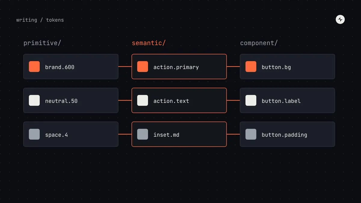
- Tokens come in three tiers: primitive (what a value is), semantic (what job it does) and, optionally, component (where it's used).
- Components should only ever use semantic or component tokens. That's what makes dark mode, themes and rebrands cheap.
- Since October 2025 there's a stable shared file format, from the W3C Design Tokens Community Group.
What are design tokens?
Here's the problem tokens solve. A designer decides the primary button should be a particular shade of orange. In a traditional handover, she writes #AB2800 on a spec. An engineer copies it into the code. Another engineer, on another team, copies it from a screenshot and gets #AA2900. A year later nobody knows which is right, and changing it means finding every copy.
A token writes the decision down once, gives it a name, and makes everything else read from that one place:
color.brand.700oklch(0.486 0.172 35)
action.primary.bg → brand.700action.primary.bg. Nobody types a hex code.The term comes from Salesforce's design system team, who started using it around 2014 to share design decisions between platforms. Today almost every serious design system uses tokens: Material Design, IBM Carbon, Atlassian, Adobe Spectrum and GitHub Primer all publish theirs.
Why tokens matter
Design and code read the same values, so "the blue" means one thing to everyone. Handoff stops being a translation exercise.
A rebrand, a contrast fix or a spacing tweak is one edit, released everywhere. Without tokens it's a search-and-replace across every codebase.
Dark mode, high contrast, density and multiple brands become different values for the same names. Components don't change at all.
At CARS24, one blue lived in the code as five different values across 10+ products in three countries. A four-layer token system carried the rebrand to all of them, and handoff from design to development got 65% faster. Read the case study.
The three tiers: primitive, semantic, component
Good token systems separate what a value is from what it's for. That separation is the whole trick.
Raw values with neutral names. The full palette, the spacing scale, the type sizes. Nothing in the product uses these directly.
color.brand.700color.neutral.50space.4 = 16pxNames a purpose and points to a primitive. Components use these. Themes change which primitive they point to.
action.primary.bg → brand.700action.primary.text → neutral.50space.inset.md → space.4Optional. Names one property of one component and points to a semantic token. Useful for multi-brand systems.
button.primary.background → action.primary.bgbutton.primary.label → action.primary.textPrimitive tokens
Your raw materials: every colour in every ramp (blue.50 to blue.950), every step of the spacing scale, every font size and weight. Primitives are named by what they are, never by what they're for. They're the only tier that holds actual values.
Semantic tokens
The tier that does the real work. A semantic token names a job (text.primary, border.default, feedback.danger.bg, action.primary.bg) and points to a primitive. Components only use semantic tokens. That's why dark mode works: in dark mode, text.primary points to a light neutral instead of a dark one, and no component needs to change. We walk through it in dark mode with design tokens.
Component tokens
Some systems add a third tier for specific components: button.primary.background, input.container.border.focus. They point to semantic tokens and add flexibility: one brand can give buttons a different colour without touching other actions. They also add a lot of names to maintain. Ten components with ten tokens each is already a hundred.
| Do you need component tokens? | Probably not | Probably yes |
|---|---|---|
| Brands and themes | One brand, light and dark | Several brands, or white-labelled products |
| Who customises | Only the system team | Product teams or clients restyle specific components |
| Team size | Small system team | A team with time to maintain hundreds of names |
The one thing to never do: let components use primitives or raw values directly. A date picker built with brand.700 and neutral.50 will stay bright orange on white when every other screen switches to dark mode. It's the first place theming breaks.
How to name design tokens
Token names are an interface. People type them hundreds of times a day, so they should be guessable. A structure that works for most systems:
// primitives: {category}.{family}.{step}
color.blue.600        space.4        font.size.300        radius.2

// semantic: {category}.{purpose}.{variant}.{state}
color.text.primary
color.action.primary.bg
color.action.primary.bg-hover
color.feedback.danger.text

// component: {component}.{variant}.{part}.{property}.{state}
button.primary.container.background.hover
input.container.border.error- Name by job, not appearance.
text.secondary, notgrey-600. Appearance changes; jobs don't. - Use one word per idea, everywhere. If one token says
background, none should saybgorfill. - Leave out levels that don't apply rather than inventing filler like
default. - Match the anatomy. Token parts should use the same names as the component's docs and Figma layers.
- Use numeric steps for scales (50–950, or 1–10) so new steps can slot in without renaming.
The Lab has a free token name linter that checks a list of names against rules like these and suggests fixes.
The DTCG format: one file every tool can read
For years every design tool and code library stored tokens in its own format, which made moving between them painful. In October 2025 the W3C Design Tokens Community Group (with contributors from Adobe, Google, Microsoft and others) published the first stable version of a shared format, the Design Tokens Format Module 2025.10. Standard Strictly, it's a community group report rather than a formal W3C Recommendation, but it's the format token tools are converging on.
It's a JSON file. Each token has a $type and a $value; groups are just nested objects; and tokens point to other tokens with curly braces. Here are the three tiers from above, using real values from our playbook's palette:
{
  "color": {
    "brand": {
      "700": {
        "$type": "color",
        "$value": { "colorSpace": "oklch", "components": [0.486, 0.172, 35], "hex": "#ab2800" }
      }
    },
    "neutral": {
      "50": {
        "$type": "color",
        "$value": { "colorSpace": "oklch", "components": [0.975, 0.011, 260], "hex": "#f3f7fe" }
      }
    }
  },
  "action": {
    "primary": {
      "bg":   { "$type": "color", "$value": "{color.brand.700}", "$description": "Main actions. 6.44:1 with action.primary.text." },
      "text": { "$type": "color", "$value": "{color.neutral.50}" }
    }
  },
  "button": {
    "primary": {
      "background": { "$type": "color", "$value": "{action.primary.bg}" }
    }
  },
  "space": {
    "4": { "$type": "dimension", "$value": { "value": 16, "unit": "px" } }
  }
}
A few things worth knowing about the format:
- Types include
color,dimension,fontFamily,fontWeight,duration,cubicBezierandnumber, plus composite types such astypography,shadow,borderandtransition. - Colours are stored with their colour space and components, so a value defined in OKLCH stays in OKLCH. A
hexfallback can sit alongside. - Aliases (
"{color.brand.700}") are how tiers point to each other. Tools resolve them when they build outputs. - Properties starting with
$are reserved by the format:$type,$value,$description,$extensions,$deprecated.
From tokens to code
Nobody should hand-copy tokens into code. A build tool reads the token file and writes out whatever each platform needs. Style Dictionary, originally from Amazon, is the most widely used, and recent versions support the DTCG format.
tokens.json
DTCG format, in a repository, reviewed like code.
CSS variables
--action-primary-bg, plus Tailwind or Sass if you need them.
Swift, Kotlin
Colour and dimension constants for iOS and Android.
Figma variables
Collections and modes, synced by a plugin or the Figma API.
On the web, the output usually looks like this. Notice the semantic layer points to the primitive layer, so the browser resolves the chain and themes only need to override the middle layer:
:root {
  /* primitives */
  --color-brand-700: oklch(0.486 0.172 35);
  --color-neutral-50: oklch(0.975 0.011 260);
  /* semantic */
  --action-primary-bg: var(--color-brand-700);
  --action-primary-text: var(--color-neutral-50);
}
[data-theme="dark"] {
  --action-primary-bg: var(--color-brand-400);
  --action-primary-text: var(--color-neutral-950);
}
.button--primary { background: var(--action-primary-bg); color: var(--action-primary-text); }
Tokens in Figma
Figma's variables are its implementation of tokens. Collections group them (primitives, semantic), and modes hold alternative values (light, dark, brand A, brand B). Set them up to mirror your token tiers exactly: a primitives collection that's hidden from publishing, and a semantic collection with a mode per theme that designers actually apply.
Keep the names identical
The Figma variable action/primary/bg and the CSS variable --action-primary-bg should be the same name in different punctuation. Any difference becomes a translation step.
Pick one source of truth
Either the token file feeds Figma, or Figma feeds the token file. Never both. Most teams with engineering capacity keep the JSON in a repository as the source.
Theming and modes
Because components only use semantic tokens, a theme is simply a different mapping from semantic names to primitives. The same structure handles:
Dark mode
Lighter text, darker surfaces, adjusted accents.
High contrast
Stronger borders and text for users who need them.
Density
Compact and comfortable spacing and control heights.
Brands
Different palettes and radii for each brand or client.
The two most common mistakes are making themes by inverting colours (dark mode isn't an inverted light mode) and adding brand-specific semantic names (brand-a.button), which defeats the point. The full walkthrough is in dark mode with design tokens; how to build the underlying palette is in accessible colour palettes in OKLCH.
Governing tokens
Tokens have the biggest blast radius in a design system: change one, and every product changes. So they deserve clear decision rights:
| Decision | Who decides | Who can block | Process |
|---|---|---|---|
| Token names and structure | System engineering lead | — | Proposal, short comment period |
| Token value changes | System lead | Accessibility specialist (contrast) | One-week comment period; release notes |
| New semantic token | System design lead | — | Must name a job no existing token covers |
| Removing a token | System lead | — | Deprecate first ($deprecated), remove in the next major version |
Add an automated check that fails a build when a component uses a primitive or a raw value. It's the cheapest way to prevent a whole class of theming bugs. More in design system governance.
Common mistakes
Only one tier
Tokens named blue-600 used directly in components. It looks like a token system, but nothing can be themed.
Too many semantic tokens
A new semantic name for every screen. Keep the semantic layer small: 30–60 colour tokens covers most products.
Two sources of truth
Tokens edited in Figma and in code separately. Within a month they disagree.
Tokens after components
Components built first end up full of hard-coded values that someone has to find and replace. Tokens first, components second.
The short version
- A design token is a named design decision, stored once and read by design tools and code.
- Use three tiers: primitive (what it is), semantic (what job it does), component (optional, where it's used).
- Components only use semantic or component tokens; that's what makes themes and rebrands cheap.
- Store them in the DTCG 2025.10 format, build platform outputs automatically, and mirror them in Figma variables.
- Govern token changes carefully: they have the biggest blast radius in the system.
Frequently asked questions
Are design tokens the same as CSS variables?
No, but they're closely related. A token is the platform-neutral decision; a CSS custom property is one way of delivering it on the web. The same token also becomes a Swift constant, a Kotlin resource and a Figma variable.
Do I need component tokens?
Only if you have several brands, white-labelled products, or teams that need to restyle specific components. For a single brand with light and dark modes, semantic tokens are usually enough.
What is the W3C design tokens format?
The Design Tokens Format Module, published as a stable version (2025.10) by the W3C Design Tokens Community Group in October 2025. It's a JSON format with $type, $value and aliases in curly braces, designed so tokens can move between tools.
How do Figma variables relate to design tokens?
Figma variables are Figma's way of storing tokens. Mirror your token tiers as variable collections, and your themes as modes, with identical names to the code.
How many design tokens should a system have?
Primitives can number in the hundreds (every step of every ramp). Keep the semantic layer small enough to remember: often 30–60 colour tokens plus spacing, type, radius and elevation.
Further reading
- Design Tokens Format Module 2025.10W3C Design Tokens Community Group. The specification.
- Design Tokens specification reaches first stable versionW3C. The announcement, October 2025.
- Style DictionaryThe open-source build tool for turning tokens into platform code.
- Guide to variables in FigmaFigma Help Center.
- Atlassian design tokensA well-documented public token system to learn from.