
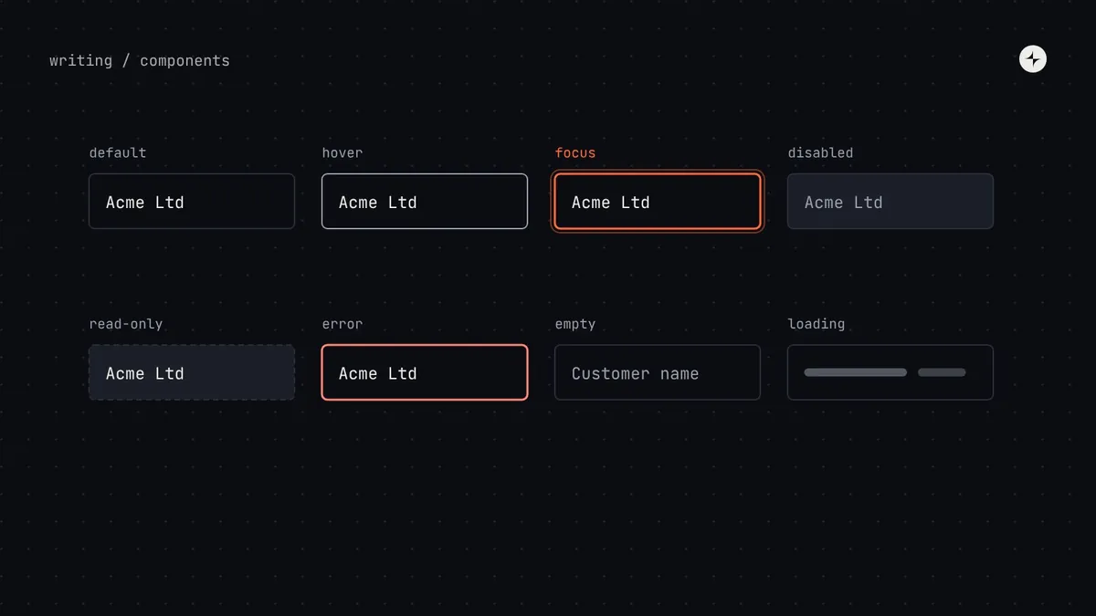
The short answer
Every design system component needs more states than the mock-up shows. Design four groups for every component: interaction states (default, hover, pressed, focus, selected, disabled, read-only), data states (empty, loading, partly loaded, error, success), content extremes (too much, too little, other languages) and context (screen sizes, bigger text and zoom). Then decide which combinations are possible and which should be prevented. Test it all on a "stress test" page with real content, and don't hand the component to engineering until every state has a design.
- A component is used in hundreds of places with content you'll never see. The states you forget are the ones that look broken in production.
- Focus and disabled are the two states most often designed badly; focus must be clearly visible (WCAG 2.4.7).
- Collect twenty real examples of the content before you design.
Why states matter more in a system
A screen designer designs for one situation. A system designer designs for every situation the component will ever meet, used by people they'll never meet, with content they'll never see. That's why a component that looks perfect in a mock-up can fall apart in a real product within a week.
An illustration: the alert that looked perfect until it met real messages
A designer creates a clean alert component. In the mock-up, every message is one short line: "Changes saved."
In the product, a message reads "Your payment of ₹1,24,000 to Acme Supplies could not be processed because the bank declined the transaction. Try another payment method." The alert wraps onto four lines, the icon floats in the middle and the close button overlaps the text.
Collecting twenty real alert messages first, and testing the design with the longest, the shortest and the strangest of them.
The states, at a glance
Four groups of states to design
| Group | States | Questions to answer |
|---|---|---|
| Interaction | Default, hover, pressed, focus, selected, disabled, read-only | What does each look like? Is focus visible on every background? Can people tell disabled from read-only? |
| Data | Empty, loading, partly loaded, error, success | What shows while we wait? What if there's nothing to show? What if loading fails? |
| Content extremes | Very long, very short, many items, other languages | Does it wrap, truncate with "…" or scroll? Does a one-character name still look intentional? Does it survive right-to-left? |
| Context | Phone, narrow panel, wide screen, 200% zoom, larger text setting | Does anything get cut off? Does the layout change, or just the size? |
Interaction states
Most teams design default, hover and pressed and stop there. The two that matter most for quality are the ones skipped most often:
Visible, every time
Keyboard users need to see where they are. WCAG 2.4.7 requires a visible focus indicator, and WCAG 2.2 adds that it mustn't be hidden by other content. Use a focus ring with at least 3:1 contrast against the surrounding colours, and test it on every surface the component sits on, including dark ones.
Use it less than you think
Disabled controls often can't be focused, so screen reader users may not know they exist, and nobody is told why they can't use them. Where you can, keep the control enabled and explain what's missing when it's used. When you do disable, explain why nearby.
Read-only is different from disabled and deserves its own design: the value is real and can be selected and copied, it just can't be changed. Treating it as disabled makes important information look greyed-out and unimportant.
Data states
Any component that shows data needs a plan for when the data isn't normal. Decide them once in the system so every team doesn't improvise:
Content extremes
Real content is longer, shorter and stranger than mock-up content. Decide for each text area whether it wraps, truncates or scrolls, and write it down:
- Wrap by default for anything people need to read in full: labels, messages, button text.
- Truncate with "…" only where the full text is available another way (a tooltip, a detail page) and never for actions or errors.
- Scroll inside the component for genuinely long content, like a long list in a menu, with a maximum height.
- Plan for translation: many languages need noticeably more space than English. See localisation and RTL.
Combinations: allow, prevent or design
States combine. A field can be in error and disabled; a row can be selected and loading. For each component, list the combinations and decide which are possible, which should be prevented in code, and which need their own design.
| Combination | Decision | Why |
|---|---|---|
| Error + disabled | Prevent | People can't fix an error in a field they can't edit |
| Selected + hover | Design | Hover should still be visible on a selected item |
| Loading + pressed (button) | Design | Show progress on the button pressed, and block a second press |
| Focus + error | Design | Both must be visible at once; the focus ring can't hide the error colour |
| Read-only + required | Prevent | A required field people can't fill is a dead end |
The stress test page
Keep a page next to every component in your design file called "stress test". Put the component there with the longest real content, the shortest, an empty state, an error, a translated version and a phone-width version. Review that page in design critique, not the polished one. It takes about an hour per component and saves weeks of bug reports. Practitioner view
Collect real content
Twenty real examples from the product: the longest, shortest and oddest labels, messages and values.
Design every state
Work through the four groups and the combinations. Every colour and size comes from a token, including states.
Build the stress test
Long, short, empty, error, translated, phone-width and 200% zoom, side by side.
Review with an engineer
Ten minutes now ("can the menu open upwards when there's no space below?") prevents a week of rework.
Hand over with the states listed
The component isn't ready to build until every state has a design and a token.
States need tokens too
Every state's colours and sizes should come from tokens, so dark mode and themes change them correctly: action.primary.bg.hover, border.focus, text.disabled. Put the state last in the name. See token naming conventions and component tokens.
At CARS24, the mobile component system tested look and feel on real screens before anything was built, so states were checked against real listings and prices in every market. Read the case study.
The short version
- Design four groups: interaction, data, content extremes and context.
- Focus must always be visible; use disabled sparingly and explain it.
- Decide which combinations to allow, prevent or design.
- Review a stress test page with real content, not the polished mock-up.
- Every state gets a token, with the state last in the name.
Frequently asked questions
What states should a design system component have?
Interaction states (default, hover, pressed, focus, selected, disabled, read-only), data states (empty, loading, error, success), content extremes (long, short, translated) and context (screen sizes and zoom), plus any combinations that can occur.
What's the difference between disabled and read-only?
Read-only shows a real value people can select and copy but not change. Disabled means the control can't be used at all right now. They need different designs.
Should disabled buttons be used?
Sparingly. They often can't be focused and don't explain why they're unavailable. Prefer an enabled button that explains what's missing when pressed.
How do I test component states?
A stress test page in the design file, and a story for every state in the component workshop, with visual tests that compare them on every change.
Further reading
- Understanding Focus Visible (2.4.7)W3C, WCAG 2.2.
- Accessibility in a design systemWhat the system covers, and what product teams still own.
- Testing a design systemHow states are checked on every change.