
The short answer
To build dark mode with design tokens, name every colour by its job (bg.canvas, text.primary, action.primary.bg) as semantic tokens, make every component use only those names, then give each name a second value for dark mode. Check every text and background pair for contrast in both modes. The components don't change at all; only the token values do.
- Dark mode is not inverted light mode. Surfaces get lighter as they rise, and accents usually move to lighter, softer steps.
- Avoid pure black backgrounds and pure white text; both make reading harder.
- The bug you'll hit first is a component that used a raw colour or a primitive. Lint for it.
Why dark mode breaks without semantic tokens
Most teams discover their colour problem the day someone asks for dark mode. The estimate is "two sprints". Then engineering searches the code and finds hundreds of colour values typed directly into styles, many of them nearly identical greys. Nothing says which grey is text and which is a border, so nothing can be switched. Two sprints become two quarters.
The fix is a layer of names between the colours and the components. If a card's background is bg.surface rather than #F3F7FE, then dark mode only has to answer one question: what should bg.surface be in the dark? Answer that for every semantic token, and every screen switches at once.
Primitive vs semantic colour tokens
Two tiers of colour tokens do two different jobs. (The full explanation, with a third optional tier, is in our design tokens guide.)
The paint
Every step of every colour ramp, named by what it is: neutral.50, neutral.950, brand.700. These never change between modes. Components never use them.
The job
Names for purposes: bg.canvas, text.secondary, feedback.danger.bg. Each points to a primitive, and that pointer is what changes between light and dark.
Step 1: Name colours by their job
List every distinct job colour does in your interface. Most products need a surprisingly small set, grouped by role:
bg.canvas, bg.surface, bg.subtle: the page, raised surfaces, quiet fills.
text.primary, text.secondary, text.disabled, text.link.
border.default, border.strong, focus.ring.
action.primary.*, feedback.danger.*, feedback.success.*.
Resist creating a semantic token for every screen ("checkout header background"). If a new name doesn't describe a job that several components share, it's a component token or a one-off, not a semantic token.
Step 2 and 3: Map light mode, then dark mode
For each semantic token, choose a primitive for light mode and a primitive for dark mode. Here's the full set from our playbook, built on an OKLCH palette:
| Semantic token | Light mode | Dark mode |
|---|---|---|
bg.canvas | neutral.50 | neutral.950 |
bg.surface | neutral.50 | neutral.900 |
bg.subtle | neutral.100 | neutral.800 |
border.default | neutral.200 | neutral.700 |
border.strong | neutral.500 | neutral.500 |
text.primary | neutral.950 | neutral.50 |
text.secondary | neutral.700 | neutral.300 |
text.disabled | neutral.400 | neutral.600 |
text.link | blue.700 | blue.300 |
action.primary.bg | brand.700 | brand.400 |
action.primary.bg-hover | brand.800 | brand.300 |
action.primary.text | neutral.50 | neutral.950 |
feedback.danger.text | red.700 | red.300 |
feedback.danger.bg | red.100 | red.900 |
feedback.success.text | green.700 | green.300 |
feedback.success.bg | green.100 | green.900 |
focus.ring | blue.600 | blue.400 |
Read down the dark column and you'll see the rules most good dark themes follow:
Don't use pure black
The dark canvas is
neutral.950(#1E232C), not #000000. Pure black makes light text appear to glow and smear, especially for people with astigmatism, and leaves no room below it for shadows or depth.Raise surfaces by making them lighter
In light mode, shadows show elevation. In the dark, shadows barely show, so raised surfaces get lighter instead: canvas
neutral.950, surfaceneutral.900, subtleneutral.800. Material Design uses the same idea.Soften the text
Primary text is
neutral.50, a very light, slightly cool grey, rather than pure white. Contrast stays very high (14.67:1) without the glare.Move accents to lighter steps
The primary action moves from
brand.700tobrand.400, and links fromblue.700toblue.300. Dark accents that work on white disappear into a dark background.Flip feedback fills
Error and success backgrounds move from pale tints (
red.100) to deep tones (red.900), and their text from dark to light, so alerts stay readable without glowing.
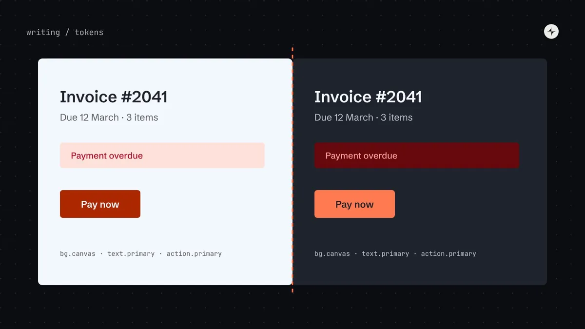
Here's what that does to a real piece of interface. Same component, same code, two sets of answers:
light mode
Invoice #2041
Due 12 March · 3 items
dark mode
Invoice #2041
Due 12 March · 3 items
Step 4: Check every pair for contrast
A dark theme is only finished when every text and background pairing passes, in both modes. WCAG 2.2 asks for 4.5:1 for body text (1.4.3) and 3:1 for meaningful non-text elements like input borders and focus rings (1.4.11). Check pairs, not colours: a token is only "accessible" in relation to what it sits on.
| Use | Pair | Needs | Light | Dark |
|---|---|---|---|---|
| Body text | text.primary on bg.canvas | 4.5:1 | 14.67:1 Pass | 14.67:1 Pass |
| Secondary text | text.secondary on bg.canvas | 4.5:1 | 5.99:1 Pass | 8.89:1 Pass |
| Links | text.link on bg.canvas | 4.5:1 | 6.05:1 Pass | 8.76:1 Pass |
| Primary button label | action.primary.text on action.primary.bg | 4.5:1 | 6.44:1 Pass | 6.09:1 Pass |
| Error message | feedback.danger.text on feedback.danger.bg | 4.5:1 | 5.74:1 Pass | 6.68:1 Pass |
| Success message | feedback.success.text on feedback.success.bg | 4.5:1 | 5.02:1 Pass | 6.81:1 Pass |
| Input border (non-text) | border.strong on bg.canvas | 3:1 | 3.07:1 Pass | 4.77:1 Pass |
| Focus ring (non-text) | focus.ring on bg.canvas | 3:1 | 4.28:1 Pass | 6.51:1 Pass |
| Disabled text (exempt) | text.disabled on bg.canvas | exempt | 2.23:1 | 3.45:1 |
Put the pairs table in your documentation and in an automated test. When someone proposes a new token value, the test tells them which pairs would fail before the change ships. The Lab has a free contrast checker with a pair matrix if you want to try this on your own palette.
Step 5: Ship it as modes
On the web, the cleanest implementation is CSS custom properties with the semantic layer overridden per theme. Let users choose, default to their system setting, and remember the choice:
:root {
  --bg-canvas: var(--neutral-50);
  --text-primary: var(--neutral-950);
  --action-primary-bg: var(--brand-700);
  color-scheme: light;
}
/* Follow the system unless the user picked a theme */
@media (prefers-color-scheme: dark) {
  :root:not([data-theme="light"]) {
    --bg-canvas: var(--neutral-950);
    --text-primary: var(--neutral-50);
    --action-primary-bg: var(--brand-400);
    color-scheme: dark;
  }
}
[data-theme="dark"] { /* the same overrides, for an explicit choice */ }
Setting color-scheme matters more than it looks: it tells the browser to draw scrollbars, form controls and the default page background in the matching theme, so there's no white flash while the page loads.
In Figma, the same structure becomes a semantic variable collection with two modes, light and dark. Designers switch a whole frame between modes to check their work, exactly as the product will.
Things that break in dark mode
One component that used a primitive
Every screen switches except the date picker, whose selected day stays bright orange on white, because it used brand.700 directly. Lint for primitives and raw values in component code.
Images and illustrations
Logos, illustrations with white backgrounds and screenshots need dark variants or a transparent background. Plan them as assets, not afterthoughts.
Charts
Data colours tuned for white often lose contrast on dark. Give charts their own semantic tokens (chart.series.1…) with dark values checked against the dark surface.
Shadows
Dark shadows on dark surfaces vanish. Use lighter surfaces for elevation, and a subtle border where separation matters.
Third-party embeds
Maps, payment forms and chat widgets often ignore your theme. Check whether they support a dark mode parameter, and test them.
Hard-coded colours in content
Rich text from a CMS with inline colours will fight your theme. Strip inline colours or map them to tokens on the way in.
Beyond dark mode: brands, density and white-label
Once your components only use semantic tokens, dark mode is just the first theme. The same structure supports:
- High contrast: stronger borders and text, for users who need them.
- Multiple brands: a different primitive palette behind the same semantic names.
- White-labelled products: a client's palette mapped into your semantic layer, with contrast checks run on their values before release.
- Density: the same trick for spacing and control heights.
At IBM, the Riyadh Air design system drew 71 components in English and Arabic, light and dark: four versions of every component, all from one set of semantic decisions. See the case study.
The short version
- Name colours by job as semantic tokens; components use only those names.
- Give each semantic token a dark value. Don't invert: lighter surfaces for elevation, lighter accents, softer text, no pure black.
- Check every pair for contrast in both modes, and automate the check.
- Ship as CSS custom properties with
prefers-color-scheme, an explicit user choice andcolor-scheme. - The same structure gives you high contrast, brands and white-label for free.
Frequently asked questions
Should dark mode just invert colours?
No. Inverting turns shadows into glows, makes accents too dark to read, and flips the logic of elevation. Dark mode is a separate set of choices for the same jobs.
How many semantic colour tokens do I need?
Fewer than you think. The set in this article has 17 and covers most of a typical product. Large systems often have 40–60, mostly for feedback states, data visualisation and specific surfaces.
How do I handle elevation in dark mode?
Make raised surfaces lighter rather than relying on shadows: canvas, then surface, then subtle, each a step lighter. Add a faint border where two surfaces at similar levels meet.
Do images and charts need dark tokens?
Charts, yes: give each data series a semantic token with a checked dark value. Images need dark-friendly variants or transparent backgrounds, managed as assets.
Should dark mode follow the system setting?
Yes by default, using prefers-color-scheme, with an explicit choice in settings that overrides it and is remembered.
Further reading
- Understanding 1.4.3: Contrast (Minimum)W3C. The 4.5:1 text contrast requirement.
- Understanding 1.4.11: Non-text ContrastW3C. The 3:1 requirement for borders, icons and focus indicators.
- Material 3 colour systemGoogle. Colour roles that map neatly to semantic tokens.
- Carbon themesIBM. Four themes from one set of tokens.
- How to build an accessible colour palette in OKLCHThe palette behind every value in this article.