
The short answer
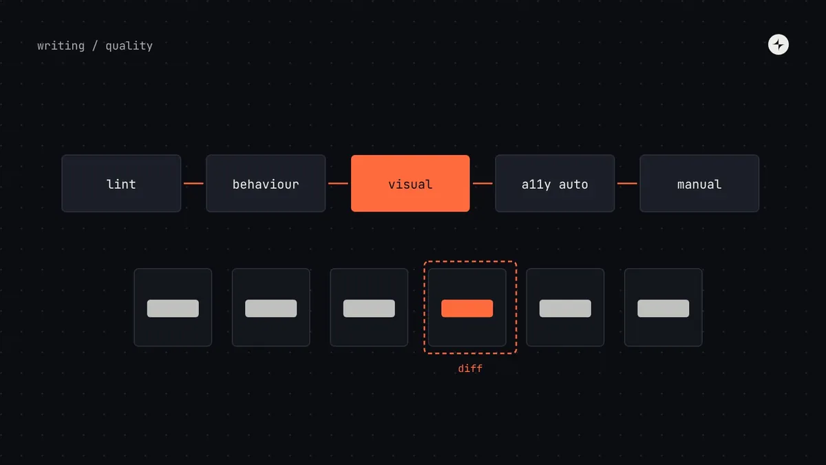
When a component is used in 400 places, one bug is 400 bugs, so design system components are tested more thoroughly than ordinary product code. Combine five layers: lint rules (no raw values, no primitives), behaviour tests (clicks, typing and keys do the right thing), visual regression tests (a picture of every variant and state, compared on every change), automated accessibility checks (labels, roles, contrast) and manual checks with a keyboard and a screen reader for anything interactive. Run the automated layers on every pull request, and make them part of one definition of done for design and code.
- Visual tests catch the "small padding change that broke every layout" before it ships.
- Automated accessibility tools catch a share of issues, not all of them. Always add a person with a keyboard and a screen reader.
- Test with real content and real data volumes for complex components like tables.
Why system components need more testing
A bug in a product screen affects that screen. A bug in a system component affects every screen that uses it, in every product, often silently. The upside is the same: fix and test something once in the system and every product gets the fix. Testing is how a design system earns the trust that makes teams willing to update.
An illustration: the 2-pixel change
An engineer increases the button's vertical padding by 2px to fix a misalignment in one dialog. Code review approves it: it's a tiny change.
Buttons grow everywhere. Table rows with inline actions shift, a toolbar wraps onto two lines, and three teams report layout bugs after the next update.
Visual tests would have shown pictures of every button changing size before merging, and flagged it as the breaking change it was.
Five layers of testing
| Layer | What it catches | How it works, simply | Typical tools |
|---|---|---|---|
| Lint | Hard-coded colours, sizes and spacing; components using primitive tokens | Rules that read the code and flag anything off-system | Stylelint, ESLint |
| Behaviour | A menu that won't open with the keyboard; a field that doesn't clear | Code that pretends to be a user and checks the result | Testing Library, Playwright |
| Visual regression | Unintended changes to how anything looks | A picture of every story, compared pixel by pixel; differences go to a person | Storybook with a visual testing service, Playwright screenshots |
| Automated accessibility | Missing labels, wrong roles, low contrast | A rule engine scans each rendered component | axe-core |
| Manual | Whether a keyboard or screen reader user can actually complete the task | A person tries it with only a keyboard, then with a screen reader | VoiceOver, NVDA, TalkBack |
Visual regression tests
Visual tests deserve special attention because they catch the problem design systems are most often blamed for: an update that quietly changes how products look. The setup is simple in principle:
A story for every variant and state
The component workshop (often Storybook) already shows each one. Those stories become the test cases.
A picture of each, on every change
The test takes a screenshot of every story in a consistent browser and compares it with the last approved one.
A person reviews any difference
Intended changes are approved and become the new baseline. Unintended ones are fixed before merging.
Differences decide the version
If a change moves anything in a product, it's at least a minor release with a note, and often a major one. See versioning.
Visual tests are only as good as their stories. A component tested only in its default state with short text will pass while its error state breaks. Include every state from the state checklist, plus long content and a dark theme.
Accessibility: automated and manual
Automated accessibility checks are excellent at finding certain problems: missing labels, invalid roles, poor contrast, duplicate IDs. They can't tell whether a keyboard user can complete a task, whether focus goes somewhere sensible when a dialog closes, or whether a screen reader announcement makes sense. Those need a person.
Run on every story
Labels and names, roles and ARIA attributes, contrast, heading order inside the component. Fails the build.
A keyboard, then a screen reader
Tab order, focus visible and returned, the expected keys from the ARIA Authoring Practices Guide, and what's announced when state changes.
A short manual script per component keeps checks consistent: "Tab to the combobox. Type 'ban'. Arrow down twice. Press Enter. Expect 'Bangalore, selected' to be announced and the list to close." More in accessibility in a design system.
Match testing to complexity
| Level | Examples | Testing |
|---|---|---|
| 1 · Elements | Badge, avatar, divider | Lint and visual |
| 2 · Controls | Button, text field, checkbox | Plus behaviour and automated accessibility |
| 3 · Composites | Menu, dialog, combobox, date picker | Plus manual keyboard and screen reader testing |
| 4 · Systems | Data table, rich text editor | Plus performance with real data volumes, and testing with assistive technology users |
One definition of done
Testing works best as part of a shared definition of done, so neither design nor engineering can call a component finished alone:
- Figma and code components have the same name, props and values.
- Every variant and state exists in both, and as a story in the workshop.
- Styles use tokens only; lint passes.
- Behaviour, visual and automated accessibility tests pass.
- Keyboard and screen reader behaviour tested by a person.
- Documentation complete; release note written; Figma library and code package released together.
Review questions for system changes
- Does this change any prop, default or visual size? Then which version number changes?
- Which components and products depend on what's changing?
- Do the visual test pictures show only the intended changes?
- Is Figma updated in the same release?
- Has someone from design reviewed the result in the workshop?
At JPMorgan Chase, two tools point out where a design file or a piece of code doesn't match the design system, so problems are fixed before review. See the project.
The short version
- Five layers: lint, behaviour, visual, automated accessibility, manual.
- Run the automated layers on every pull request.
- Visual tests need a story for every state, with real content.
- Automated accessibility is necessary, not sufficient: add a keyboard and a screen reader.
- Match the depth of testing to the component's complexity.
Frequently asked questions
How do you test a design system?
With lint rules for off-system values, behaviour tests, visual regression tests of every variant and state, automated accessibility checks, and manual keyboard and screen reader checks for interactive components.
What is visual regression testing?
Taking a screenshot of every component variant and state on each change and comparing it with the last approved version, so unintended visual changes are caught before they ship.
Are automated accessibility tests enough?
No. They catch many common problems but can't judge whether a task can be completed with a keyboard or whether announcements make sense. Pair them with manual testing.
Who should write the tests?
System engineers, as part of building the component. Designers review visual test differences and the stories that define each state.
Further reading
- Testing in StorybookStorybook documentation.
- axe-coreDeque. An open-source accessibility rule engine.
- ARIA Authoring Practices GuideW3C. The keyboard patterns to test against.