
The short answer
A multi-brand design system shares one core (behaviour, accessibility, component structure and the names of semantic tokens) and lets each brand vary its values: palette hues, fonts, corner radius, imagery and voice. A new brand becomes a new set of token values, not a new system. Platforms work the same way: one token source, translated for web, iOS and Android, with components built natively. At large scale, one system becomes a family: a shared core with specialised systems on top.
- Share what should be the same; make what should differ easy to differ.
- Design the first components against your two most different brands at once.
- Fund the shared core centrally, or it becomes nobody's job.
What changes when you scale
Scaling a design system isn't "the same thing, bigger". New kinds of difference appear: brands that must look different, platforms that must feel native, and business units with their own priorities and budgets. Each one tempts teams to start their own system.
An illustration: one group, three brands, three systems
A financial group runs a bank, an insurer and a lending app. Each brand has its own design team, and each built its own design system.
Three date pickers, three accessibility fixes, three token pipelines. When a regulation changes how fees must be shown, it's implemented three times, differently.
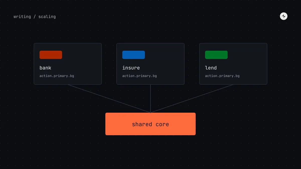
One shared core (behaviour, accessibility, structure, foundations) with a brand layer on top. Each brand still looks like itself; the hard work is done once.
What to share and what to vary
| Layer | Shared across brands | Varies by brand |
|---|---|---|
| Behaviour | Keyboard use, focus, announcements, validation logic | Nothing |
| Structure | Component anatomy, props, patterns | Rarely; only through agreed extensions |
| Semantic tokens | The names of the jobs | Which values the names point to |
| Colour | The lightness curve and contrast rules | Brand hues, sometimes neutral tints |
| Typography | The roles and accessibility rules | Font families, sometimes the scale |
| Shape and motion | The token names | Corner rounding, shadows, animation style |
| Imagery and voice | Accessibility rules | Illustration, photography, tone of voice |
The key move is that brands change values, not names. Every brand has color.action.primary.bg; each points it to its own palette. Because the lightness curve is shared, each brand's colours meet the same contrast rules automatically, even when their hues are completely different.
How brand tokens work
Each brand has its own ramps on the shared lightness curve.
bank.brand.700insure.brand.700Each brand maps the shared job names to its own primitives.
action.primary.bgtext.linkComponents only read semantic (or component) tokens, so they restyle themselves.
Button · Input · DialogComponent tokens (button.primary.container.radius) are where multi-brand systems usually need them: one brand wants pill-shaped buttons and square cards, another the reverse. See token naming for how to keep those names consistent.
Test with the most different brand first. Design the first components against your two most different brands at once, not one brand and then the other. It's much easier to find the right flexibility points while building than to add them afterwards.
Several platforms from one source
Web, iOS and Android each have their own conventions. A good multi-platform system respects them while keeping the brand recognisably the same.
| Decide to… | Usually | Examples |
|---|---|---|
| Share | Brand, foundations, content, component names and purposes | Colours, voice, "primary button", error message formulas |
| Adapt | Things with strong platform conventions | Navigation, date pickers, switches, text sizes, haptics |
| Keep separate | Things that exist on one platform only | Widgets, watch faces, desktop keyboard shortcuts |
A useful test: would a regular user of this platform be surprised by how this behaves? If yes, adapt to the platform. If no, share it.
At IBM, the Riyadh Air design system drew 71 components in 13 families, each in English and Arabic, light and dark, for eight or more web and mobile apps built at the same time. See how.
Families of systems
At a certain size, one system can't sensibly hold everything. A bank's customer app, its internal tools and its marketing site have such different needs that forcing them into one library makes it worse for all three. Many large companies arrive at a family of systems:
Nathan Curtis describes this as tiers below a high-quality core, and Spotify's Encore is a well-known example of bringing many separate systems under one shared structure. At CARS24, a separate system for 30+ internal tools runs alongside the consumer system, sharing the brand's foundations. Read the case study.
Governance and funding across units
- Fund the core centrally. If every business unit pays only for its own needs, the shared core becomes nobody's job.
- Let units own their extensions, built on the core and reviewed against its standards.
- Have a path for absorption: when an extension component proves useful to two or more units, it moves into the core.
- Set cross-unit decisions in one place: a small forum for changes that affect every brand, and the decision-rights matrix for the rest. See governance.
- Measure per brand and per unit: adoption, version spread and the cost of a cross-brand change.
The short version
- Share behaviour, structure and semantic names; vary token values per brand.
- A shared lightness curve keeps every brand's colours accessible.
- One token source, many platform outputs; adapt only where platform users would be surprised.
- At large scale, use a family: a shared core with specialised systems on top.
- Fund the core centrally and give extensions a path back into it.
Frequently asked questions
Do I need component tokens for multi-brand?
Usually yes, for a handful of properties that brands want to differ on, such as radius and button styles. Keep them to what brands genuinely need.
Can brands have different fonts?
Yes. Share the text roles (heading, body, label) and accessibility rules; let each brand map them to its own font families and, if needed, slightly different sizes.
What about white-label products?
Treat each client as a brand: map their palette into your semantic layer, then run your contrast tests on their values before release.
When does one system become a family?
When product types are so different (customer apps, internal tools, marketing) that one library serves all of them badly. Keep a shared core either way.
Further reading
- Design System TiersNathan Curtis, EightShapes.
- Reimagining Design Systems at SpotifySpotify Design, on Encore.
- Carbon themesIBM. Four themes from one token structure.
- Style DictionaryOne token source, many platform outputs.