
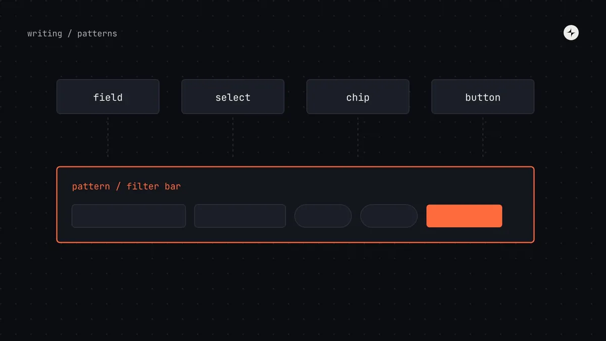
The short answer
A design system pattern is a documented way of combining components to solve a recurring user problem, such as "how we show that there are no results" or "how we confirm a destructive action". Components are the words; patterns are the sentences. A system with good components and no patterns still produces inconsistent products, because every team combines the same parts differently. Start with the four pattern families that cause most inconsistency: forms, lists and tables, navigation and feedback (loading, empty, error and success).
- A pattern isn't a new component. It's guidance, with the reasoning and evidence behind it.
- Document a pattern when two or more teams have solved the same problem differently.
- Patterns need documentation even more than components, because there's no code to copy: the guidance is the pattern.
Components are words, patterns are sentences
You can have a perfect dictionary and still write confusing sentences. Design systems have the same problem. Every team uses the system's button, text field and table, so the components are consistent. But each team combines them differently: one form shows errors at the top, another under each field, a third in a pop-up. One list paginates, another scrolls forever. The parts match and the product still feels like five products.
An illustration: four ways to say "nothing here"
A customer searches invoices, filters payments, opens an empty report and views a new project. Every component on those screens comes from the design system.
"No data", a blank white area, a sad-face illustration with "Oops!", and "0 results found" in small grey text. Four teams, four answers to the same question.
One documented empty-state pattern with three versions (first use, no results, all done), each with a clear message and a next step. Same components, now saying the same thing.
A pattern is a proven, documented way of combining components to solve a recurring user problem. The UK government's GOV.UK Design System is the best-known public example: alongside its components it publishes patterns for asking for dates, addresses and names, each based on research with real users.
Pattern or component?
Teams often ask for a new component when what they need is a pattern, and the other way round. A quick test helps:
| If the request is… | It's probably a… | Example |
|---|---|---|
| A new visual element with its own states and behaviour | Component | A stepper, a file uploader, a segmented control |
| A way of arranging existing components for a task | Pattern | A filter bar built from fields, selects and chips |
| A rule about when to use one component over another | Pattern | "Toast for confirmations, banner for account-wide warnings" |
| A flow across several screens | Pattern | Sign-up, checkout, onboarding a new team member |
| The same arrangement copied into many products, with code | Pattern first, then maybe a component | An empty state used everywhere may earn its own component later |
The four pattern families to start with
You don't need a hundred patterns. Most of the inconsistency in business software comes from four families, and writing down one answer for each removes most of the re-debating between teams.
Where products make money
Layout, required fields, when to check for errors, where to show them, what they say, long forms and buttons. Usually the first pattern worth writing down. See form design patterns.
Where people find things
Table, list or cards; pagination or "load more"; how filters, search, sorting and bulk actions work across the product.
Noticed only when it fails
The app frame, side menu or top navigation, tabs, breadcrumbs and back links, and the rules for when each is right.
Where products feel inconsistent
Loading, empty, error and success states. Each team handles them as an afterthought, so they drift the most.
Lists and tables: three choices to make once
Most business software is a collection of lists: invoices, customers, orders, users. How people find, sort and act on items decides how fast they work.
When people compare
Many items with the same attributes, where people scan columns, sort and compare: invoices, transactions.
When people pick
Items with one or two key details, where people mostly find one and open it: messages, notifications.
When items are visual
Where an image or preview matters more than comparison: templates, projects, products.
| Approach | Best for | Downsides |
|---|---|---|
| Pages | Work tools where people need to find their place again or reach the end | Extra clicks; page size choice matters |
| "Load more" button | Feeds and search results where people mostly look at the first few | Long pages; footer hard to reach after loading lots |
| Endless scrolling | Browsing with no particular goal | Hard to return to a spot; footer unreachable; heavy for keyboard and screen reader users |
For filters, decide where they sit (above the list or in a side panel), whether results update instantly or after "Apply", how active filters are shown and cleared, and what the empty result says. For bulk actions, decide how people select many items and where the actions appear. Written once, these decisions stop every list in the product from working slightly differently.
Navigation: one job per component
| Component | Use it for | Don't use it for |
|---|---|---|
| Side menu | The main sections of an app with many areas (five or more) | Actions; settings for the current page |
| Top navigation | A few main sections, often on websites | Deep hierarchies |
| Tabs | Switching between views of the same thing (an invoice's details, payments, history) | Moving between different areas of the app |
| Breadcrumbs | Showing where you are in a deep hierarchy and stepping back up | Flat products with one or two levels |
| Back link | Returning from a detail page or a step in a flow | Replacing the browser's own back button |
If people need to go more than three levels deep (section, page, tab) to reach something they use often, the problem is usually the structure of the product, not the navigation component. That's a conversation for product leadership, and the design system team is often the first to notice it.
Feedback: four moments, four components
Every screen has moments when things aren't normal: data is loading, there's nothing to show, something went wrong, or something just succeeded. Decide once which component carries each kind of message.
Nothing yet
Explain what will appear and offer the first step: "No invoices yet. Create your first invoice to get paid faster."
Search found nothing
Say what was searched, and suggest changing or clearing the filters.
Everything is cleared
A small, positive confirmation: "All invoices are paid." No action needed.
For loading, show a skeleton for short waits so the page doesn't jump, show progress on the button that was pressed for actions like saving, and always handle the case where loading fails, with a clear way to try again.
How to document a pattern
A component page can lean on live code examples. A pattern page can't: the words are the pattern. A consistent template makes patterns quick to write and easy to trust.
The evidence section matters more than it looks. Without it, a pattern is one team's preference, and the next team with a different preference will argue. With it ("we tested inline errors against a top summary with eight users; both were needed"), the conversation moves on.
When to write a pattern down
Notice the second solution
When a second team solves a problem the first team already solved, differently, that's the signal. The same "rule of two" that decides when something joins the core library applies to patterns.
Collect every existing version
Screenshot each team's solution side by side. Seeing four empty states on one board usually ends the debate about whether a pattern is needed.
Agree one answer, with evidence
Pick or design the best version with the teams involved, and test it if the stakes are high. A short working group of three to six people works well.
Document it with the template
Problem, solution, examples, variations, when not to use it, evidence, accessibility and writing.
Migrate the most visible versions
Update the screens people see most first. The rest follow as teams touch them.
At JPMorgan Chase, shared design patterns are used by product teams across the company, with a workflow where an AI agent does the early research and drafts each pattern for designers to review. See the project.
The short version
- Components are words; patterns are sentences. Consistent parts still need agreed combinations.
- Start with forms, lists and tables, navigation, and feedback states.
- Write a pattern down when a second team solves the same problem differently.
- Use one template: problem, solution, examples, variations, when not to use it, evidence, accessibility and writing.
- Evidence is what stops a pattern being re-debated.
Frequently asked questions
What is the difference between a pattern and a component in a design system?
A component is a reusable part with its own code, design, props and states, like a button or a dialog. A pattern is guidance on how to combine components to solve a recurring problem, like validating a form or showing that there are no results.
Do patterns need code?
Not necessarily. Many patterns are guidance plus examples. When a pattern is copied into many products with the same code, it can be worth turning into a component or a copyable recipe later.
Who should own patterns?
The system team owns the library of patterns, but individual patterns are often written by the product team closest to the problem, through the normal contribution process, and reviewed by the system team.
How many patterns does a design system need?
Fewer than you think. Start with the four families (forms, lists, navigation, feedback) and add patterns only when two or more teams need the same answer.
Further reading
- GOV.UK Design System patternsResearch-based patterns for common tasks.
- Form design patternsThe first pattern most systems should write down.
- Content design in a design systemThe words inside every pattern.