
The short answer
Good form design comes down to seven decisions a design system should make once for the whole product: one column with labels above fields; mark optional fields rather than starring required ones (when most are required); check for errors when people leave a field and when they submit, never while they're still typing; show a message next to each problem field plus a summary at the top on submit; write errors that say what's wrong and how to fix it; split long forms into steps or sections; and end with one primary button named for what it does.
- WCAG requires errors to be identified and described in text, not by colour alone.
- The goal isn't that these answers are the only right ones; it's that your product has one answer for each question.
- Forms are usually the first pattern worth writing down: they're where products make money and where people get most frustrated.
Why forms deserve a pattern
Sign-up, checkout, invoice creation, settings: most of the value a business product creates passes through a form. Forms are also where small inconsistencies cost the most. If one form validates as you type, another only on submit and a third in a pop-up, people learn none of them, and every team spends design reviews re-debating the same choices.
A design system can't design every form. It can make the seven decisions every form shares, so product teams only spend time on what's specific to their form.
The seven decisions
| Question | Our default answer | Why |
|---|---|---|
| Layout | One column, labels above fields | Easiest to scan; works on every screen size; labels stay close to their fields |
| Required fields | Mark the optional ones ("optional") when most fields are required | Fewer marks, less noise; clear words beat a symbol |
| When to check | When the person leaves a field (for format problems) and on submit (for everything) | Checking while someone is typing shows errors before they've finished |
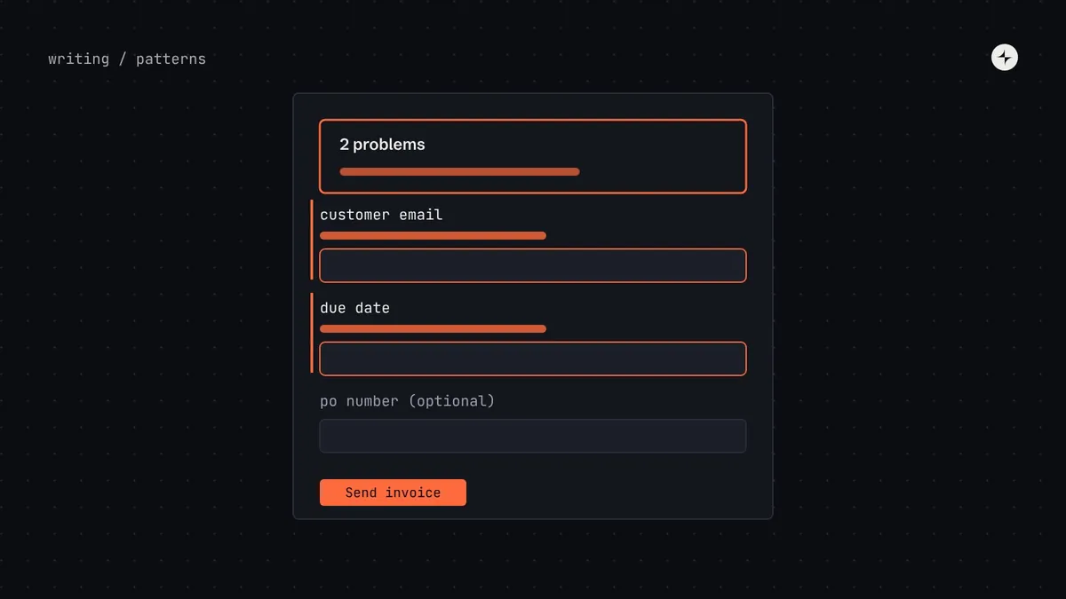
| Where errors appear | Next to each problem field, plus a summary at the top on submit that links to each error | People and screen readers can find every problem |
| What errors say | What's wrong and how to fix it: "Enter a date after 1 January 2026" | Errors must be identified and described in text (WCAG 3.3.1) |
| Long forms | Split into steps with a progress indicator, or sections with headings | Smaller chunks feel achievable and reduce mistakes |
| Buttons | One primary action at the end, named for what it does: "Send invoice" | The main action should be obvious and specific |
What a well-behaved form looks like
When to show errors
Timing is the most argued-about form decision, and the one most worth settling. Showing an error while someone is still typing their email address tells them they're wrong before they've had a chance to be right. Waiting until submit for everything makes people scroll back up through a long form to find what failed.
Disabling the submit button until the form is valid looks tidy but hides the reason. People can't tell what's missing, and screen reader users may not find the button at all. Keep the button enabled and explain the problems on submit.
Writing error messages
Error messages are the most read words in a form, because people only read them when something has gone wrong. A simple formula makes them easy to write well:
What to enter, specifically
"Enter an amount between ₹1 and ₹10,00,000", not "Invalid amount". Use the field's own label in the message, so it makes sense in the summary too.
What happened, why, what to do
"Payment failed. The card has expired. Update the card details." Calm, specific, and never blaming the person.
| Instead of | Write | Why |
|---|---|---|
| "Invalid input" | "Enter a phone number, like 98765 43210" | Says what to do and shows the format |
| "This field is required" | "Enter the customer's email address" | Makes sense out of context, in the summary |
| "Oops! Something went wrong" | "We couldn't save the invoice. Check your connection and try again." | Calm and specific; jokes feel dismissive when something has failed |
| "Date must be valid" | "Due date must be after the invoice date" | Names the actual rule that was broken |
More on message formulas in content design in a design system.
Accessibility, built into the pattern
Most form accessibility can be handled once, in the components and the pattern, so product teams get it for free.
- Every field has a visible label, connected to the input in code. Placeholders aren't labels; they disappear when people type.
- Errors are in text, not only a red border. WCAG 3.3.1 requires errors to be identified and described in text; 3.3.3 asks for suggestions where they're known.
- Each error message is connected to its field so screen readers announce it with the field.
- Focus moves to the summary on a failed submit, and each summary link moves focus to its field.
- Hints sit above the field, so they're read before people start typing.
- Group related fields (a date in three parts, a set of radio buttons) with a legend that names the question.
- Don't ask for information twice in the same process; WCAG 2.2 added this as "redundant entry" (3.3.7).
Long forms
A form with thirty fields on one page feels like a wall. Two approaches help, and the pattern should say when to use each:
One thing per page
For flows people do rarely, or on phones: applications, onboarding, checkout. Show progress ("Step 2 of 4") and a summary page to check answers before submitting.
One page, headed sections
For forms people return to and edit: settings, profiles, records. Headings let people jump to the part they need; saving can be per section.
Making it part of the system
Collect the forms you have
Screenshot five or six real forms, including their error states. Note every difference in layout, timing and wording.
Agree the seven answers
With a small working group from the teams that build the most forms. Use the table above as a starting point, and write down the reasons.
Build the behaviour into components
Field components that show hints and errors in the right place, connected for screen readers; an error summary component that manages focus.
Document the pattern
Problem, solution, examples, variations (short form, long form, steps), when not to use it, evidence, accessibility and writing. See design system patterns.
Migrate the busiest forms first
Sign-up and checkout before an admin settings page. Measure completion and error rates before and after if you can.
The short version
- Make seven decisions once: layout, required fields, timing, error placement, error wording, long forms and buttons.
- Check on leaving a field and on submit, never while typing.
- Show each error next to its field and in a linked summary at the top.
- Errors say what's wrong and how to fix it, in text.
- Build the behaviour into components so every form gets it for free.
Frequently asked questions
Should form labels go above or beside fields?
Above, by default. Labels above fields are easiest to scan, keep labels close to their fields and work on every screen size. Side-by-side labels can suit dense desktop admin forms, but they break on phones.
Should I mark required or optional fields?
When most fields are required, mark the optional ones with the word "optional". When most are optional, mark the required ones. Use words rather than a symbol alone.
Is inline validation good or bad?
Checking a field when someone leaves it is helpful for format problems. Checking while they're still typing usually isn't, because it shows errors before they've finished.
Should the submit button be disabled until the form is valid?
Usually not. A disabled button doesn't explain what's missing. Keep it enabled and show clear errors on submit.
Further reading
- Error summaryGOV.UK Design System.
- Understanding Error Identification (3.3.1)W3C, WCAG 2.2.
- Design system patternsHow forms fit into the wider pattern library.