
The short answer
Build contrast into a design system once, at the token level, and every product inherits it. Use the WCAG 2.2 minimums: 4.5:1 for body text, 3:1 for large text and for meaningful non-text elements like input borders, icons and focus rings. Check pairs, not colours (a colour is only accessible against what it sits on), in every theme. With a palette built on a shared lightness curve, simple rules emerge: in ours, any two steps six apart pass for body text, with one exception at the very light end.
- Low-contrast text is the most common accessibility failure on the web.
- Publish the approved pairs and test them automatically on every token change.
- Give the accessibility owner a real veto over token value changes.
Why contrast belongs in the design system
WebAIM's 2025 scan of the world's top million home pages found low-contrast text on 79.1% of them. Measured It's the most common accessibility failure on the web, and almost always the result of colours chosen one screen at a time.
A design system changes the economics. Decide the text and background pairs once, as tokens, check them once, and every component and product built on them inherits the result. Fix a failing pair in the system and the fix reaches every screen in a release. That's why contrast is the cheapest place in the whole product to get accessibility right.
The WCAG ratios that matter
| What | Minimum (AA) | WCAG 2.2 | Examples |
|---|---|---|---|
| Body text | 4.5:1 | 1.4.3 | Paragraphs, labels, table cells, helper text, button labels |
| Large text | 3:1 | 1.4.3 | 24px and above, or about 18.66px and above in bold |
| Non-text elements | 3:1 | 1.4.11 | Input borders, checkbox outlines, icons that carry meaning, focus indicators, chart lines |
| Enhanced (AAA) | 7:1 | 1.4.6 | Optional; worth it for long-form reading and data-dense views |
| Disabled controls, decoration | none | exempt | Disabled buttons, purely decorative dividers and illustrations |
"Exempt" isn't the same as "fine". Disabled text that nobody can read still confuses people. Keep disabled states legible, and explain nearby why an action isn't available.
Check pairs, not colours
A colour has no contrast on its own. neutral.600 is 4.57:1 on white but only 4.25:1 on neutral.50, our light canvas: it passes on one background and fails on the other. So the unit you check, document and test is the pair: a foreground token on a background token, in a specific theme.
That's another reason for semantic tokens. When colours are named by job (text.secondary on bg.canvas), the pairs that matter are finite and nameable, and you can check every one in every theme:
| Use | Pair | Needs | Light | Dark |
|---|---|---|---|---|
| Body text | text.primary on bg.canvas | 4.5:1 | 14.67:1 Pass | 14.67:1 Pass |
| Secondary text | text.secondary on bg.canvas | 4.5:1 | 5.99:1 Pass | 8.89:1 Pass |
| Links | text.link on bg.canvas | 4.5:1 | 6.05:1 Pass | 8.76:1 Pass |
| Primary button label | action.primary.text on action.primary.bg | 4.5:1 | 6.44:1 Pass | 6.09:1 Pass |
| Error message | feedback.danger.text on feedback.danger.bg | 4.5:1 | 5.74:1 Pass | 6.68:1 Pass |
| Success message | feedback.success.text on feedback.success.bg | 4.5:1 | 5.02:1 Pass | 6.81:1 Pass |
| Input border (non-text) | border.strong on bg.canvas | 3:1 | 3.07:1 Pass | 4.77:1 Pass |
| Focus ring (non-text) | focus.ring on bg.canvas | 3:1 | 4.28:1 Pass | 6.51:1 Pass |
| Disabled text (exempt) | text.disabled on bg.canvas | exempt | 2.23:1 | 3.45:1 |
A contrast matrix for your palette
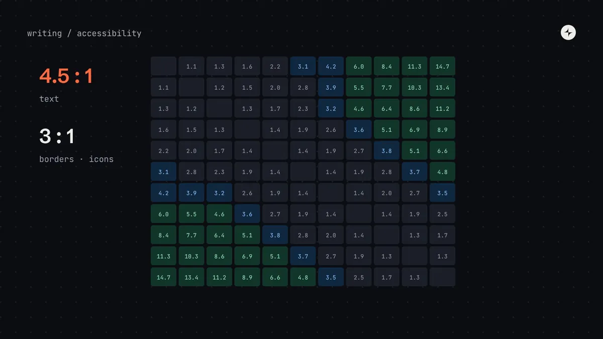
If your palette is built on one shared lightness curve, as an OKLCH palette can be, contrast becomes predictable. Here's every pairing of the eleven neutral steps:
| Text ↓ · Bg → | 50 | 100 | 200 | 300 | 400 | 500 | 600 | 700 | 800 | 900 | 950 |
|---|---|---|---|---|---|---|---|---|---|---|---|
| 50 | – | 1.1 | 1.3 | 1.6 | 2.2 | 3.1 | 4.2 | 6.0 | 8.4 | 11.3 | 14.7 |
| 100 | 1.1 | – | 1.2 | 1.5 | 2.0 | 2.8 | 3.9 | 5.5 | 7.7 | 10.3 | 13.4 |
| 200 | 1.3 | 1.2 | – | 1.3 | 1.7 | 2.3 | 3.2 | 4.6 | 6.4 | 8.6 | 11.2 |
| 300 | 1.6 | 1.5 | 1.3 | – | 1.4 | 1.9 | 2.6 | 3.6 | 5.1 | 6.9 | 8.9 |
| 400 | 2.2 | 2.0 | 1.7 | 1.4 | – | 1.4 | 1.9 | 2.7 | 3.8 | 5.1 | 6.6 |
| 500 | 3.1 | 2.8 | 2.3 | 1.9 | 1.4 | – | 1.4 | 1.9 | 2.8 | 3.7 | 4.8 |
| 600 | 4.2 | 3.9 | 3.2 | 2.6 | 1.9 | 1.4 | – | 1.4 | 2.0 | 2.7 | 3.5 |
| 700 | 6.0 | 5.5 | 4.6 | 3.6 | 2.7 | 1.9 | 1.4 | – | 1.4 | 1.9 | 2.5 |
| 800 | 8.4 | 7.7 | 6.4 | 5.1 | 3.8 | 2.8 | 2.0 | 1.4 | – | 1.3 | 1.7 |
| 900 | 11.3 | 10.3 | 8.6 | 6.9 | 5.1 | 3.7 | 2.7 | 1.9 | 1.3 | – | 1.3 |
| 950 | 14.7 | 13.4 | 11.2 | 8.9 | 6.6 | 4.8 | 3.5 | 2.5 | 1.7 | 1.3 | – |
4.5:1 or more · any text3:1 to 4.5:1 · large text, borders, iconsbelow 3:1 · decoration only
From a matrix like this you can write pairing rules anyone can apply without a checker:
Body text: six steps apart
Steps six or more apart pass 4.5:1, except next to the lightest step: on
50, text needs700or darker.Large text and borders: five steps apart
Steps five or more apart always pass 3:1, which covers large headings, input borders, icons and focus rings.
Same rule, every hue
Because every ramp shares the lightness curve, step 700 is between 5.8:1 and 7.1:1 on white in every colour family we built. Brand, blue, red and green follow the same rule.
How to build contrast into the system
- Pick text tokens that pass on every background they're allowed on, in every theme.
- Publish the approved pairs on the token documentation page, with their ratios.
- Test automatically: a script that computes every documented pair and fails the build if one drops below its minimum.
- Check states: hover, pressed, focus and selected colours are pairs too.
- Lint for raw colours in product code, so nobody bypasses the checked tokens.
- Give accessibility a veto over token value changes in your decision-rights matrix.
An illustration: fixing secondary text everywhere at once
An audit finds secondary text (captions, helper text, timestamps) at 4.25:1 on the default background: just below 4.5:1, in every product.
Hundreds of hard-coded greys across several codebases, fixed screen by screen over months.
color.text.secondary moves from neutral.600 to neutral.700, raising it to 5.99:1. One token change, announced in the release notes, reaches every screen.
Beyond the ratio: colour and meaning
Contrast is necessary but not sufficient. WCAG also asks that colour isn't the only way information is shown (1.4.1). An error field needs an icon or message as well as a red border; a chart needs labels or patterns as well as colours. Build those patterns into components, so teams get them by default.
WCAG 2 vs APCA
APCA, the Accessible Perceptual Contrast Algorithm, is a newer method that accounts for font size, weight and whether text is light-on-dark or dark-on-light. It often gives better answers in dark mode and for thin fonts. It's a useful second opinion, but WCAG 2.2's ratios are what laws and audits measure today, so use WCAG as the gate.
The short version
- 4.5:1 for body text; 3:1 for large text, borders, icons and focus rings.
- Check pairs, not colours, in every theme and every state.
- A shared lightness curve turns contrast into simple step rules.
- Publish approved pairs, test them automatically, and lint for raw colours.
- Don't rely on colour alone to carry meaning.
Frequently asked questions
What contrast ratio does WCAG require?
At level AA: 4.5:1 for normal text, 3:1 for large text, and 3:1 for meaningful non-text elements such as borders, icons and focus indicators.
Does the primary brand colour have to pass contrast?
Only where it's used for text or meaningful UI. Many brands use a lighter brand colour for decoration and a darker step of the same hue for text and buttons.
Should we use APCA instead of WCAG 2?
Use WCAG 2.2 as the requirement, and APCA as a second opinion, especially for dark mode and thin type.
How do we test contrast automatically?
List every allowed foreground–background pair in your token docs, compute their ratios in a script during the token build, and fail the build if any drop below their minimum.
Further reading
- Understanding 1.4.3 Contrast (Minimum)W3C.
- Understanding 1.4.11 Non-text ContrastW3C.
- The WebAIM Million, 2025The most common accessibility failures.
- APCA in a nutshellMyndex Research.