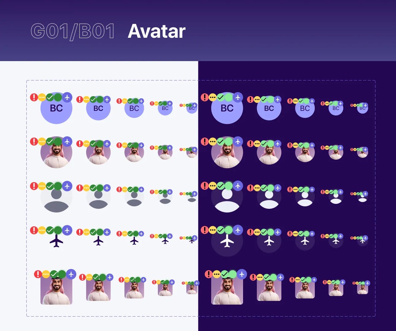
- Avatar
- Main badge
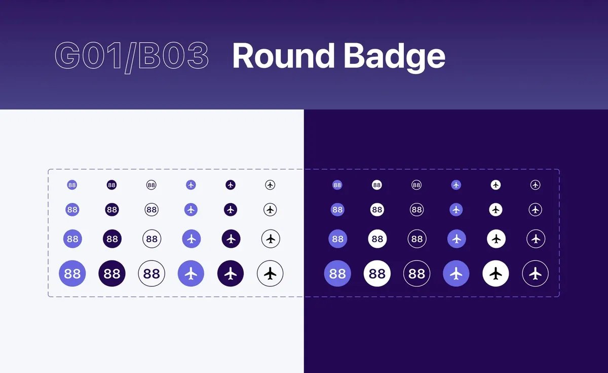
- Round badge
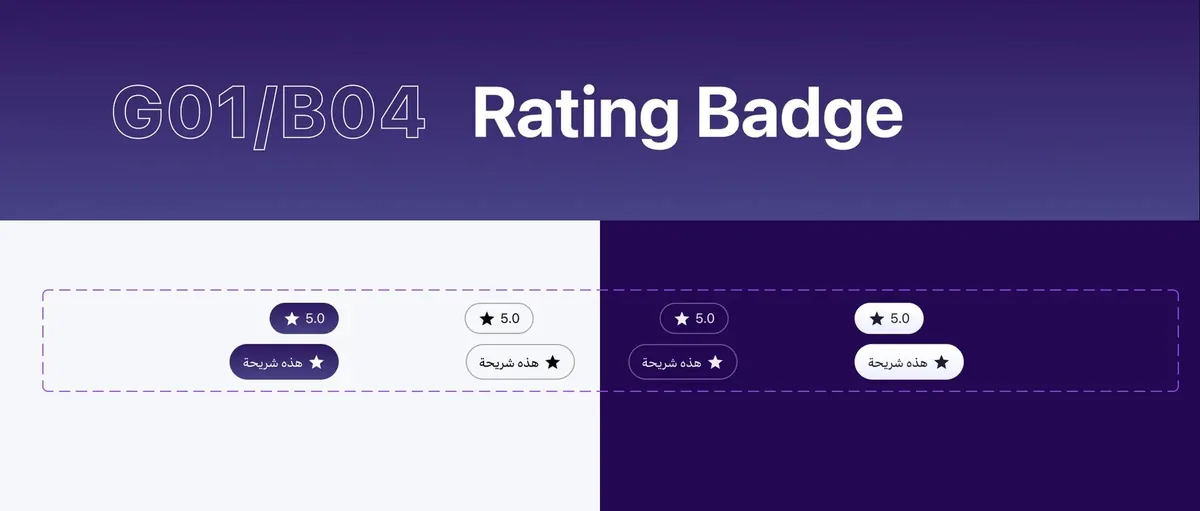
- Rating badge
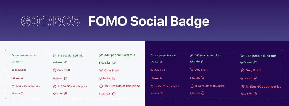
- FOMO social badge
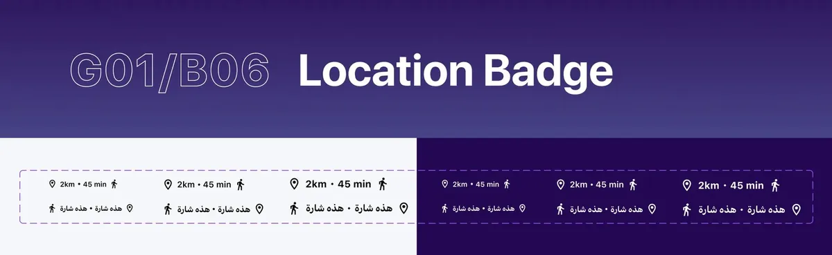
- Location badge
Work / IBM × Riyadh Air
 ×

A design system for an airline that started from zero
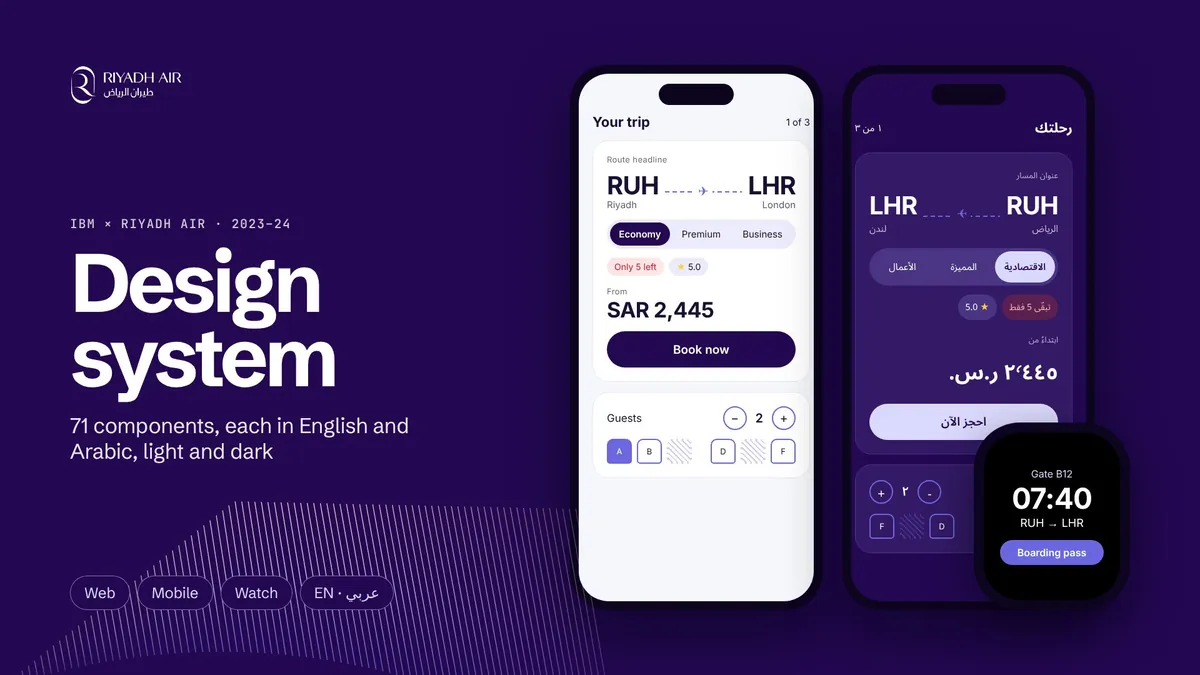
A pilot first, then 71 components that every Riyadh Air team built from, in English and Arabic, light and dark.
- 71
- components in 13 families
- 2 × 2
- EN and AR, light and dark
- 6
- breakpoints, watch to desktop
- 8+
- apps from one library
01 the client:
An airline with no past to inherit
Riyadh Air is Saudi Arabia's new national carrier, founded by the Public Investment Fund and built digital-first.
- 2023
- founded, with IBM named lead digital partner
- 100+
- destinations planned by 2030
- 787-9
- a new Boeing Dreamliner fleet
- Oct 2025
- first flight, Riyadh to London Heathrow
Most airlines carry decades of booking engines, loyalty platforms and check-in kiosks. Riyadh Air started with none of it. Every screen a guest would touch, from booking to boarding, had to be designed and built for the first time, while the airline itself was being stood up.
IBM was the lead digital partner. Its design team proposed the design system and built it with Publicis Sapient, and IBM engineers turned it into code. Riyadh Air's product owners, brand and engineering teams reviewed and signed off. Aniket worked on the system as a design system designer at IBM.
Client
Riyadh Air
Product owners, brand and engineering, standing up an airline and its digital estate together.
Lead digital partner
IBM
The design team proposed the system and built it. IBM engineers built the components in code.
Agency
Publicis Sapient
Our partner on the design system, shaping and reviewing the library with us.
02 the problem:
Many apps, many teams, one launch date
Booking, check-in, loyalty and the trip itself, across web, phone and watch, all designed at once.
Scale8+
web and mobile apps, designed at once
Language2
scripts, reading in opposite directions
Devices6
breakpoints, from a watch to a wide desktop
Deadline1
launch date that couldn't move
Five to six web apps and two to three mobile apps were being designed in parallel, each with its own team. Left alone, every app would drift into its own version of the brand, and every team would rebuild the same button under a deadline set by the first flights.
Two things made it harder. Every screen had to work in English and Arabic, which read in opposite directions and need different line heights. And the brand was brand new: a lavender identity made for liveries and billboards, with nothing yet that could carry a seat map, a price or an error message.
How might we give every team, on every device and in both languages, one way to build Riyadh Air, before there was a Riyadh Air to copy?
Every app team designing its own interface
One library every team builds from
Arabic as a translation pass at the end
Every component drawn in English and Arabic
A lavender brand made for liveries and billboards
A brand that can carry a seat map and an error
03 the work, in twelve frames:
Swipe through it
Foundations, components and brand, as the library shows them. Select any frame to see it full size.
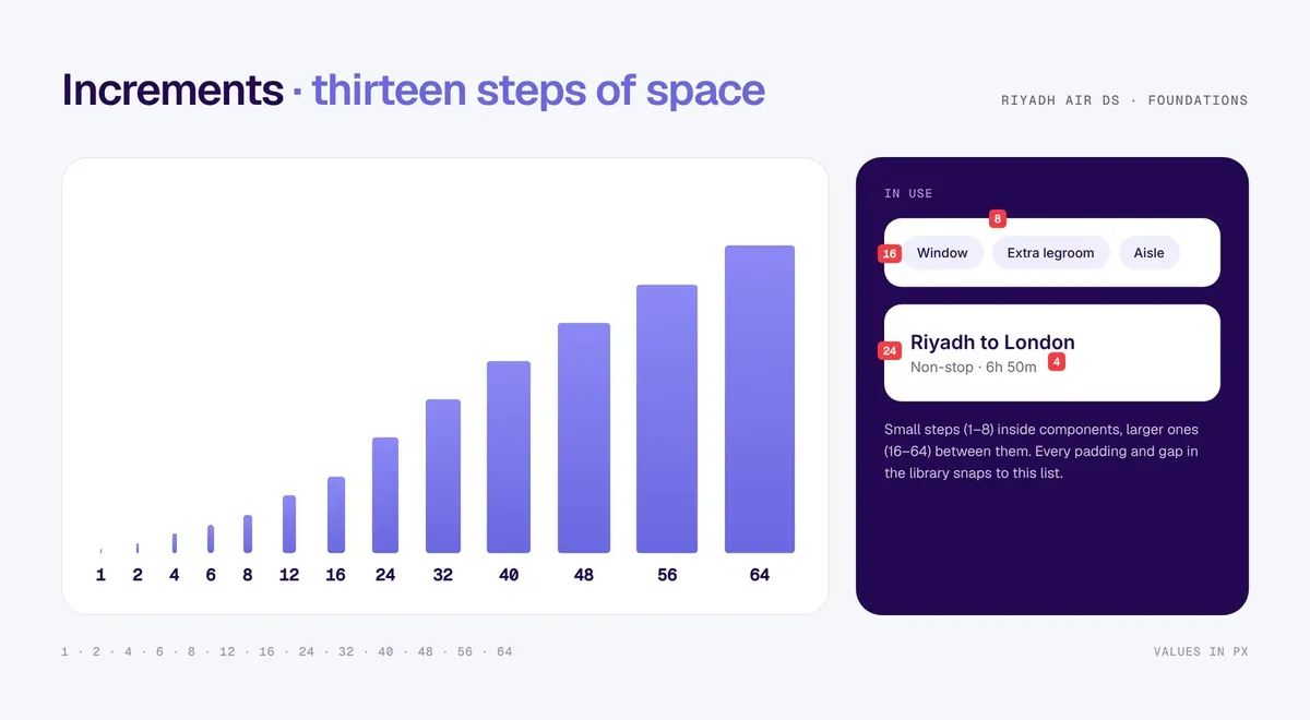
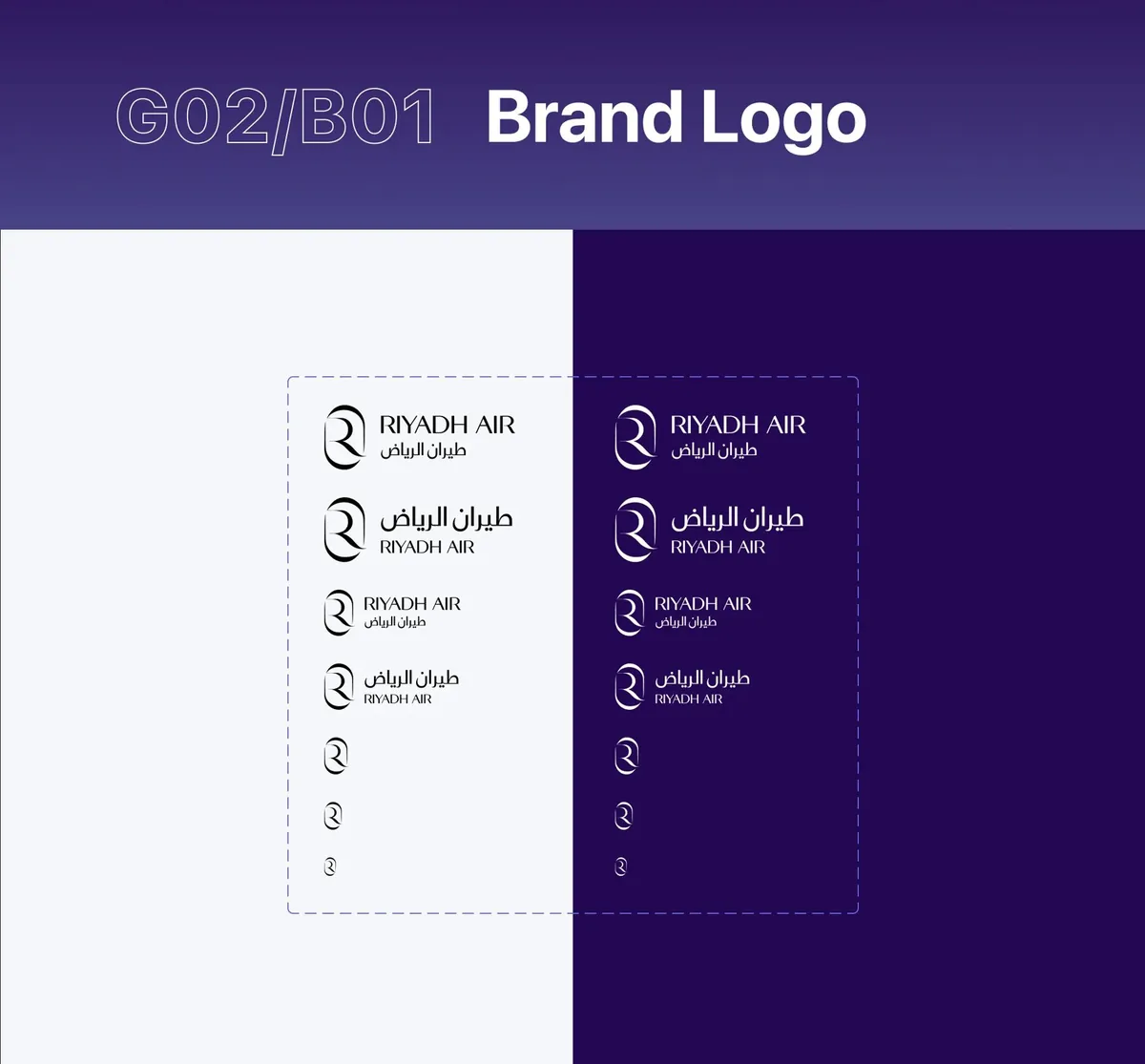
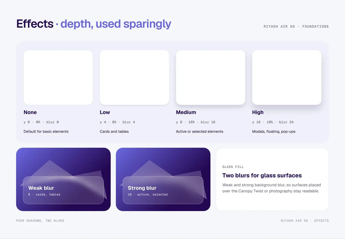
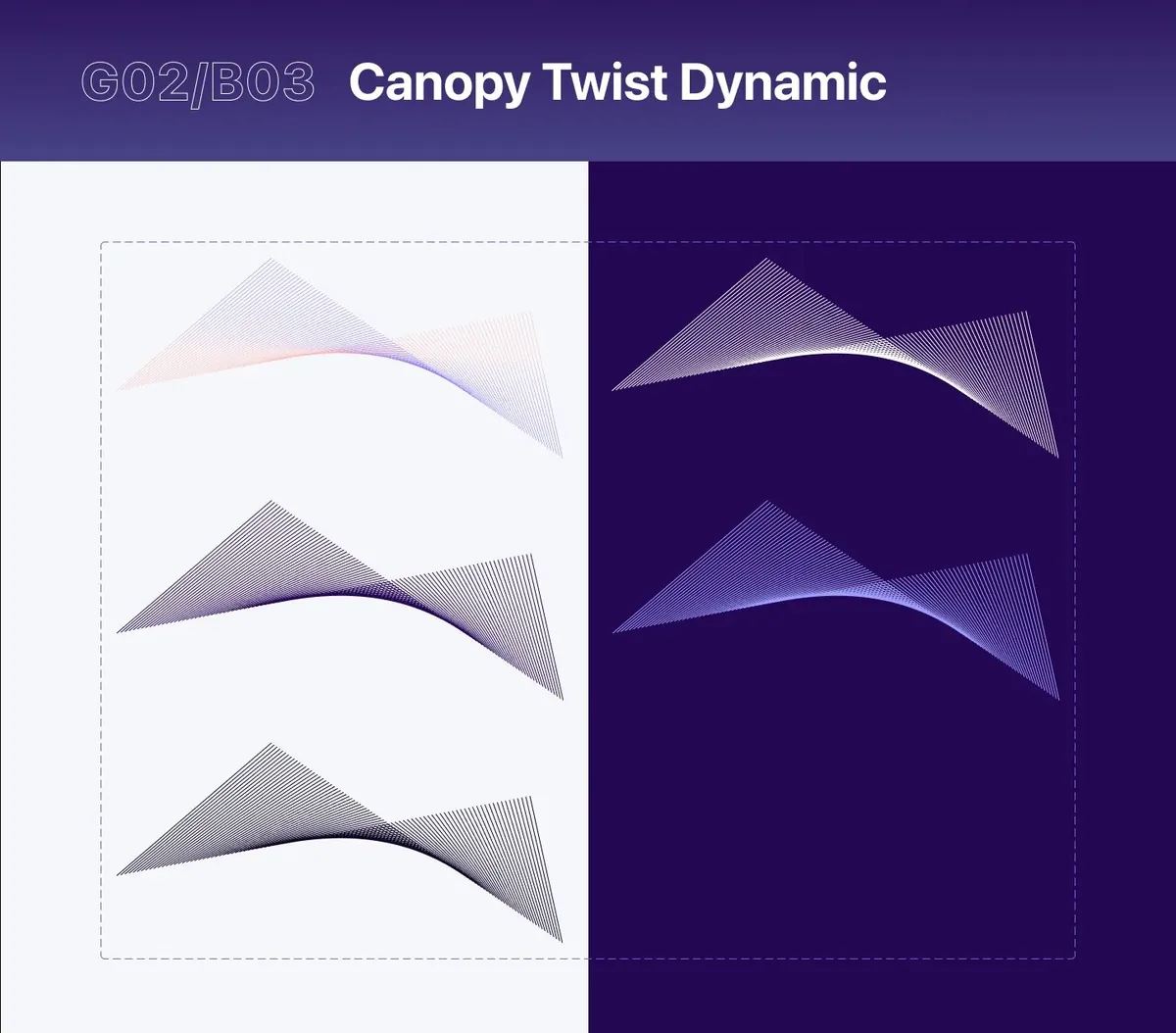
01 / 12
04 the pilot:
Prove it on one project, then scale
Rather than pitch a system on a slide, the team ran a small one on real work and let the results make the case.
A design system is a big ask of a client building everything else at the same time. So the team didn't pitch it on a slide. It ran a small system on one IBM project, watched whether it helped, and let the results make the case. The teams outside the pilot asked for it, and it delivered a clear efficiency gain on real work. That was enough to build the full system.
- 01
Propose
A shared system to speed up delivery
- 02
Pilot
One IBM team builds with an early library
- 03
Measure
Faster? Consistent? Do teams want it?
- 04
Scale
The full system, with Publicis Sapient
Result
Faster
A clear efficiency gain on real work.
Result
Wanted
Teams outside the pilot asked for it.
Result
Approved
The go-ahead to build the full system.
Partner
Publicis Sapient
Shaped and reviewed the library with IBM.
05 brand to UI:
A lavender brand, made usable
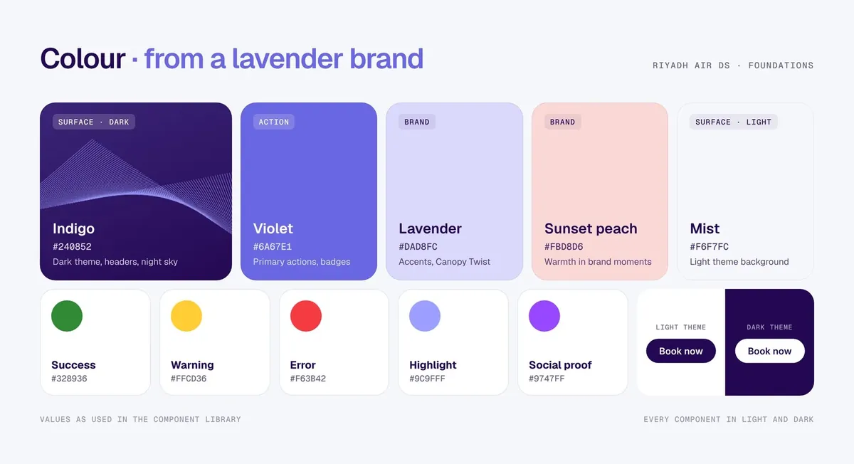
Indigo and mist carry every screen. Violet does the work. Lavender and peach stay for brand moments.
Dark theme surface
Indigo
#240852Actions, badges
Violet
#6A67E1Brand moments
Lavender
#DAD8FCBrand moments
Sunset peach
#FBD8D6Light theme surface
Mist
#F6F7FCSuccess
Warning
Error
Highlight
Social proof
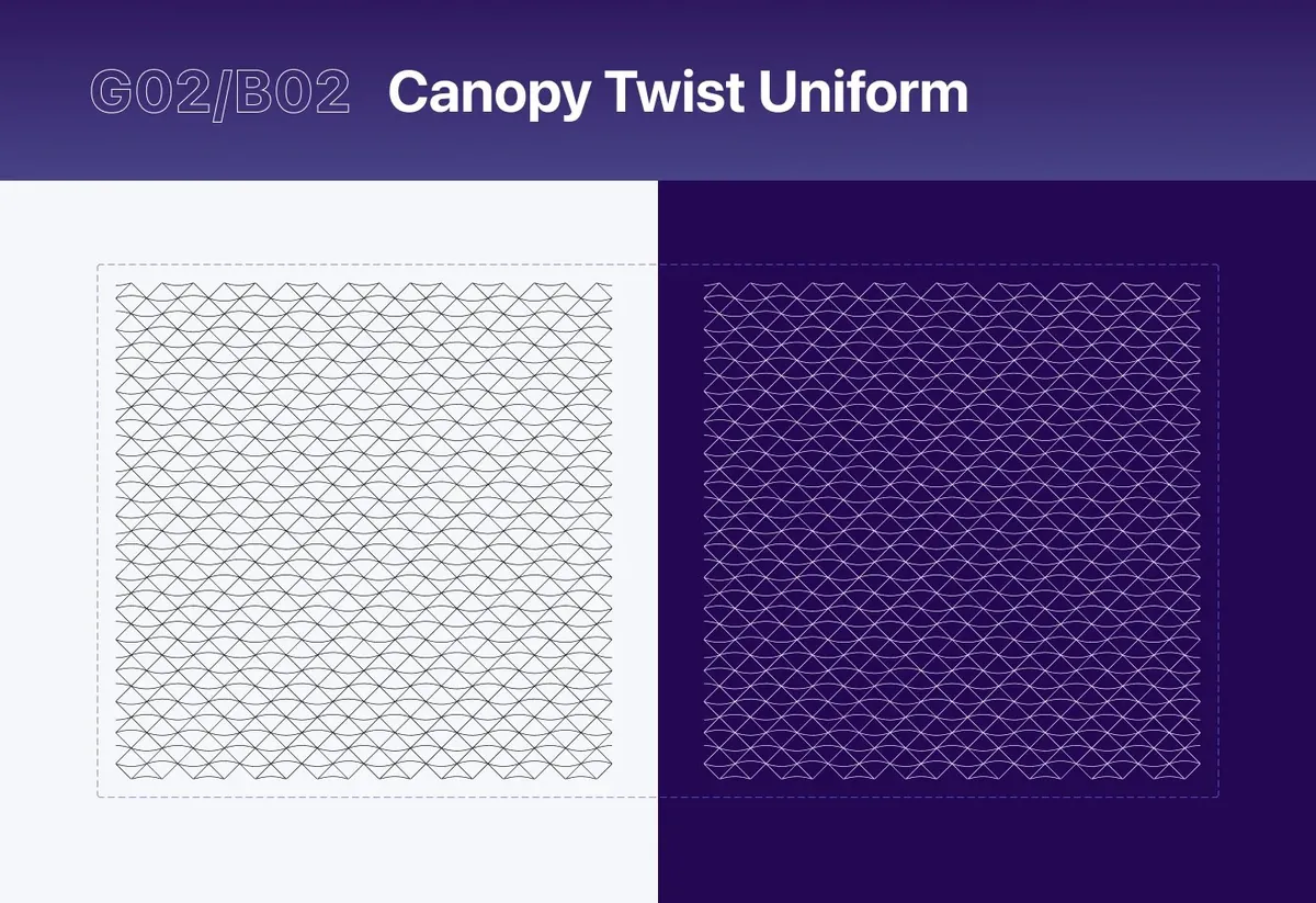
Canopy Twist · G02/B03 · move across it to twist
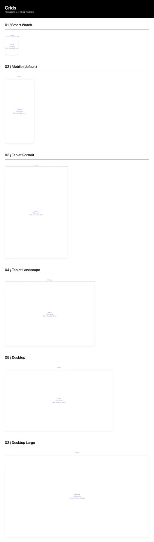
06 foundations:
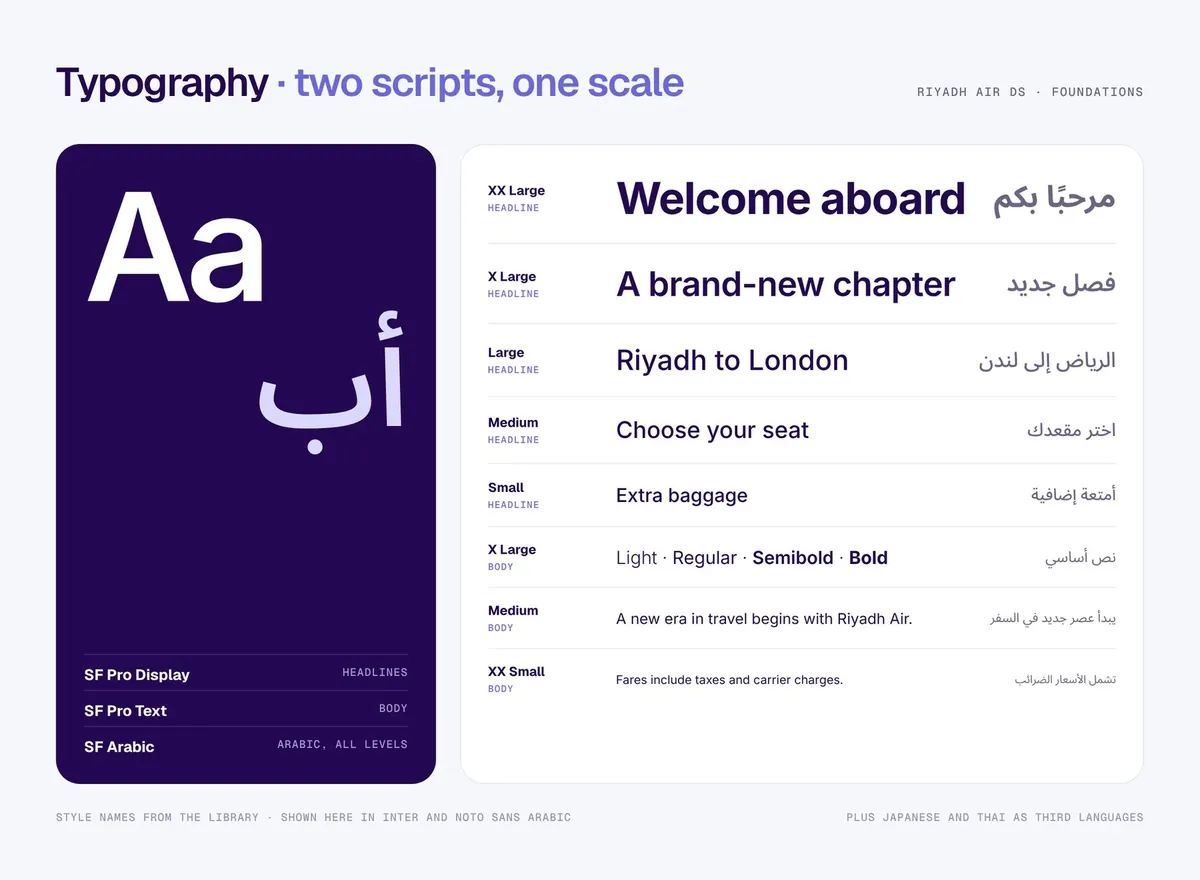
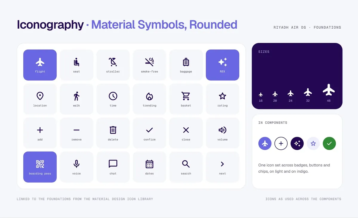
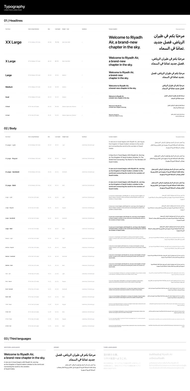
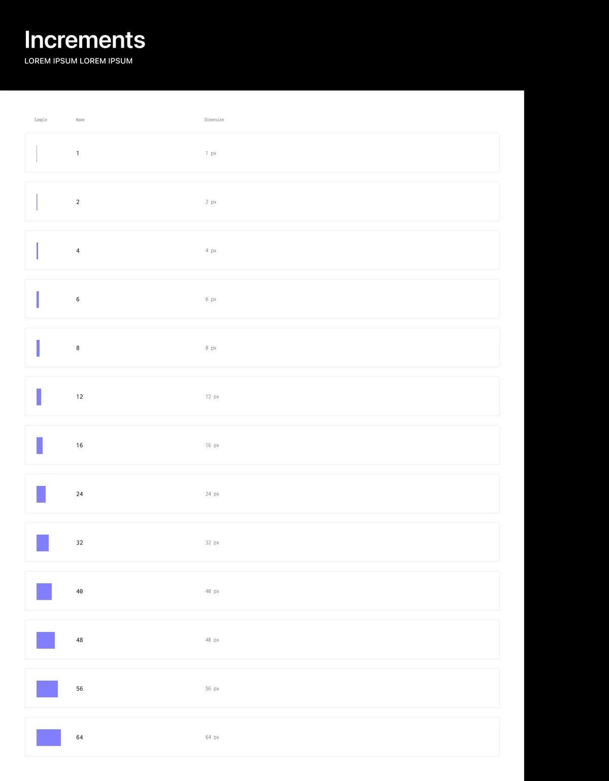
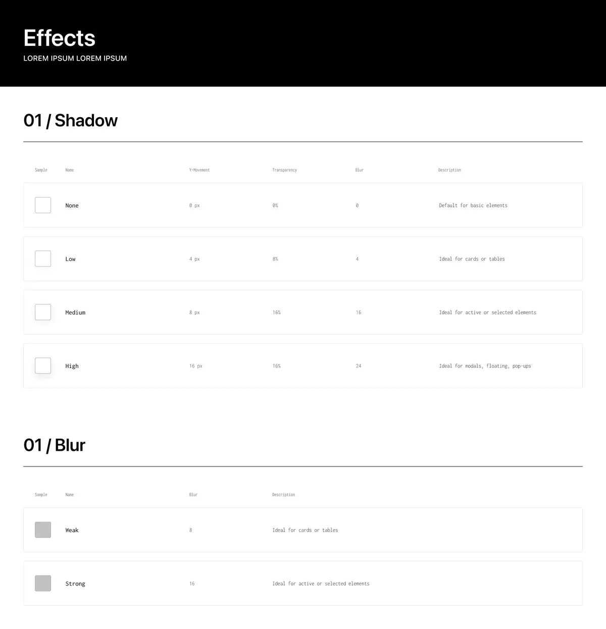
Styles that travel through all 71 components
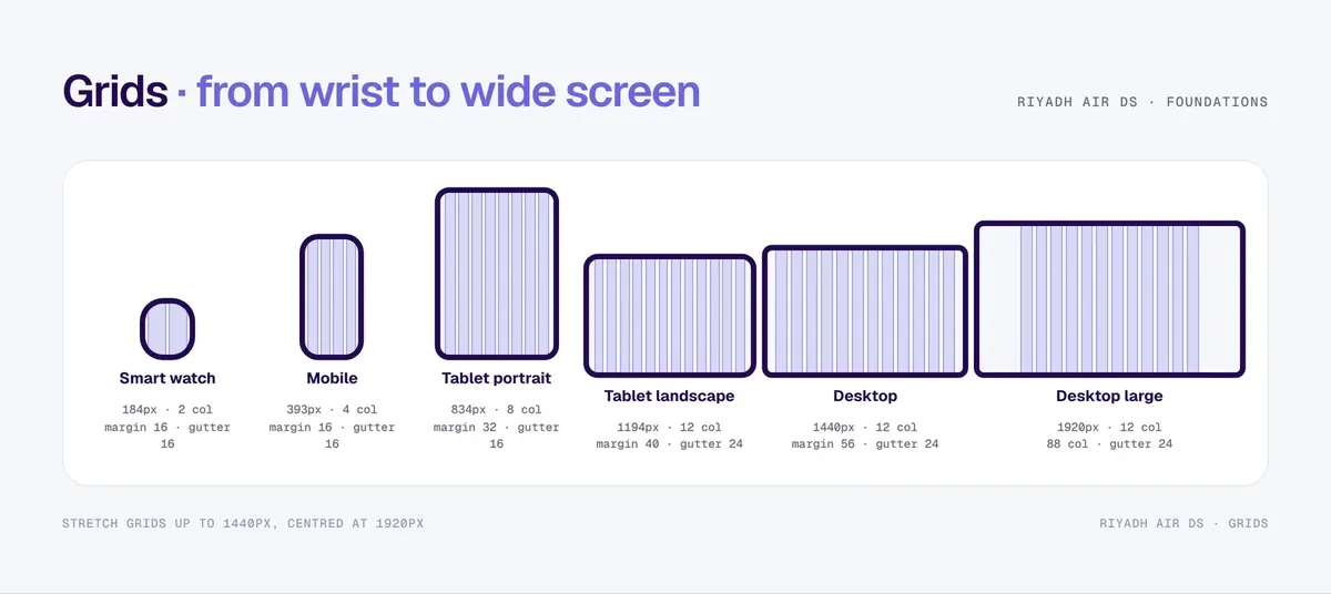
Pick a breakpoint, switch the script. The grids and the type are drawn from the library's own values.
XX Large
Large
Body
Family
07 components, live:
Switch the theme. Switch the language.
Everything flips: direction, arrows, numbers and currency formatting.
Every component shipped in all four versions.
Route headline · Segmented button
RUHRiyadh
LHRLondon
5.0
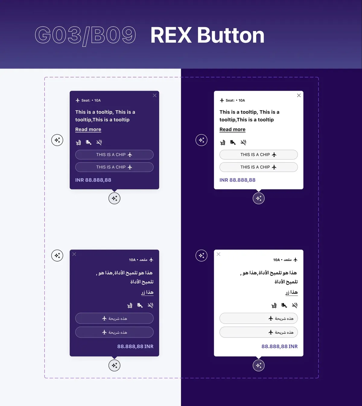
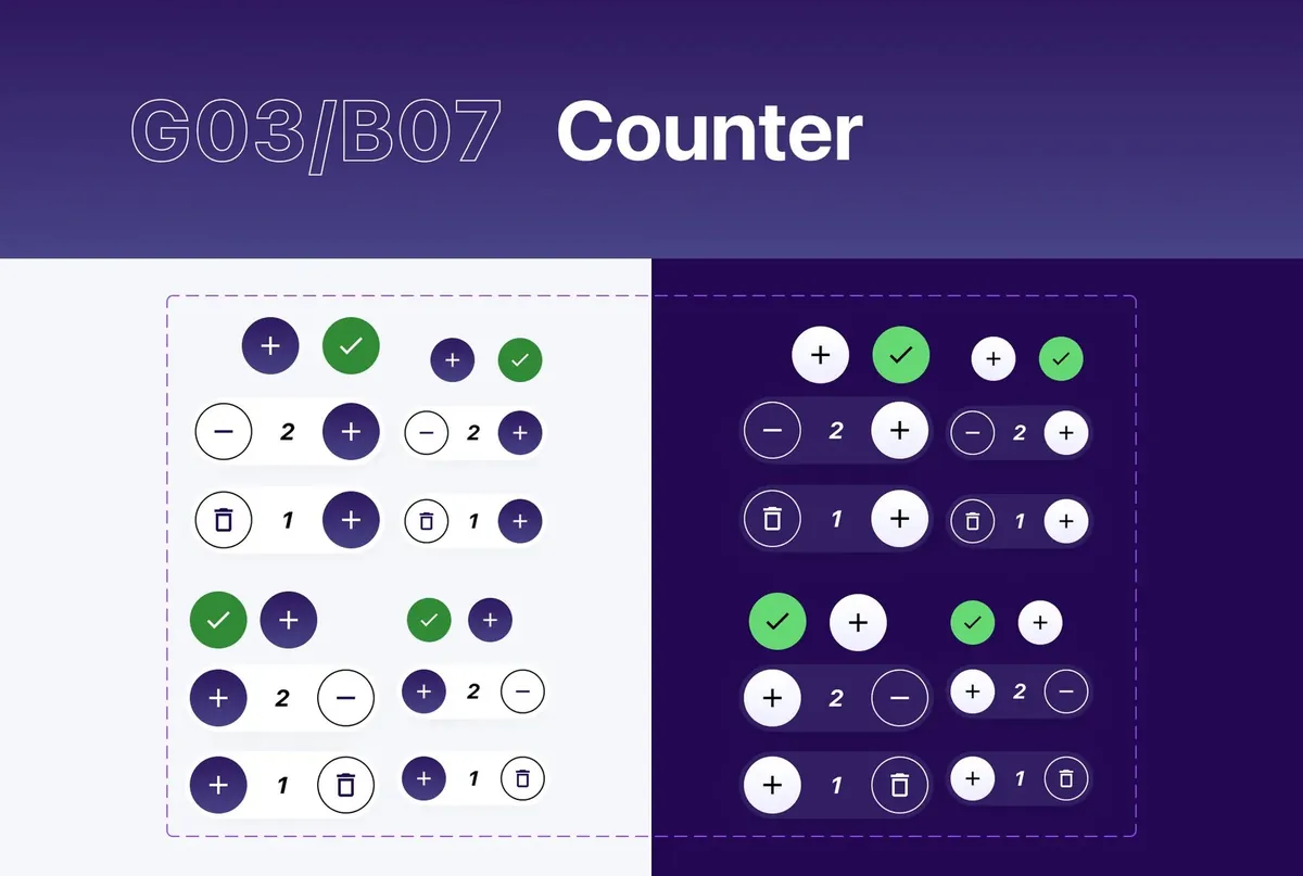
Counter · Seat selector · REX
Rebuilt in HTML from the library sheets, with its colours, shapes and states. Fares are illustrative.
08 the library:
71 components in 13 numbered families
Read the families and you can read the product: an assistant, selling nudges, and the trip itself.
71components, each in English and Arabic, light and dark
- Brand logo
- Canopy Twist uniform
- Canopy Twist dynamic
- Main button
- Segmented button
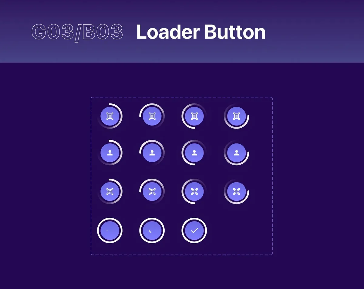
- Loader button
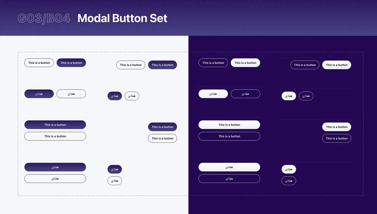
- Modal button set
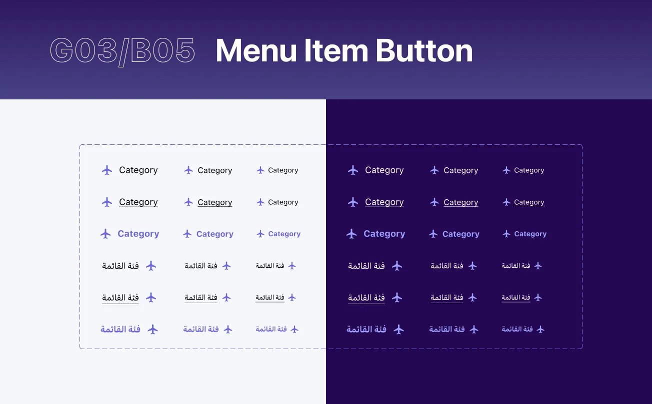
- Menu item button
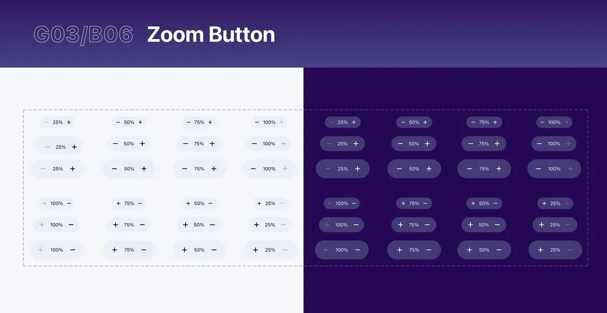
- Zoom button
- Counter
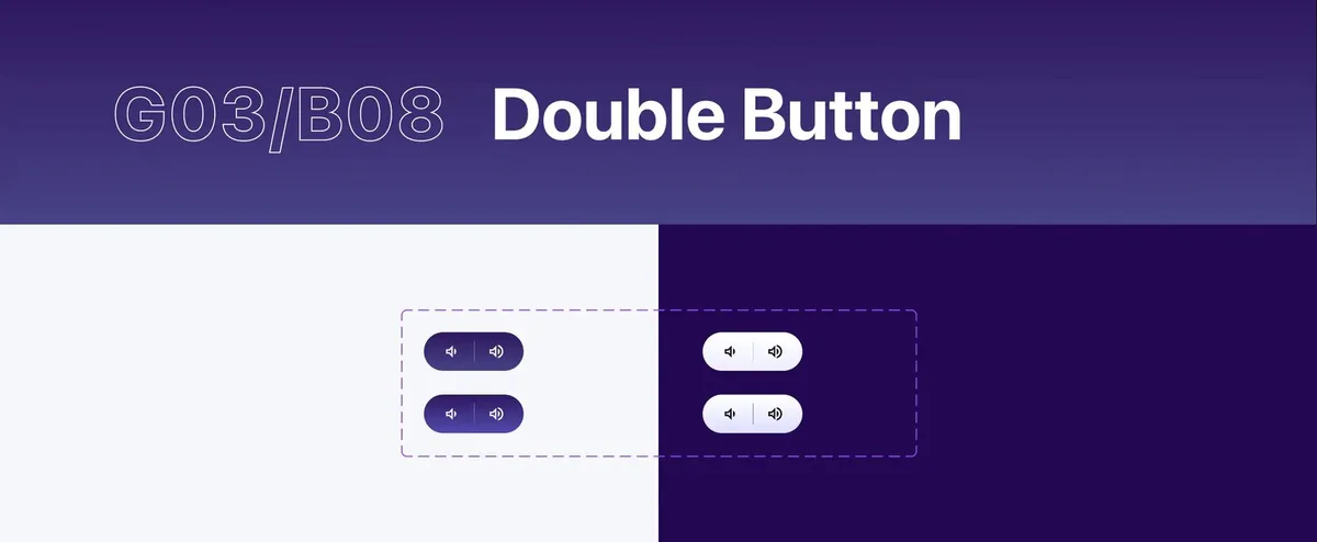
- Double button
- REX button
- Sticky button
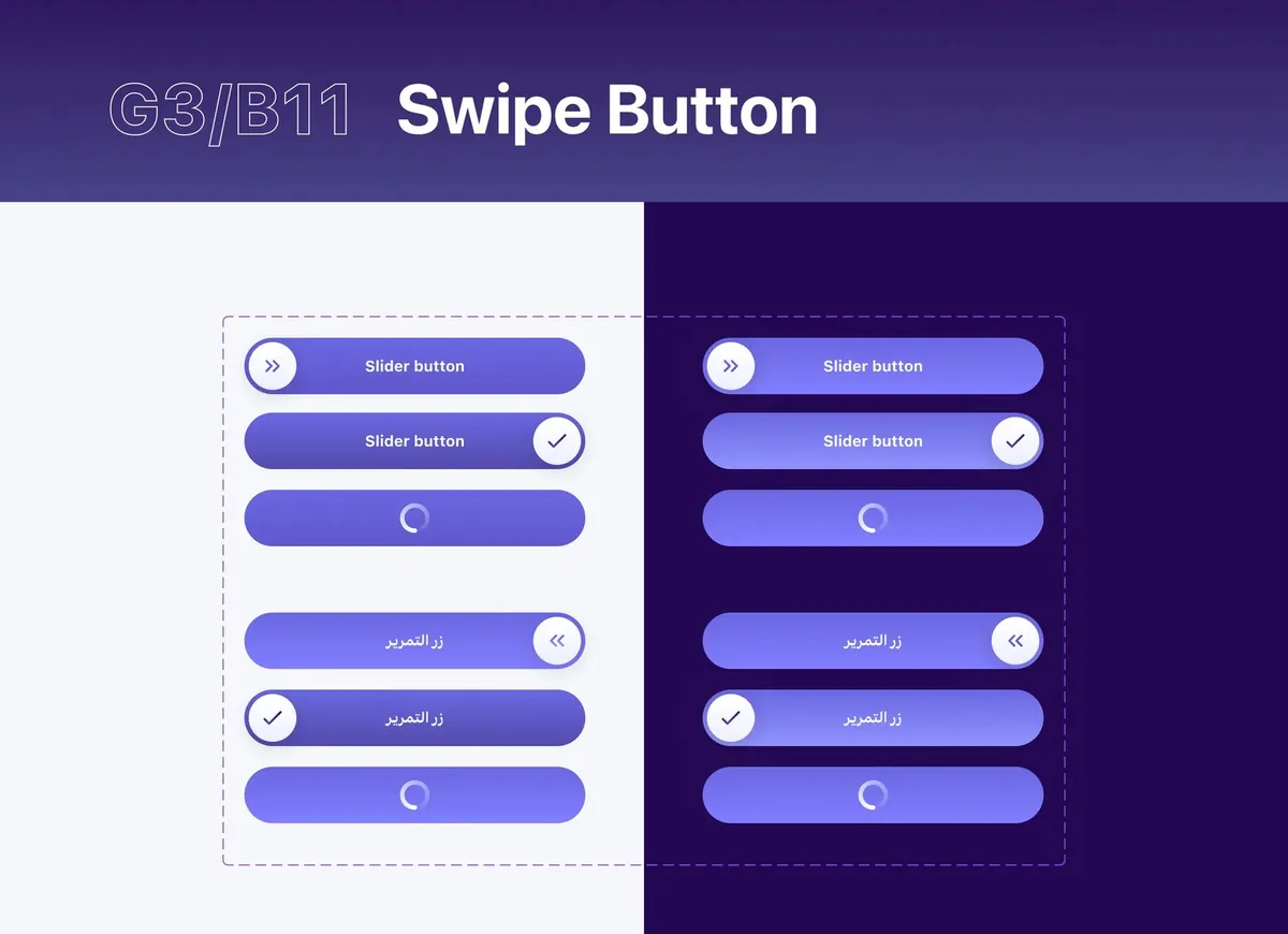
- Swipe button
- Speech bubble
- Message input bar
- Live voice input
- Accordion
- Tooltip
- Table line
- Bullet point list
- Price
- Route headline
- Slider
- Level controller
- Player controller
- Chip
- Seat selector
- Rating stars
- Toggle
- Checkbox
- Date selector
- Phone number field
- Radio button
- Security input code
- Price range indicator
- Text area
- Text field
- Destination search
- Prefilled selectors
- List item
- Avatar list item
- List
- Dropdown
- Progress bar
- Loader circle
- Loader dots
- Live update
- Nudge message
- Live message bar
- General message
- Breadcrumbs
- Top bar
- Tab item
- Banner carousel
- Tab selector
- Main tile
- Image and text tile
- Progress tile
- Action tile
- Progress segment
- Progress indicator
- Divider
- Carousel dots
- QR code
09 definition of done:
Tested in four languages before it shipped
Arabic for direction, German for long words, Japanese for a third script, and currencies with very long numbers.
Language
Currency
- 01
Build
Fewest frames; every text on a style, every colour on a variable
- 02
Structure
Named to convention, every useful variant, placed and described
- 03
Test
EN and AR, light and dark, long words, long numbers, in a real layout
10 how we worked:
Three companies, one way from idea to code
The system sat between three organisations and many teams. It worked because the path from an idea to a component in code was the same every time.
The pilot
An early library on one IBM project, to test whether a shared system would speed the teams up.
IBMThe system
Styles, structure and components built from scratch in Figma, reviewed with Publicis Sapient and Riyadh Air's product team.
IBM · Publicis SapientInto code
IBM engineers built the components in code, so every app used the same ones.
IBM design · IBM engineeringLaunch
The apps launched with the airline. The first flight left Riyadh for London Heathrow.
Riyadh Air
Rules
One page of rules
The library opened with its own guide: what ready means, how it's structured, how to name things.
Language
Bilingual from day one
Arabic wasn't a translation pass at the end. Every component shipped with its right-to-left version.
Handoff
Design and code in step
Variant names matched the props engineers built, so handoff was a lookup, not a translation.
How the three companies decided what shipped is its own case study: who decides what ships.
11 what changed:
From Figma to code to launch
Speed
Proven first
A pilot showed a clear efficiency gain before the full build.
Consistency
One airline
71 components and six breakpoints, used by every team.
Reach
EN + AR
Every component in both directions, light and dark.
Adoption
Shipped
Built in code by IBM engineering. The apps launched with the airline in October 2025.
01
Prove it small. A pilot on real work persuades faster than any deck.
02
Design the second language first. Arabic and German break what English never will.
03
Start at the smallest screen. A 184px watch made every larger layout simpler.
12 for your team:
The same playbook, as a studio engagement
Each step of this case study maps to how we work with clients now.
2 weeks, fixed
Audit
$1,500
In this case studyThe pilot: one team, real work, and a clear answer on whether a system will pay off.
See what's included6 weeks, fixedMost teams start here
Foundations
$5,900
In this case studyStyles, a naming grammar and core components, tested in your languages and themes.
See what's includedMonthly, pause any time
Partner
$2,900/mo
In this case studyGrow the library with your teams, with a shared definition of done.
See what's includedThe work above was done by our founder as an IBM employee. Layer One now runs the same method as a studio, for product teams of any size.
Aniket Pandey worked on this as a design system designer at IBM (2023–24), with the IBM design team, IBM engineering, Publicis Sapient and Riyadh Air's product, design and engineering teams. This is IBM client work done as an employee, not Layer One client work. Images belong to Riyadh Air and IBM and are shown for portfolio purposes.