
The short answer
OKLCH is a way of describing colour by Lightness, Chroma (colourfulness) and Hue, designed so that equal changes in numbers look like equal changes to the eye. That makes it much better than HSL for design system palettes: if two colours share the same OKLCH lightness, they really do look equally light, and they have similar contrast against white. To build an accessible palette, pick a hue per colour family, use one shared lightness curve for every ramp, shape chroma so it peaks in the middle, map any out-of-gamut colours back into sRGB, then check contrast for every pairing you'll use.
- OKLCH works in every major browser today:
oklch(0.565 0.17 255). - A shared lightness curve means step 600 behaves almost the same in every hue, so contrast rules become simple.
- OKLCH doesn't guarantee WCAG contrast. It makes contrast predictable; you still check it.
Why HSL palettes look uneven
HSL makes a promise it can't keep. Set six colours to 50% lightness and full saturation, and HSL says they're equally light. Your eyes disagree immediately: the yellow is almost white, the blue is almost navy. The numbers describe the screen's red, green and blue channels, not human perception.
HSL, all at 50% lightness
OKLCH, all at lightness 0.65
That's not an aesthetic quibble. It's why palettes built in HSL fail contrast checks unpredictably: "blue 600" passes 4.5:1 on white while "green 600" and "yellow 600" fail badly, even though they were built with the same numbers. Teams end up with a different rule for every hue, and nobody can remember them.
What OKLCH is, in plain terms
OKLCH is a cylindrical version of OKLab, a colour space published by Björn Ottosson in 2020 and adopted into CSS Color Level 4. It describes a colour with three numbers:
0 to 1
How light the colour looks. 0 is black, 1 is white. Built to match perception, so 0.6 in red and 0.6 in green look about equally light.
0 to ~0.37
How colourful it is. 0 is grey. Unlike HSL saturation, the maximum depends on hue and lightness, because screens can't show every combination.
0 to 360°
Which colour: roughly 25 for red, 75 for amber, 150 for green, 255 for blue. Keeping hue fixed keeps a ramp from drifting towards purple or grey.
In CSS it looks like this, and it's supported in all current major browsers:
--blue-600: oklch(0.565 0.17 255);    /* L C H */
--blue-600-hover: oklch(from var(--blue-600) calc(l - 0.08) c h);  /* relative colour: 8% darker */
Tailwind CSS moved its default palette to OKLCH in version 4 (2025), and Evil Martians' widely read explainer helped make it the default choice for new design systems.
Step 1: Pick a hue and peak chroma for each family
Decide which colour families you need. Most product systems need a brand colour, a neutral, and feedback colours for information, success, warning and danger. For each, choose a hue angle and a peak chroma: how colourful the family is at its most vivid.
| Family | Hue | Peak chroma | Why |
|---|---|---|---|
| Brand (signal orange) | 37° | 0.19 | Taken from the brand seed colour, oklch(0.705 0.191 37) |
| Blue (info, links, focus) | 255° | 0.17 | Clear, calm, distinct from the brand hue |
| Green (success) | 150° | 0.17 | Far enough from blue to tell apart |
| Amber (warning) | 75° | 0.16 | Warm but not orange, so it doesn't clash with brand |
| Red (danger) | 25° | 0.21 | The most vivid family; errors should stand out |
| Neutral | 260° | 0.018 | A slightly cool grey; a hint of hue feels less flat than pure grey |
Step 2: Use one lightness curve for every ramp
This is the step that makes the whole palette predictable. Instead of choosing lightness by eye for each colour, define eleven lightness values once, from very light to very dark, and use them for every family.
Notice the steps aren't evenly spaced. They're closer together at the light end, where small changes are easy to see and where you need subtle backgrounds, and wider in the middle, where the important text-on-white decisions happen.
Step 3: Shape chroma so it peaks in the middle
Very light and very dark colours can't hold much colour: a "vivid" near-white or near-black doesn't exist on a screen. So chroma follows an envelope: low at both ends, full in the middle. We multiply each family's peak chroma by the same envelope:
Step 4: Map out-of-gamut colours back into sRGB
Some combinations of lightness, chroma and hue can't be shown on a standard screen. OKLCH will happily describe them, so a palette generator has to bring them back inside the sRGB gamut, usually by reducing chroma until the colour fits while keeping lightness and hue as close as possible.
In practice this affects more steps than you'd expect. In our brand orange ramp, ten of eleven steps needed a small chroma reduction; step 50 asked for 0.023 and got 0.016. Blue and red mostly lost chroma only at the light end; green and amber only in the darker half. That's normal, and it's why you should generate palettes with a tool that does proper gamut mapping (we use culori) rather than typing OKLCH values and hoping. If you target wide-gamut P3 displays you can keep more chroma there, with sRGB as the fallback.
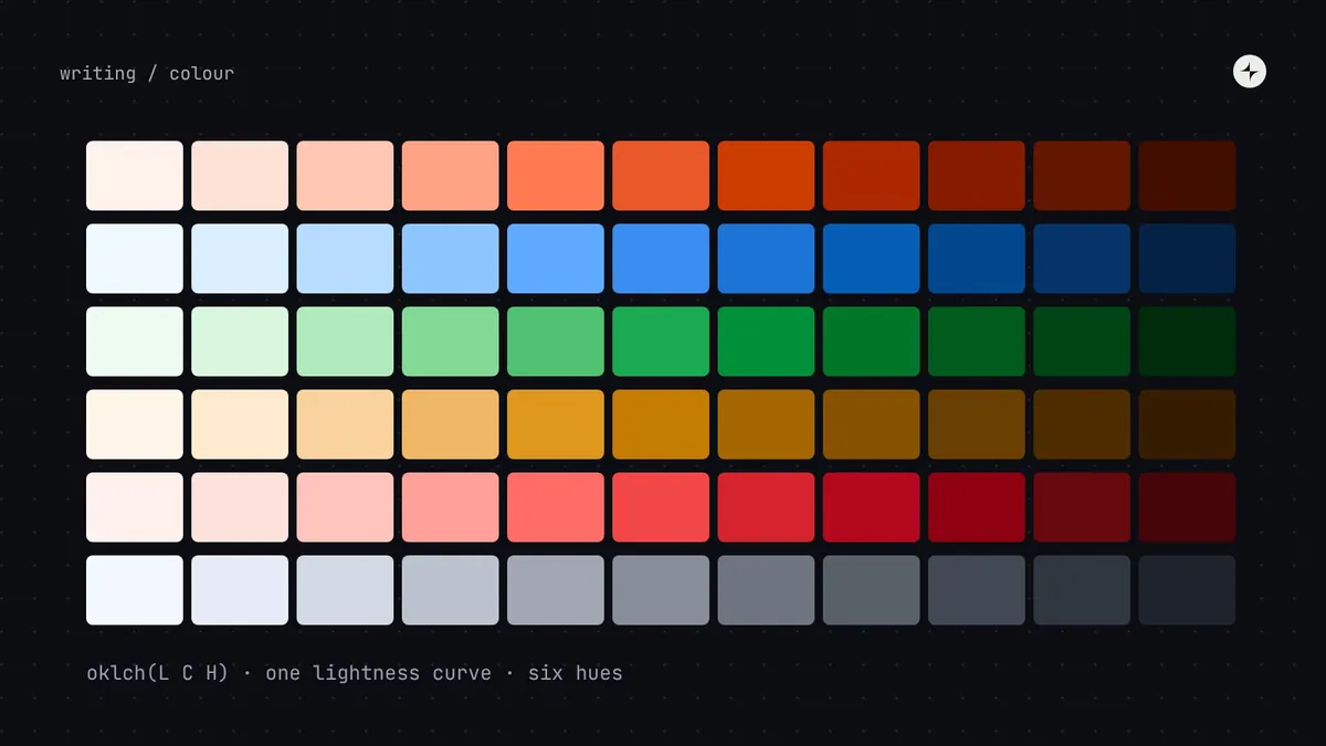
The result: six ramps, one curve
Brand (Signal)hue 37°
Bluehue 255°
Greenhue 150°
Amberhue 75°
Redhue 25°
Neutralhue 260°
Because every ramp shares the lightness curve, the contrast numbers line up across hues. Step 700 is between 5.8:1 and 7.1:1 on white in every family. Step 600 lands between 4.16:1 and 5.06:1, which is why we use 700 rather than 600 for text and primary actions: one rule that holds for every colour. Compare that with the HSL row above, where the same "lightness" gave anything from 1.07:1 to 8.59:1.
Step 5: Check contrast for every pairing
OKLCH makes contrast predictable, not guaranteed. WCAG 2 contrast is calculated from relative luminance, which doesn't perfectly match OKLCH lightness, so always compute it. Check the pairings you'll actually use, not every colour against white:
- Body text on every background it appears on: at least 4.5:1 (WCAG 2.2, 1.4.3).
- Large text (24px, or 18.66px bold): at least 3:1.
- Input borders, icons and focus rings against their background: at least 3:1 (1.4.11).
- Button labels on button fills, in every state including hover and pressed.
- The same pairs again in dark mode.
A useful shortcut from a shared lightness curve: two steps far enough apart on the curve will pass, whatever their hue. In our neutral ramp, step 600 on step 50 gives 4.25:1 (fails for body text), and step 700 on step 50 gives 5.99:1 (passes). That gap rule then holds, within a small margin, for every family.
APCA (the Accessible Perceptual Contrast Algorithm) is a newer contrast method that accounts for text size, weight and polarity better than WCAG 2. It's useful as a second opinion, especially in dark mode, but WCAG 2.2 is still the standard you'll be measured against.
Step 6: Name the colours and ship them as tokens
The palette is your primitive layer: blue.600, neutral.50. Products should never use it directly. Map it to semantic tokens named by job (text.link → blue.700, action.primary.bg → brand.700) and ship those to design and code. The structure and the file format are in our design tokens guide; how the same palette produces a dark theme is in dark mode with design tokens.
At CARS24 a new palette built in OKLCH replaced five different blues in the code, and became the colour of the company's rebrand across India, the UAE and Australia. Read the case study. To try the method on your own brand colour, the Lab builds OKLCH ramps from a hex value, pins your exact colour to the nearest step and checks contrast.
How many colours should a design system have?
Fewer than most teams think. A typical product needs five or six families of eleven steps (around 60 primitives) and 30–60 semantic colour tokens. If you need more, ask whether you're adding colours for decoration rather than meaning. Data visualisation is the main exception: charts need their own categorical palette, also checked for contrast and for colour-blind safety.
Browser support and fallbacks
oklch() is supported in current Chrome, Edge, Safari and Firefox. If you must support older browsers, have your token build output hex values as well (the DTCG format lets a colour carry a hex alongside its OKLCH components), and use them as a fallback:
.button { background: #ab2800; background: oklch(0.486 0.172 35); }The short version
- HSL lightness doesn't match perception, so HSL palettes fail contrast unpredictably.
- OKLCH does match perception: equal lightness looks equal and behaves alike for contrast.
- Build ramps from one shared lightness curve and a chroma envelope; gamut-map into sRGB.
- Check contrast for real pairings in both modes. OKLCH makes it predictable, not automatic.
- Ship the palette as primitives and expose semantic tokens to products.
Frequently asked questions
Is OKLCH supported in all browsers?
In all current major browsers, yes. For older ones, output a hex fallback from your token build.
What's the difference between OKLCH, OKLab and HSL?
OKLab and OKLCH describe the same perceptual colour space; OKLab uses a and b axes, OKLCH uses chroma and hue angle, which is easier for designing palettes. HSL is a reshuffle of RGB channels and doesn't model perception.
Does OKLCH guarantee WCAG contrast?
No. WCAG contrast uses relative luminance, which is close to but not the same as OKLCH lightness. OKLCH makes contrast consistent across hues; you still have to check it.
Can I use OKLCH in Figma?
Figma's colour picker works in hex, RGB and HSL/HSB, so most teams generate the palette in code or a plugin and import the resulting values as variables.
Should I design for P3 wide gamut?
Only if your brand needs the extra vividness. Keep sRGB values as the baseline and add P3 variants in a @media (color-gamut: p3) block.
Further reading
- A perceptual color space for image processingBjörn Ottosson. The original description of OKLab.
- OKLCH in CSS: why we quit RGB and HSLEvil Martians. The practical case for OKLCH.
- CSS Color Module Level 4W3C. Where
oklch()is specified. - Understanding the scaleRadix Colors. A well-documented example of giving each step a job.
- APCA in a nutshellMyndex Research. The newer perceptual contrast method.