
The short answer
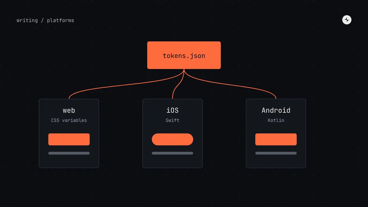
A cross-platform design system shares decisions, not code. Write tokens once in a shared format and generate them for every platform (CSS variables, Swift, Kotlin, Figma variables) with a build tool such as Style Dictionary. Build components natively on each platform, with the same names, props and tokens. Then decide, component by component, what to share (brand, foundations, words, component purposes), what to adapt to platform conventions (navigation, date pickers, switches, text sizes) and what to keep separate (things that only exist on one platform). The test: would a regular user of this platform be surprised by how it behaves? If yes, adapt.
- People expect an iPhone app to feel like an iPhone app, while still recognising your brand.
- Each extra platform adds roughly the same component effort again; tokens are the part that scales for free.
- Keep one set of names and one documentation page per component, with platform tabs.
The problem with three separate systems
Most companies end up with a web system, then an iOS one built by the iOS team, then an Android one. Each starts from the same brand guidelines and drifts within a year: three blues, three button heights, three ways to show an error.
An illustration: one brand, three blues
Web, iOS and Android teams each maintain their own colours and components from a shared brand PDF.
A brand refresh means three projects. A contrast fix lands on web and Android but not iOS. Support screenshots look like three different companies.
One set of token files generates colours, type and spacing for all three. The refresh is one change, reviewed once, released everywhere.
One source of decisions, every platform
// one token…
{ "color": { "action": { "primary": { "bg": { "$type": "color", "$value": "{color.brand.600}" } } } } }

// …generated for each platform
--color-action-primary-bg: #4736fe;                          /* CSS */
static let colorActionPrimaryBg = Color(hex: 0x4736FE)        // Swift
val ColorActionPrimaryBg = Color(0xFF4736FE)                  // Kotlin
Units change too: spacing in rem on the web becomes points on iOS and dp on Android; type sizes may map to Dynamic Type styles on iOS. The build tool handles the conversion, so designers and engineers still talk about space.4 on every platform.
Share, adapt or keep separate
| Decide to… | Usually | Examples |
|---|---|---|
| Share | Brand, foundations, content, component names and purposes | Colours, voice, "primary button", error message formulas, icon meanings |
| Adapt | Things where the platform has strong conventions | Navigation (tab bar vs drawer), date and time pickers, switches, sheets, text sizes, haptics, back behaviour |
| Keep separate | Things that only exist on one platform | Widgets, watch faces, desktop keyboard shortcuts, hover-only interactions |
Would a regular user be surprised?
If an iPhone user would be surprised by how something behaves, adapt it to iOS. If not, share it. A custom date picker that ignores the platform's own usually fails this test.
Purpose, name and tokens
Even an adapted component keeps the same name, the same purpose, the same props where possible and the same tokens. "Primary button" means the same thing everywhere.
Organising the team and the docs
- One component, one page: a single documentation page per component with tabs for web, iOS and Android, so the shared purpose and guidance sit above the platform details.
- Platform specialists in the core team: at least one engineer per platform. Without one, that platform's version lags and teams build their own.
- Same names, mapped props: where platforms differ (
onClickvs a SwiftUI action), document the mapping once. - Coordinated releases: token changes ship to every platform in the same release, even if components follow at different speeds.
- Platform-specific sizes as component tokens: a button's height can map to each platform's guidelines through a component token. See component tokens.
Where to start
Move tokens into one source
Collect each platform's colours, type and spacing, agree the names, and generate all three from one set of files. This alone removes most visible drift.
Align names and purposes
Make a table of every component on every platform. Same purpose, same name; note where behaviour should differ.
Decide share, adapt or separate
Component by component, starting with the ten used most.
Bring docs together
One page per component with platform tabs, so the guidance is written once.
Each extra platform adds roughly the same component effort again. Budget for it; see component complexity.
At CARS24, a new palette in OKLCH and a four-layer token system carried the rebrand across India, the UAE and Australia. Read the case study.
The short version
- Share decisions, not code: one token source generated for every platform.
- Build components natively, with the same names, props and tokens.
- Share brand and purpose; adapt to platform conventions; keep platform-only things separate.
- One documentation page per component, with platform tabs.
- Put a specialist for each platform in the core team.
Frequently asked questions
Can one design system cover web, iOS and Android?
Yes, by sharing tokens, names and guidance from one source while building components natively on each platform and adapting where platform conventions differ.
How do you share design tokens across platforms?
Keep tokens in a shared format such as DTCG JSON and use a build tool like Style Dictionary to generate CSS variables, Swift, Kotlin and Figma variables from the same files.
Should mobile apps follow the brand or the platform?
Both: brand in colour, type, voice and imagery; platform in navigation, controls and behaviour people already know.
Should we use a cross-platform framework instead?
Frameworks like React Native or Flutter can share component code. The same principles still apply: shared tokens, and adapting where people expect platform behaviour.
Further reading
- Style DictionaryGenerating tokens for every platform.
- Human Interface GuidelinesApple.
- Material Design 3Google.
- Multi-brand design systemsThe other kind of scaling.