
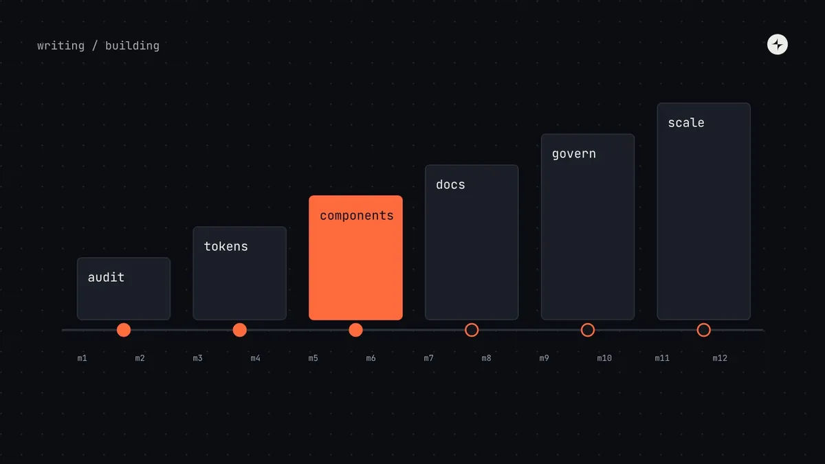
The short answer
To build a design system: (1) get a sponsor, engineering commitment and a named owner; (2) audit what you already have; (3) turn your foundations into design tokens; (4) build the ten most-used components in design and code, inside a real product project; (5) document them; (6) agree how decisions and requests work; (7) launch to more teams, measure, and only then scale to themes, brands and platforms.
- Fund it in stages. Each stage ends with a "gate" that earns the next round of investment.
- Build components with a pilot team that needs them, never in isolation.
- Start with the boring components: buttons, fields, alerts and dialogs. That's where the waste is.
Most "how to build a design system" guides start with colour palettes and end with a component list. That's the visible part of the work, and it's not where design systems fail. In audits, the systems that struggle almost never struggle because the buttons were badly drawn. They struggle because engineering never adopted them, because nobody owned them after launch, or because the team built for a year before anyone used anything.
So this guide puts the people, scope and gates around each step. It's the plan we'd follow ourselves for a growing product company, condensed from our design systems playbook.
Before you start: sponsor, scope and owner
Three things need to be true before any design work starts. Skip them and the rest of this guide won't save you.
Someone with a budget
A head of design, product or engineering who will defend the system in planning when a product deadline wants its people back.
A yes from engineering leads
An explicit agreement that teams will use the shared component package. Without it, you're building a UI kit.
Protected time, in writing
A named designer and engineer, with time reserved in their team's plan. "A bit of everyone's time" becomes nobody's.
Then decide the scope: which stage you're aiming for next, not the final one. If you're not sure whether you need a full system yet, start with do you need a design system?
The most common failure we see is a system built by design and ignored by engineering. Staff the work with at least as much engineering time as design time. Adoption happens in code.
The plan at a glance
Here's the sequence, with how long each step usually takes and the gate that should be met before moving on.
Step 1: Audit what you already have
Before you design anything, find out what exists. An audit (also called an interface inventory) means screenshotting and grouping every button, input, message, colour and text style across your product, then counting the duplicates in design and code.
It does three jobs at once. It shows you where to start. It gives you "before" numbers to prove progress later. And, done as a team exercise, it turns sceptics into supporters: people who find seven different primary buttons themselves rarely need convincing.
We've written the full method, step by step, in how to run a design system audit.
Step 2: Set foundations and turn them into tokens
Foundations are the decisions every component depends on: colour, typography, spacing, layout grid, radius and elevation. Settle them before components, because every component inherits them, good or bad.
- Colour: build ramps with even lightness steps (we use OKLCH), then name colours by their job:
text.primary,border.default,action.primary. Check every text and background pairing against WCAG contrast. - Typography: a small set of text styles named by role (display, heading, body, label, caption), not by size.
- Spacing: a scale on a 4px base (4, 8, 12, 16, 24, 32, 48…) so every gap is a choice from a short list.
- Layout: breakpoints, columns and gutters that match how your product is actually used.
Then store them as design tokens, in one source that feeds both Figma variables and code. This is the cheapest layer of a design system and it pays back first: a rebrand, a dark theme or an accessibility fix becomes a change to token values rather than a hunt through the codebase.
At CARS24, one blue lived in the code as five different values. A new OKLCH palette and a four-layer token system carried the rebrand across 10+ products in three countries, with a 65% faster design-to-development handoff. Read the case study.
Step 3: Choose your first components
Don't start with the component that's most fun to design, or the one that seems like the biggest problem. Start with the ones that are used everywhere and inconsistent today. Plot each component from your audit on two axes:
A typical first set of eight: button, text field, select, checkbox, radio, switch, link and alert. Then containers and feedback (dialog, card, tabs, toast, menu, empty state), then data and navigation (table, pagination, badge, tag, side navigation), and only then the hard ones like date pickers and advanced tables.
A team decides to start with the data table "because it's the biggest problem". Six months later they have a sophisticated table, nothing else, and product teams have stopped waiting. Start with components you can finish in days, so teams see progress early.
Build, borrow or buy?
You don't need to build every component from scratch. Our usual recommendation: build simple components yourself (buttons, badges, cards), because they're easy and you'll want full control. Use a headless library (one that handles behaviour and accessibility but has no visual style) for complex interactive components like menus, dialogs, comboboxes and date pickers, because the behaviour is the hard part.
| Approach | Good for | Watch out for |
|---|---|---|
| Build your own | Full control, exactly your needs, no outside dependency | Slowest; accessible behaviour for complex components is hard |
| Headless library + your tokens | Correct, accessible behaviour out of the box, with your own look | You depend on the library's updates and conventions |
| Fully styled library, themed | Fastest start; early-stage products and internal tools | Hard to make truly yours; heavy theming can be harder than building |
Step 4: Build in design and code together, with a pilot
Every component should be built inside a real product project: a pilot team that needs it for something they're shipping. Dan Mall makes this point in Design That Scales, and in our experience it's the single biggest predictor of a system people actually use. The pilot gives you real requirements, a real deadline and a team that already trusts the result.
For each component, design and code are built as twins: the same name, the same variants, the same options in Figma and in code. Before a component is called "ready", it should pass a definition of done like this:
- Every state designed: default, hover, focus, pressed, disabled, loading, error.
- Uses only semantic tokens, no hard-coded values.
- Works with a keyboard and a screen reader; contrast checked.
- Same name, variants and props in Figma and code.
- Tested in the pilot product, with real content (long labels, empty data, translations).
- Documented: what it's for, when not to use it, and a code example.
At CARS24 this is how the LEGO component system was built: the first components were picked from teams' actual roadmaps, look and feel was tested on real screens, and the result was 44 composable components adopted in India, the UAE and Australia. See how.
Step 5: Document as you go
Documentation decides adoption. A component nobody can find, or can't work out how to use, doesn't exist. Write the page for each component as you build it, while the decisions are fresh, using one template so every page reads the same way: what it is, when to use it and when not to, anatomy, variants, states, accessibility notes, content guidance and code.
Keep everything in one place, a single source of truth, rather than half in Figma descriptions and half in a wiki. We've written a full guide with a component page template in design system documentation: what to include.
Step 6: Agree how decisions and requests work
As soon as a second team starts using the system, you'll get requests: a new variant, a missing component, a bug. Decide now how they're handled, before the first argument:
Who decides what
A short decision-rights table: who has the final say on tokens, components, patterns and breaking changes. One decider per row. See governance.
One front door for requests
A single form that creates an item in a public tracker, plus a weekly triage. See the contribution model.
Versioning rules
Semantic versioning (major.minor.patch), with breaking changes announced ahead and a deprecation period.
Release notes
A predictable rhythm (every two weeks is common) with notes written for the people who use the system, not for the team that built it.
Step 7: Launch, measure and scale
There's no big-bang launch. The system spreads team by team: the pilot, then a second team, then a third, each with less hand-holding than the one before. Set up the rhythms that keep it healthy (office hours, triage, releases, a monthly health check) and start measuring adoption from the first release. See how to measure design system success.
Only once most new work uses the system should you invest in the expensive layers: dark mode and multiple themes, multiple brands, native platforms and formal cross-department governance. These multiply value when the basics are adopted, and multiply cost when they're not.
A 12-month plan
Here's a realistic first year for a mid-sized product company starting from a UI kit or a few shared components. Four workstreams run side by side, and each quarter ends with a gate.
| Q1 · Start | Q2 · Prove | Q3 · Spread | Q4 · Settle | |
|---|---|---|---|---|
| Foundations | Audit. Colour, type, spacing and layout as tokens. Token pipeline. | Semantic tokens complete. Contrast checks automated. | Dark mode as a second theme. | Density modes. Token audit. |
| Components | 8 basics: button, field, select, checkbox, radio, switch, link, alert. | Dialog, card, tabs, toast, menu, empty state. | Table, pagination, badge, tag, side menu. | The hard ones: date picker, search, advanced table. |
| Operations | Owner named. Who-decides-what agreed. Versioning rules. | Request and contribution process live. Docs template. | First outside contribution. Monthly health check. | Deprecate old components. Next year's roadmap. |
| Adoption | Pilot team: a new settings page. | Second pilot. A champion in each team. | Second and third teams adopt. Office hours. | Migration dashboard. Most new work on the system. |
| Gate | The pilot ships using only tokens. | The pilot team is measurably faster or has fewer UI bugs. | A team adopts without hand-holding. | Adoption trend and savings reported to leadership. |
How many people does it take?
For a mid-sized SaaS company (2–3 products, 6–12 designers, 40–80 engineers), a realistic first year is about 45 FTE-months: a part-time lead, one system designer, two engineers during the build, then one and a half engineers plus product-team contributions to run it. A startup can do a lighter version in about 6–7 FTE-months. The full model is in design system ROI and cost.
Common mistakes
| How it fails | The antidote |
|---|---|
| Built by design, ignored by engineering | Get engineering commitment before you start; staff the team with engineers. |
| Treated as a project, then abandoned | Run it as a product, with a team that stays after launch. |
| Started with the fun components | Rank by frequency and pain; start with the boring ones. |
| Built in isolation, then "launched" | Build every component inside a pilot product project. |
| Colours named by appearance, not job | Semantic tokens: text.primary, not grey-700. |
| No way in for requests | One front door, a public queue and weekly triage. |
| Docs written last, or never | A page per component, written while it's built. |
| Measuring output, not use | Track adoption, request turnaround and satisfaction, not components shipped. |
The short version
- Start with a sponsor, engineering commitment and an owner with protected time.
- Audit first; tokens second; then the ten most-used components, in design and code, inside a pilot.
- Document as you build, and agree decision rights and a request process before the second team arrives.
- Fund it in stages with gates. Scale to themes, brands and platforms only once the basics are adopted.
Frequently asked questions
How long does it take to build a design system?
A useful first version, with tokens and 8–15 core components in design and code, usually takes three to six months. A system that most new work runs on takes about a year. After that it's never "done": it's maintained like any product.
Should design or code come first?
Neither: they should move together. Foundations are decided in design and stored as tokens that code reads; components are built as twins with the same names and options on both sides.
How many people do you need?
For a startup, a designer and an engineer with about a day a week each. For a mid-sized company, a small team of two to four. For an enterprise, eight or more, including engineers for each platform. See team structure.
Which components should you build first?
The ones used everywhere and inconsistent today: usually button, text field, select, checkbox, radio, switch, link and alert. Rank them from your audit by frequency and pain.
Should you start from an open-source design system?
Often, yes, for the component layer. A headless library gives you accessible behaviour; your own tokens give you your look. You still need your own documentation, patterns and process.
Further reading
- Interface InventoryBrad Frost. The original write-up of the audit method.
- Picking Parts, Products & PeopleNathan Curtis, EightShapes. How to choose what to build first, for whom and with whom.
- Design That ScalesDan Mall. Why pilots beat building in isolation.
- ARIA Authoring Practices GuideW3C. Keyboard and screen reader patterns for complex components.
- Design Tokens Format Module 2025.10Design Tokens Community Group. The stable format for storing tokens.