
The short answer
Good design system documentation answers the questions people arrive with, in the five minutes before a deadline: what is this, when should I use it, how do I build with it, and is it changing? Give every component page the same nine sections in the same order (summary, when not to use it, live examples, anatomy, how to build with it, accessibility, writing, do's and don'ts, status and history), and put everything behind one front door: a portal organised by the tasks people come with, not by how the system team is organised.
- The trick isn't writing more. It's writing the same few things for every component, so people know where to look.
- "When not to use it" is the most valuable section, and the one most often missing.
- If it's in the portal, it's true. If it isn't, it isn't official.
What design system documentation is for
Docs decide adoption. A component nobody can find, or can't work out how to use, doesn't exist: people will build their own. Documentation is the shop window of the system and its main support channel, the thing that answers questions when the system team isn't in the room.
An illustration: seven places to check, zero answers
An engineer wants to know whether the old modal is being retired. The answer might be in the wiki, the Figma file, Storybook, the release notes, a Slack thread or the roadmap spreadsheet.
The wiki says one thing, a three-month-old thread says another. The engineer asks in the channel, waits a day, and builds with the old modal anyway.
The modal's page says: "Deprecated: removed in 6.0 (March). Use Dialog. Migration guide →". One place, one answer, always current.
Who reads it, and what they're looking for
Which component fits this problem? What are the variants? What should the words say? Where's the Figma component?
How do I install and import it? What are the props? How does it handle focus and keyboard? What changed in this version?
Does something already exist for this? How do I request something new? When will it be ready?
Where do I start? What do I need to know in my first week? Who do I ask?
Notice how few of these questions are about design philosophy. Essays have a place, on a separate page for people who want them, but the pages people use daily should be short, consistent and scannable.
The component page template
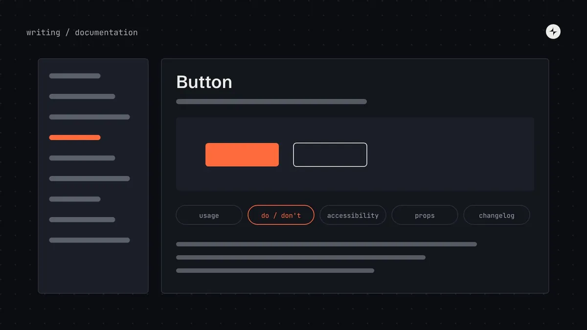
Every component gets the same nine sections, in the same order. Consistency is the feature: after reading two pages, people know exactly where to look on the third.
1–2. Summary, and when not to use it
Start with what the component is for, in plain words: "Buttons start an action, such as saving a form or opening a dialog." Then, immediately, what to use instead in the cases people get wrong: "To go to another page, use a link. For a choice between options, use a radio group or a segmented control." This section prevents more misuse than any review.
3–4. Live examples and anatomy
Show every variant and state in a live, interactive example, rendered by the real component code, not a screenshot. Then one labelled anatomy diagram. Use the same part names everywhere: in the diagram, in token names (button.primary.label.color) and in Figma layer names.
5. How to build with it
import { Button } from "@acme/ui";

<Button variant="primary" size="md" onClick={save}>Save changes</Button>| Prop | Type | Default | Description |
|---|---|---|---|
variant | "primary" | "secondary" | "ghost" | "danger" | "secondary" | Visual emphasis. One primary button per view. |
size | "sm" | "md" | "lg" | "md" | Height and padding. Use sm only in dense tables. |
loading | boolean | false | Shows a spinner, keeps the width, announces "Loading" to screen readers. |
disabled | boolean | false | Prefer explaining why an action isn't available over disabling it. |
The same options should exist in Figma with the same names. If the Figma component has a "Style" property and the code has variant, somebody will translate them wrong.
6. Accessibility
A short checklist, split into what the component handles and what the product team must still do. For a button: the component provides focus styles, keyboard activation with Enter and Space, and a minimum target size; the team must give icon-only buttons an accessible name and must not use a button to navigate.
7–8. Writing, and do's and don'ts
One or two lines on what the words should say ("Start with a verb: Save, Send, Delete. Say what will happen.") with examples, then two to four visual pairs. Pictures of wrong use teach faster than paragraphs about right use.
9. Status and history
A status label (proposed, beta, stable, deprecated) that matches the label in Figma and in code, and a short changelog linking to release notes. Beta and deprecated are the two labels teams most often skip, and the two that build the most trust.
Foundations, patterns and guidelines pages
Components aren't the only pages. Three other kinds matter:
Token pages
Every token with its value in each theme, a swatch or preview, its purpose and an example. Generate them from the token source so they're never out of date. See design tokens.
Pattern pages
How components combine to solve a recurring problem: forms, tables, empty states, errors. Include the evidence behind the pattern, as the GOV.UK Design System does.
Content guidelines
Voice, vocabulary and message formulas: how to write errors, confirmations and empty states consistently.
Structuring the portal
A single source of truth doesn't mean everything lives in one tool. Figma files stay in Figma and code in the repository. It means one front door that everyone knows, which links to everything else and says what's current. Organise it by the questions people arrive with:
For designers · For engineers · For PMs · Learning paths
Principles · Colour · Type · Spacing · Layout · Motion · Icons
Every token, every theme, generated from source
A–Z and by group, one template
Forms, tables, feedback · Voice and vocabulary
Install · Theming · Testing · Migration guides
Request something · Contribute · Review process
Release notes · Roadmap · Deprecations and breaking changes
Office hours · FAQ · Owners · Channels
A startup's version might be three of these on a single page. An enterprise's has all of them. The home page should answer "what's new and where do I go?": the latest release and any upcoming breaking change, quick links by role, search front and centre, and the next office hours.
Tools: Storybook, zeroheight, Supernova or custom
| Approach | Good for | Watch out for |
|---|---|---|
| Storybook | Live component examples and props tables generated from code; engineers | On its own it's weak for design guidance, patterns and content |
| Documentation platforms (zeroheight, Supernova, Knapsack and others) | Combining Figma, code examples and written guidance quickly, without building a site | Cost per seat; another tool to keep in sync |
| Custom docs site | Full control; live components; generated token pages | Needs engineering time to build and maintain |
| A wiki or Notion | A startup's first page | No live examples; drifts from the real components fast |
Many teams combine two: Storybook for live, generated component examples, embedded in a documentation platform or custom site that holds the guidance. Whatever you choose, it must render the real components, not pictures of them.
Keeping docs current
An out-of-date portal is worse than none: people learn not to trust it. Four habits keep it accurate:
Docs are part of done
A component isn't released until its page is complete. Add a build check that fails when a public component has no page.
Generate what you can
Token values, props tables and live examples should come from the source, never be typed by hand.
Give every page an owner and a review date
Show "Last reviewed" on the page. Track pages past their review date as a metric.
Listen to search
Searches with no results are a to-do list. So are repeated questions in office hours: each one should become a docs or FAQ entry.
The short version
- Docs decide adoption: write for the five minutes before a deadline.
- Use one nine-section template for every component; lead with what it's for and when not to use it.
- Render real components, generate token and props tables, and keep names identical in Figma, code and docs.
- One front door, organised by the questions people arrive with; updates always one click away.
- Make docs part of done, give pages owners and review dates, and treat failed searches as a backlog.
Frequently asked questions
What tool should we use for design system documentation?
Whatever renders your real components and is easy for both designers and engineers to edit. Storybook plus a documentation platform or a custom site is the most common combination.
Should design and code documentation live together?
Yes, on one page per component. Separate design and code docs drift apart, and the reader has to merge them in their head.
How do you keep docs up to date?
Make a complete page part of the definition of done, generate everything you can from source, and give each page an owner and a review date.
What should a component documentation page include?
Summary, when not to use it, live examples, anatomy, how to build with it, accessibility, writing, do's and don'ts, and status and history.
How long should a component page be?
As short as it can be while answering those nine questions. Most good pages can be skimmed in two minutes.
Further reading
- GOV.UK Design System patternsConsistent pages with research behind each one.
- Atlassian Design SystemA clear, well-structured public portal.
- StorybookA frontend workshop for building and documenting components.
- How we documentzeroheight's Design Systems Report.