
The short answer
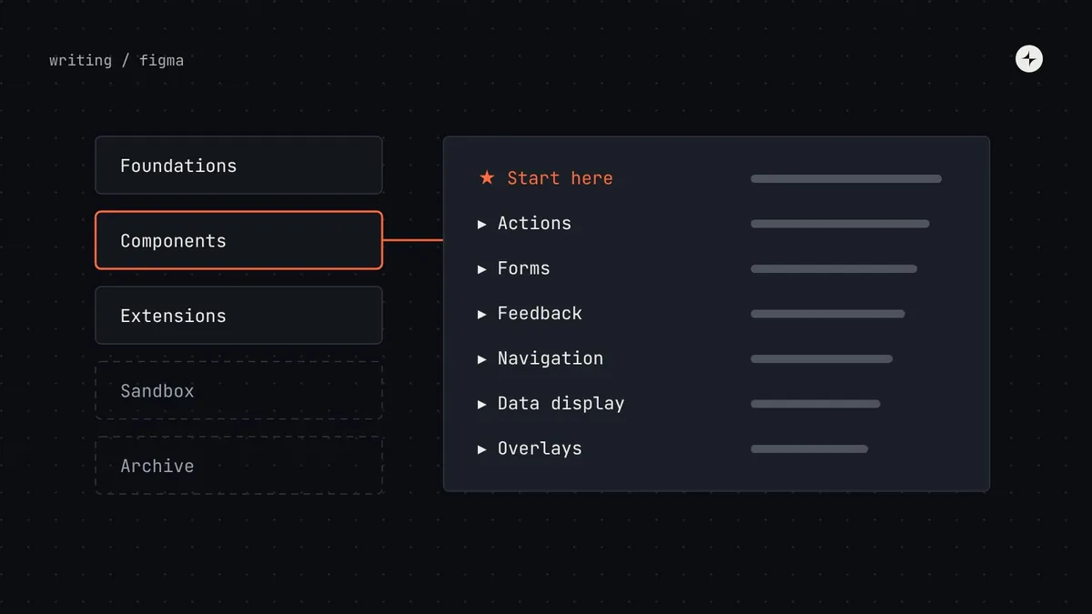
Organise a Figma design system as separate libraries for separate jobs: one for foundations (variables, styles, icons), one for core components, and one per product family for extensions, plus a hidden archive. Inside the component library, group pages the way people think (actions, forms, feedback, navigation, data display), start with a "Start here" page, give every component a one-line description and search keywords, use the same names as code, and keep work in progress out of the published file. Publish on the same rhythm as code releases, with the same notes.
- If people can't find a component, they'll rebuild it. Findability is one of the most underrated causes of low adoption.
- Status belongs in a label, not the name: "Tag v2 NEW" is a cry for help, not a name.
- Detach data shows where components fail people. Read it monthly.
If people can't find it, they'll rebuild it
In year one, the Figma library is small and everyone knows what's in it. By year three it has hundreds of components, abandoned experiments, old versions nobody deleted and names that made sense to whoever created them.
An illustration: the designer who couldn't find the right component
A new designer needs a tag to show an invoice's status. She searches the library for "tag".
"Tag", "Tag v2", "Chip", "Pill/Status", "Badge (old)", "Label - DO NOT USE", and three more on a page called "WIP". No descriptions. Two look identical.
She picks one at random. It's deprecated. Engineering builds it from scratch because the code version was deleted months ago. The product now has another status tag.
A structure that works
Acme · Foundations            ← variables, text styles, effects, icons
Acme · Components             ← the core, used by everyone
  ├─ Start here               ← how to use this library, in two minutes
  ├─ Actions                     Button · Icon button · Link
  ├─ Forms                       Text field · Select · Checkbox · Radio · Switch
  ├─ Feedback                    Alert · Toast · Empty state · Progress
  ├─ Navigation                  Tabs · Side menu · Breadcrumbs · Pagination
  ├─ Data display                Table · Badge · Tag · Avatar
  └─ Overlays                    Dialog · Menu · Popover · Tooltip
Acme · Analytics extensions   ← shared by one product family
Acme · Sandbox                ← work in progress, never published
Archive (hidden from search) ← old versions, kept for reference| File | Who turns it on | What's in it |
|---|---|---|
| Foundations | Everyone | Variables (colour, spacing, radius, type) with modes for themes and brands; text styles; effects; icons |
| Components | Everyone | Stable and beta core components, grouped by job |
| Extensions | One product family | Components shared by a few products, built on the core |
| Sandbox | System team | Proposals and work in progress. Never published. |
| Archive | Nobody, by default | Deprecated and removed versions, hidden from search |
Names, descriptions and keywords
- Same names everywhere: Figma, code and documentation all say "Text field", not "Input" in one and "TextBox" in another. See keeping Figma and code in sync.
- No versions or status in names: "Tag v2 NEW" becomes "Tag" with a beta label in the description.
- Properties match code props: "Variant: Primary / Secondary / Danger" in Figma,
variant="primary"in code. - A one-line description: "Tag: a short label showing a status or category."
- Search keywords for the words people actually use: "Also known as: chip, pill, badge, label." That line would have saved the designer in the story half a day.
- A documentation link on every component, to its page on the docs site.
Inside a component page
Use Figma's variables for every colour, size and spacing value in components, so modes (light and dark, brand A and B, density) switch every component at once. Keep the variable names identical to the token names in code. See component tokens.
A component's life, visible in the library
Publishing and reading the data
On a rhythm, with notes
Publish library updates on the same rhythm as code releases, with the same release notes. Random, unannounced updates teach designers to ignore update notifications.
Inserts and detaches
Library analytics show how often each component is inserted and how often it's detached. A high detach rate means the component doesn't do something people need.
An illustration: what the detach numbers revealed
The alert component is inserted 900 times and detached 310 times.
Almost every detached copy adds a second button: "Retry" next to "Dismiss". The component allowed only one.
They add an optional second action to both Figma and code, release it as a minor update, and the detach rate falls.
At IBM, the Cardinal Health system was built from scratch in Figma: 110 colours in 11 ramps, purpose-named tokens and 40+ components every squad built from. Read the case study.
A library health checklist
- Separate files for foundations, core, extensions, sandbox and archive.
- Groups that match how people think, plus a "Start here" page.
- Same names as code; no versions or status in names.
- A description, keywords and a docs link on every component.
- Every value is a variable; modes for themes and brands.
- Published on a rhythm, with release notes; detach data reviewed monthly.
The short version
- Separate libraries for foundations, core components and extensions.
- Group by job, start with a "Start here" page, archive old things.
- Same names as code, plus descriptions and keywords.
- Show life-cycle status; keep work in progress out of the published file.
- Publish with release notes, and treat detaches as feedback.
Frequently asked questions
How should I organise a Figma component library?
Separate files for foundations, core components and product-family extensions; pages grouped by job (actions, forms, feedback, navigation, data display, overlays); a "Start here" page; and an archive hidden from search.
Should foundations and components be in the same Figma file?
Usually not, once the system grows. A separate foundations library lets teams use variables and styles without the full component set, and keeps publishing simpler.
What does a high detach rate mean?
That the component doesn't do something people need. Look at a sample of detached copies to see what they changed, then decide whether to extend the component.
How often should a Figma library be published?
On the same rhythm as code releases, often every two weeks, with the same release notes.
Further reading
- Component tokensVariables that match the code, mode by mode.
- Design system documentationThe page each component links to.
- Keeping Figma and code in syncNames, props and tokens on both sides.