
The short answer
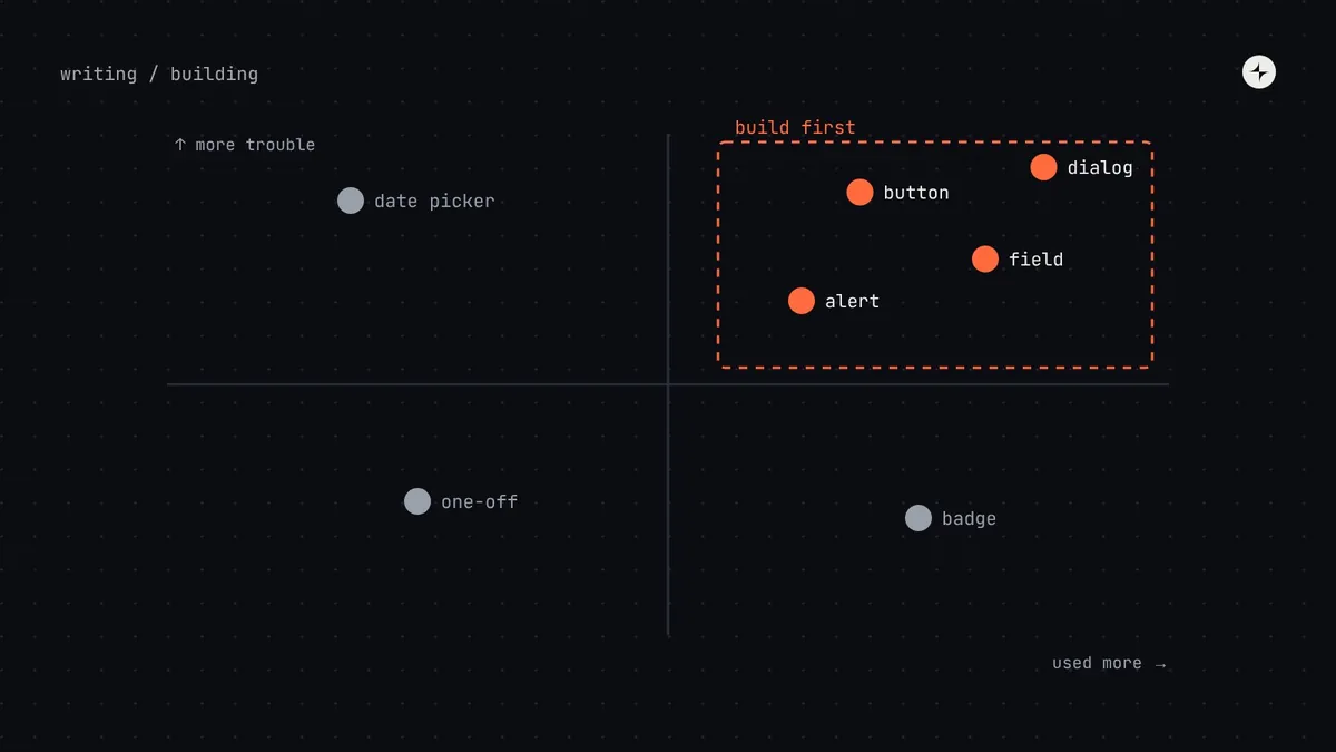
Build first the components that are used everywhere and inconsistent today. Count two things for each component from an audit: how often it's used and how much trouble it causes (versions, bugs, accessibility issues, rebuild time). Plot them on a 2×2 and start top-right. For most products that's the boring ones: button, text field, select, checkbox, radio, switch, link and alert, then dialog, tabs, menu and toast. Build each with a pilot team that needs it now.
- Don't start with the hardest component. Teams stop waiting.
- Pick from real roadmaps, not a wish list.
- Leave rare, fine components local until a second team needs them.
Why the order matters
The first components set the tone for the whole system. Pick well and product teams see value within weeks, the system earns trust, and adoption pulls in more work. Pick badly and the system team spends months on something impressive while teams keep building their own buttons.
A team decides to start with the data table "because it's the biggest problem". Six months later they have a sophisticated table, nothing else, and product teams have stopped waiting. Start with components you can finish in days, and tackle the big ones once you have momentum and a working process.
Step 1: Inventory what exists
Run an interface inventory on your 15–25 most important screens: screenshot every instance of every component, group the near-duplicates, and ask engineers to count implementations in code. Do it as a team exercise. People who find the seven buttons themselves become supporters.
Step 2: Count frequency and trouble
Frequency
Count uses in code (imports, instances) and in design files. Engineers can usually script this in an afternoon.
Pain
Number of versions, bugs and accessibility issues reported, and how much time teams spend rebuilding or debating it. Ask in a short survey if you're unsure.
Step 3: Plot the 2×2
Step 4: Check against roadmaps
The 2×2 tells you what matters today. Product roadmaps tell you what teams will build next quarter. Cross-check: a component in "plan next" jumps up if three teams are about to build features that need it. Nathan Curtis calls this exercise "picking parts, products and people": agree the parts to build, the products that will use them first, and the people who'll do the work.
At CARS24, the first components of the LEGO mobile system were picked from teams' actual roadmaps, then tested on real screens. The result was 44 composable components adopted in India, the UAE and Australia. Read the case study.
A typical build order
| Wave | Components | Why now | Typical effort |
|---|---|---|---|
| 1 · Basics | Button, text field, select, checkbox, radio, switch, link, alert | On almost every screen; most versions; accessibility issues repeat | Days to two weeks each |
| 2 · Containers and feedback | Dialog, card, tabs, toast, menu, empty state | Used widely; harder keyboard and focus rules | One to four weeks each |
| 3 · Data and navigation | Table, pagination, badge, tag, side navigation | Data-heavy screens; consistent navigation | Weeks; tables longer |
| 4 · The hard ones | Date picker, search with suggestions, advanced table features, file upload | Complex behaviour; build with the teams that need them | One to three months each |
For a more precise estimate of each component, score it with the component complexity rubric.
Step 5: Build each one with a pilot
Every component should be built inside a real product project: a pilot team that needs it for something they're shipping. Dan Mall makes this point in Design That Scales, and in our experience it's the single biggest predictor of a system people use. The pilot brings real requirements, a real deadline and a team that already trusts the result.
- Every state designed: default, hover, focus, pressed, disabled, loading, error.
- Uses semantic tokens only.
- Works with a keyboard and screen reader.
- Same name and options in Figma and code.
- Tested with real content in the pilot product.
- Documented before it's called stable.
Build, borrow or buy?
You don't have to build everything. For simple components (buttons, badges, cards), building is quick and gives you full control. For complex interactive ones (menus, dialogs, comboboxes, date pickers), a headless library gives you tested behaviour and accessibility. See headless libraries vs building your own.
The short version
- Inventory first; count frequency and trouble for each component.
- Plot a 2×2 and start top-right: used everywhere and inconsistent.
- Cross-check with roadmaps; pick parts, products and people together.
- Build in waves, basics first, hardest last.
- Build every component with a pilot team that needs it now.
Frequently asked questions
Which components should a design system start with?
For most products: button, text field, select, checkbox, radio, switch, link and alert. Then dialog, card, tabs, toast and menu.
How many components does a first version need?
Eight to fifteen well-built components cover a large share of most screens. Ship those properly before adding more.
Should we build the data table first if it's our biggest problem?
Usually not first. Start with components you can finish quickly to build momentum and a working process, then tackle the table with the teams that need it.
What about one-off components a single team needs?
Keep them local, built from system parts, and watch them. If a second team needs the same thing, it becomes a candidate for the system.
Further reading
- Interface InventoryBrad Frost.
- Picking Parts, Products & PeopleNathan Curtis, EightShapes.
- Design That ScalesDan Mall.