
The short answer
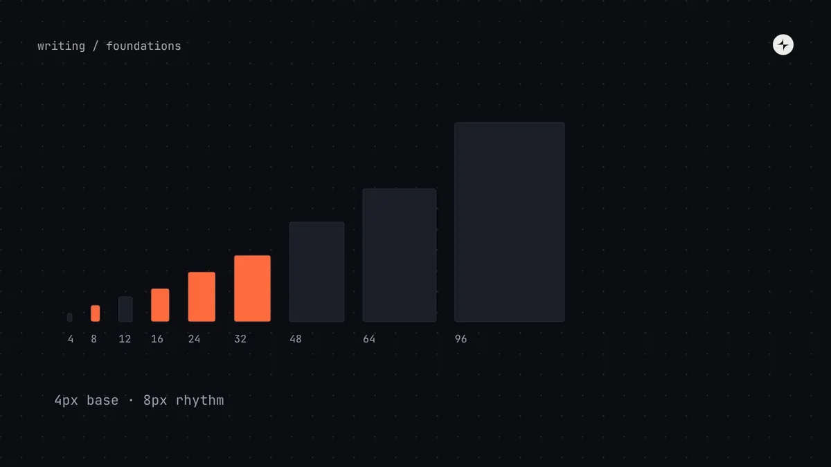
A spacing system is one small base unit and a short scale of multiples that everyone picks from. Use a 4px base with an 8px rhythm: every value is a multiple of 4, and most of the values people reach for (8, 16, 24, 32) are multiples of 8. You get the precision small components need without "any number will do". Then give space clear jobs: inset (padding inside), stack (between things vertically) and inline (between things side by side), with space inside a group always clearly smaller than space between groups.
- Jump at least two steps on the scale between levels (8 → 16 → 24 or 32), so grouping stays obvious.
- Component spacing changes with density; layout spacing changes with screen size.
- Set line heights on the same 4px grid, so text and boxes share one rhythm.
Why spacing matters so much
Space does three jobs on a screen. It groups things: we automatically read items that sit close together as belonging together. It shows importance: things with more room around them feel more important. And it creates rhythm: a repeating beat that makes a page feel calm and intentional.
When spacing is chosen screen by screen, each value can be defended on its own, but together they're noise: 13 pixels here, 14 there, 22 somewhere else. People don't notice the numbers. They notice that the product feels a bit untidy, and they trust it a little less.
Title 5 · Description 22 · Label 7 · Field 13 · Label 9 · Field 19 · Button
The gap between a label and its field (7) is almost the same as the gap between fields (13), so labels seem to float.
Title 4 · Description 24 · Label 4 · Field 16 · Label 4 · Field 24 · Button
Three relationships, three values: belongs to (4), next item (16), new section (24).
4px vs 8px: choosing a base unit
A spacing system starts with one small number, the base unit, and every value is a multiple of it. Think of it like the smallest Lego stud: everything you build is a whole number of studs.
Fewer, clearer choices
Easy to think about, and most screen sizes divide neatly by 8. Atlassian's design system builds its spacing on an 8px base, with a few smaller steps for tight spots.
Finer control for busy screens
Allows 12, 20 and 28, which matter for small components, icons and line spacing. Google's Material uses a 4dp grid for text and icons alongside an 8dp grid for layout.
Our recommendation is the combination: a 4px base with an 8px rhythm. Allow every multiple of 4 in the scale, but steer people to multiples of 8 for most layout decisions. In practice, the 4px steps get used inside components (an icon gap, a badge's padding, line heights) and the 8px steps everywhere else.
The spacing scale
The scale is the fixed list of values people can choose from. Give it lots of options at the small end, where 4px is a visible difference, and only a few at the large end, where nobody can tell 64 from 68.
space-0.52pxspace-14pxspace-28pxspace-312pxspace-416pxspace-520pxspace-624pxspace-832pxspace-1040pxspace-1248pxspace-1664pxspace-2080pxspace-2496pxNaming each value by how many base units it contains (space-6 = 6 × 4 = 24px) means anyone who knows the name knows the size. Other styles work too (Atlassian's space.300, Carbon's spacing-06, T-shirt sizes); choose the one your engineers can read without a lookup table. More on naming in design token naming conventions.
Inset, stack and inline: giving space a job
Nathan Curtis gave three kinds of space names that have stuck. Naming the kind of space, not just the amount, makes specs and code reviews much clearer.
Padding inside
The space between a box's edge and its content: inside a card, a button, an input. Usually equal on all sides, or a little less vertically.
Top to bottom
Space between things stacked vertically: a label and its field, one field and the next, one section and the next.
Side by side
Space between things in a row: two buttons, an icon and its label, chips in a list.
Then use smaller values inside things and larger values between bigger groups:
| Where the space is | Typical values | Examples |
|---|---|---|
| Inside a component | 4–16px | Icon to label; padding inside a button or input |
| Between related items | 8–16px | A label and its field; one field and the next; list items |
| Between groups | 24–32px | Sections of a form; gaps between cards |
| Between page sections | 40–64px | Major sections of a page |
| Page edges | 16–80px | Grows with screen size |
Space within a group must always be clearly smaller than space between groups. A simple way to guarantee it: jump at least two steps on the scale between levels, 8 → 16 → 24 or 32. That keeps relationships obvious even when different designers make their own sensible choices.
Compact and comfortable: density
An accountant at month-end wants to see 200 rows without scrolling. A small business owner checking one invoice on a Sunday wants things roomy and easy to tap. Good systems serve both by switching a few spacing values, not by building separate components.
| Setting | Compact | Default | Comfortable |
|---|---|---|---|
| Height of buttons and inputs | 32px | 40px | 48px |
| Padding inside buttons and inputs | 8px | 12px | 16px |
| Padding inside table rows | 4px | 8px | 12px |
| Space between form fields | 12px | 16px | 24px |
There's a floor to how compact you can go. WCAG 2.2 requires targets of at least 24 by 24 pixels (2.5.8), with some exceptions. Apple recommends at least 44 by 44 points for touch, and Material recommends 48 by 48. So compact modes are for mouse-and-keyboard use on desktop; don't make them the default on phones.
Spacing on different screen sizes
A simple principle: spacing inside components shouldn't change with screen size (a button has the same padding on a phone and a laptop), but layout spacing should (page margins and section gaps grow when there's room). Build that split into your tokens:
/* The scale itself never changes */
--space-2: 8px;  --space-4: 16px;  --space-6: 24px;  --space-10: 40px;  --space-16: 64px;

/* Layout spacing grows on bigger screens */
--space-page-margin: var(--space-4);      /* 16px on phones */
--space-section-gap: var(--space-10);
@media (min-width: 840px) {
  --space-page-margin: var(--space-6);    /* 24px on larger screens */
  --space-section-gap: var(--space-16);
}

/* Component spacing changes with density, not screen size */
--space-control-inset-x: var(--space-3);
Common spacing mistakes
"Just this once" values
Each one seems harmless. Fifty of them add up to a second, invisible spacing system. Add a lint rule for values that aren't on the scale.
The same spacing everywhere
Using 16px for everything removes the grouping signal, and groups disappear. Vary space on purpose.
Components with built-in outside margins
A component that adds its own margin fights every layout it's placed in. Components own their inside (inset); layouts own the space between them.
Text that ignores the grid
Line heights like 1.4 × 15px give 21px, off the 4px grid, and nothing lines up. Round line heights to multiples of 4.
The short version
- Use a 4px base with an 8px rhythm, and a scale with many small steps and few large ones.
- Name values so the size is obvious:
space-6= 24px. - Think in inset, stack and inline; keep space inside groups clearly smaller than between them.
- Offer density modes by changing a few values, never below accessible target sizes.
- Component spacing changes with density; layout spacing changes with screen size.
Frequently asked questions
Is the 8px grid better than 4px?
Neither is better in general. 8px gives fewer, clearer choices; 4px gives the precision small components and line heights need. A 4px base with an 8px rhythm gets the benefits of both.
How many spacing values should a system have?
Ten to fourteen is typical. Our scale has thirteen, from 2px to 96px.
Should spacing tokens be semantic?
Keep the scale as primitives (space-4) and add a small set of semantic tokens for layout and density (space-page-margin, space-control-inset-x) where values change by context.
Should line height follow the spacing grid?
Yes. Rounding line heights to multiples of 4px lets text and boxes share one rhythm. See how to build a type scale.
Further reading
- Atlassian spacingAn 8px-based scale with smaller steps.
- Carbon spacingIBM's numbered spacing scale.
- Material 3: structureThe 4dp and 8dp grids.
- WCAG 2.5.8 Target Size (Minimum)The floor for compact modes.