
The short answer
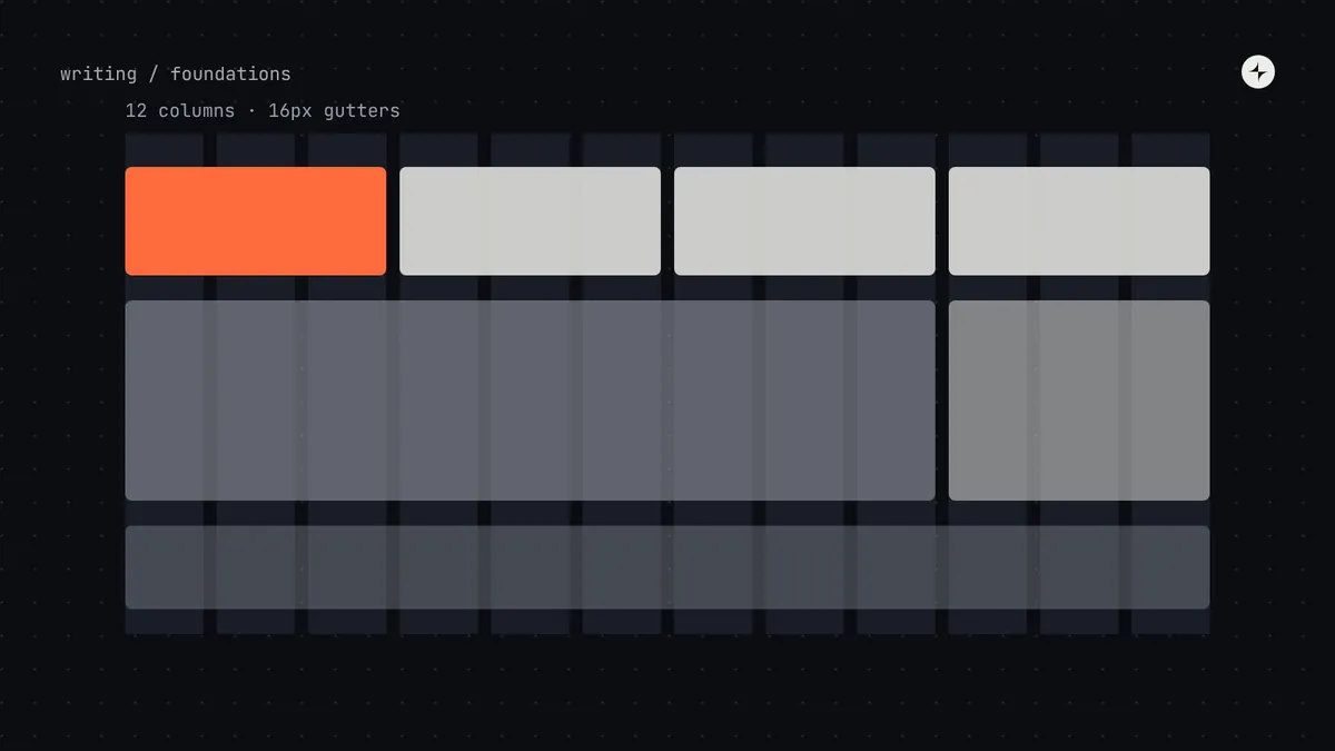
A layout grid splits the screen into columns separated by fixed gutters, inside margins and a container. For product UI, use 4 columns on phones, 8 on tablets and 12 on laptops and desktops, gutters from your spacing scale (16–24px), and four or five named breakpoints ("medium", not "iPad") set where your layout needs to change. Grid the big things (page sections, cards) and let small things inside a component align with spacing tokens. Store breakpoints, columns, gutters and named widths as tokens so design and code agree.
- Material 3 and IBM Carbon use different numbers, and both work. The lesson is to pick a set and name it, not to copy either.
- Body text should stay around 45–75 characters per line, so reading widths are their own named values.
- WCAG 2.2 requires content to work at 320px wide without sideways scrolling, except things like data tables.
The parts of a grid
Look at a newspaper. The text sits in columns, photos span one, two or three of them, and everything lines up even though dozens of people worked on the page. Screen grids do the same job: they make things line up without anyone measuring.
| Part | What it is | Rule of thumb |
|---|---|---|
| Columns | The vertical strips content lines up to | 4 on phones, 8 on tablets, 12 on laptops and desktops. Twelve divides into halves, thirds, quarters and sixths. |
| Gutters | The fixed gaps between columns | A value from the spacing scale (16–24px). Gutters stay fixed; columns stretch. |
| Margins | The space between the grid and the edge of the screen | Grows with screen size: 16px on phones, 32–80px on large screens |
| Container | The box the grid lives in, sometimes with a maximum width | Cap reading pages (around 1200–1440px); let busy apps use the full width |
Choosing breakpoints
A breakpoint is a screen width at which the layout changes, for example from one column to two, or from a side menu to a bottom bar.
Set breakpoints where your layout needs to change, guided by broad classes of device, rather than chasing specific phone models, which change every year. Here's how two mature systems do it:
| Class | Width (dp) |
|---|---|
| Compact | < 600 |
| Medium | 600–839 |
| Expanded | 840–1199 |
| Large | 1200–1599 |
| Extra-large | ≥ 1600 |
| Name | From (px) | Columns |
|---|---|---|
| sm | 320 | 4 |
| md | 672 | 8 |
| lg | 1056 | 16 |
| xlg | 1312 | 16 |
| max | 1584 | 16 |
Two respected systems, two sets of numbers. Carbon's 16 columns suit dense enterprise screens; Material's classes are designed around how apps adapt across phones, foldables and tablets. Pick four or five breakpoints, give them names rather than device names, and share them as tokens so design and code agree. Documented
Stretchy, fixed, or both
Stretches to fill the screen
Uses all the space. Great for busy apps, but lines of text get uncomfortably long on wide screens.
Always the same width
Predictable and easy to design, but wastes space on big screens and needs separate layouts for small ones.
Stretches, up to a limit
Columns stretch until a maximum width. Reading pages use the limit; busy apps can skip it.
Named widths for content
The grid decides where things can go. Separately, decide how wide some things should be. Paragraphs are easiest to read at around 45–75 characters per line, so body text should rarely stretch across all 12 columns of a big screen. Forms work best narrow too.
| Named width | Value | Used for |
|---|---|---|
width.prose | 68ch | Articles, help pages, long descriptions |
width.form | 560px | Single-column forms and settings |
width.dialog | 560px | Standard dialogs |
width.page | 1440px | Maximum width for reading and marketing pages |
width.app | none | Busy app screens that use the full width |
Laying out a dashboard
Most business software isn't a set of pages on a grid. It's a frame (a top bar and a side menu that stay put) around a content area that changes. If the design system defines the frame once, every team stops reinventing it, and every product feels like part of the same family.
- Most important thing at the top start. In left-to-right languages that's the top left. Put the number that answers "is everything OK?" there.
- Cards in a row share a height, so the grid stays visible and comparison is easy.
- A short list of spans: 3, 4, 6, 8, 9 or 12 columns. Avoid 5 and 7, which create edges that line up with nothing.
- Build with "start" and "end", not "left" and "right", so right-to-left layouts mirror correctly. See localisation and RTL.
Phones, and what lines up with what
A phone layout isn't a shrunken desktop
The side menu becomes a bottom bar or drawer, side-by-side panels become separate screens with a back button, and wide tables become lists or cards. Decide these changes once, as patterns.
Big things to columns, small things to each other
Page sections and cards line up to grid columns. Inside a card, elements line up with each other using spacing tokens. A button doesn't need to snap to a column; gridding everything makes components rigid.
WCAG 2.2 success criterion 1.4.10 (Reflow) requires content to fit a 320px-wide viewport without scrolling in two directions, except for things that genuinely need two dimensions, like data tables, maps and diagrams. Standard Plan the 320px version of every pattern, and only ever scroll sideways inside a table, never the whole page.
Layouts for complex software
Enterprise tools push past a simple page grid: an email app with a folder list, message list and reading pane side by side, or a CRM where people resize panels to fit their work. The layout system needs words and rules for these too:
Several panes side by side
List and detail views side by side on large screens, separate screens on small ones. Material documents these as canonical layouts.
Panels people resize or fold
Set minimum and maximum widths as tokens, and remember each person's choice.
Components that fit their space
A component in a narrow side panel should adapt to the panel, not the whole screen. CSS container queries make this possible.
Headers that stay put
Table headers that stay visible, fixed first columns, and sideways scrolling inside tables keep people oriented in large data sets.
Layout decisions as tokens
"breakpoint": { "medium": "600px", "expanded": "840px", "large": "1200px", "xlarge": "1600px" },
"grid": { "columns": { "compact": 4, "medium": 8, "expanded": 12 },
          "gutter": "{space.4}", "margin": { "compact": "{space.4}", "expanded": "{space.6}" } },
"layout": { "sidebar": { "width": "240px", "folded": "64px" }, "topbar": { "height": "48px" },
            "width": { "prose": "68ch", "form": "560px", "page": "1440px" } }
A note for engineers: CSS custom properties can't be used inside media query conditions, so breakpoint tokens are generated as constants (Sass variables, JavaScript values or custom media queries) by the token pipeline, alongside the CSS variables. Gutters and margins reference the spacing scale.
The short version
- 4, 8 and 12 columns; gutters from the spacing scale; margins that grow with the screen.
- Four or five named breakpoints, set where your layout needs to change.
- Stretch up to a limit; give prose, forms and dialogs their own named widths.
- Define the app frame once; grid the big things, space the small things.
- Plan the 320px version of every pattern, and store layout decisions as tokens.
Frequently asked questions
How many columns should a design system grid have?
Twelve on laptops and desktops is the most common choice because it divides evenly into halves, thirds, quarters and sixths. Use 4 on phones and 8 on tablets. Dense enterprise tools sometimes use 16.
What breakpoints should I use?
Four or five, set where your layout needs to change. Material 3's window size classes (600, 840, 1200 and 1600) are a sound starting point. Name them by size, not device.
Should gutters change at each breakpoint?
Keep gutters fixed within a breakpoint and take them from the spacing scale. Many systems use 16px on phones and 24px on larger screens.
Do components need to snap to the grid?
No. Page sections and cards align to columns; elements inside a component align to each other with spacing tokens.
Further reading
- Window size classesMaterial Design 3.
- 2x GridIBM Carbon Design System.
- Understanding Reflow (1.4.10)W3C, WCAG 2.2.
- Container queriesMDN.