
The short answer
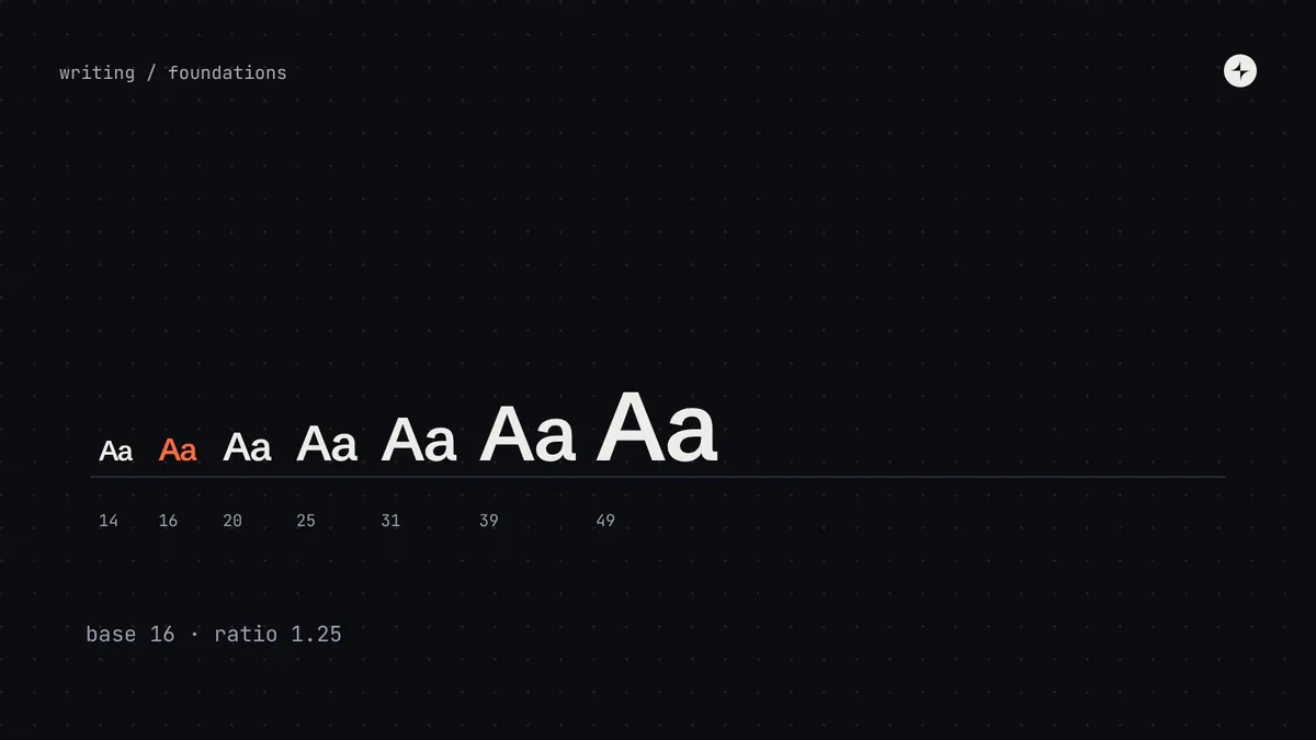
A type scale is the short, fixed list of text sizes a product uses. To build one: start from a base size (usually 16px), multiply by a ratio to get candidate sizes (1.125–1.25 suits product screens), then adjust by hand: apps need several sizes between 12 and 20px and only a few large ones. Give each size a line height that tightens as text grows (about 1.5 for body, 1.2 for display), rounded to a 4px grid, and name the styles by role: display, heading, body, label, caption.
- A mathematical scale is a starting point, not the answer.
- Show importance with weight, colour and space as well as size; you'll need fewer sizes.
- Fluid type must keep a fixed part, or it won't grow when people zoom.
Why a type scale
If anyone can pick any text size, you end up with 13, 14, 14.5, 15 and 16 pixels across the product, and nothing quite looks related. A type scale fixes this with a short list everyone chooses from. It also makes typography a set of decisions you can change in one place, and the foundation for accessible text across every screen.
Step 1: Choose a base and a ratio
The classic method: start from a base size and multiply by the same number at each step up. That number is the ratio. A small ratio gives many sizes close together; a large one jumps quickly to big headlines.
Major second× 1.125
Major third× 1.25
Perfect fourth× 1.333
Golden ratio× 1.618
| Ratio | Feels | Suits |
|---|---|---|
| 1.125 (major second) | Quiet, dense | Data-heavy apps, dashboards, admin tools |
| 1.2 – 1.25 (minor/major third) | Balanced | Most product UIs |
| 1.333 (perfect fourth) | Editorial | Content sites, marketing pages |
| 1.618 (golden ratio) | Dramatic | Posters and landing pages; too few useful sizes for apps |
Step 2: Adjust by hand
Pure maths gives you sizes like 22.78px and leaves gaps where apps need options. Product screens need several sizes clustered between 12 and 20px (labels, body text, small headings) and only a few large ones. So mature systems start from a ratio, then round to whole numbers and tune the set. Google's Material Design 3, for example, uses a hand-tuned set of 15 named styles rather than a strict formula.
Three practical rules for tuning:
- Keep body text at 16px on the web (the browser default) and no smaller than 14px in dense apps.
- Make sure neighbouring steps are visibly different: 14 and 15 are too close to both earn a place.
- Stop adding large sizes once you have one for page titles and one for big numbers or hero text.
Step 3: Line height and letter spacing
Line height (leading) should get proportionally tighter as text gets bigger. Body text reads comfortably at about 1.4–1.6 times its size; big headlines look loose above about 1.2. Round every line height to a multiple of 4px so text lines up with the spacing system.
| Text size | Target line height |
|---|---|
| Up to 14px | about 1.45 |
| 15–20px | about 1.5 |
| 21–32px | about 1.3 |
| 33–48px | about 1.2 |
| Over 48px | about 1.1 |
Letter spacing works the other way. Fonts are spaced for reading sizes, so headlines usually get slightly tighter tracking, while very small text and all-caps labels get slightly looser tracking to stay legible.
Step 4: Name text styles by their job
Like colours, text styles should be named by what they're for, not their size. "Heading large" survives a redesign; "28px" doesn't. Five families cover almost every product:
Big numbers and headlines: a dashboard total, a welcome message.
Page and section titles: the structure of a screen.
Paragraphs, descriptions, table cells, form values.
Buttons, tabs, form labels, menu items. Slightly bolder.
Timestamps, helper text, small print.
Here's a complete set built this way, from the Layer One playbook. Each style bundles size, line height, weight and tracking under one name, stored as a DTCG typography token:
| Text style | Size | Line height | Ratio | Weight | Tracking |
|---|---|---|---|---|---|
display.lg | 57px | 64px | 1.12 | 600 | -0.020em |
display.md | 45px | 56px | 1.24 | 600 | -0.020em |
heading.xl | 36px | 44px | 1.22 | 600 | -0.015em |
heading.lg | 28px | 36px | 1.29 | 600 | -0.010em |
heading.md | 22px | 28px | 1.27 | 600 | -0.005em |
heading.sm | 18px | 24px | 1.33 | 600 | +0.000em |
body.lg | 18px | 28px | 1.56 | 400 | +0.000em |
body.md | 16px | 24px | 1.50 | 400 | +0.000em |
body.sm | 14px | 20px | 1.43 | 400 | +0.000em |
label.md | 14px | 20px | 1.43 | 500 | +0.005em |
label.sm | 12px | 16px | 1.33 | 500 | +0.010em |
caption | 12px | 16px | 1.33 | 400 | +0.010em |
Importance takes more than size
A common mistake is showing every level of importance with size alone. You end up with a dozen sizes and a page that still feels flat. Weight (bold or regular), colour (primary or secondary text), case and space around text are just as effective, and they don't add sizes. The clearest hierarchies change two or more of these at once between levels.
Title 28 · Status 22 · Summary 18 · Meta 14, all the same weight and colour. Four sizes, and the eye still has to work to find the order.
Title 22 semibold · Status 14 semibold in the danger colour · Summary 16 regular · Meta 14 secondary colour. Fewer sizes, clearer order.
Step 5: Responsive and fluid type
A 36px heading looks right on a laptop and takes half the screen on a phone. Two approaches work:
Different sizes per breakpoint
"Heading XL" is 28px on phones and 36px on larger screens. Simple, predictable, easy to show in design files.
Sizes that grow smoothly
Text grows between a minimum and maximum with the viewport, using CSS clamp(). Tools like Utopia popularised this.
/* Heading XL: 28px on a 360px phone → 36px on a 1280px laptop */
--type-heading-xl-size: clamp(1.75rem, 1.554rem + 0.87vw, 2.25rem);
/* growth = (36 − 28) ÷ (1280 − 360) = 0.0087 → 0.87vw
start = 28 − 0.0087 × 360 = 24.87px → 1.554rem */If text size depends only on viewport width, it won't get bigger when someone zooms in, which can fail WCAG's requirement that text can be enlarged to 200%. Always keep a fixed rem part in the formula, and only make headings fluid. Keep body text at a steady size.
On iOS and Android, people can choose a larger text size for every app. Map your text styles to the platform's adjustable styles (Dynamic Type on iOS) rather than fixing sizes.
Readable for everyone
- Contrast: every text style uses a colour that passes 4.5:1 (3:1 for large text). See colour contrast in design systems.
- Zoom: text can be enlarged to 200% without being cut off (WCAG 1.4.4).
- Text spacing: layouts survive users increasing line and letter spacing (1.4.12). Avoid fixed heights around text.
- Line length: aim for about 45–75 characters per line in long text.
- Minimum size: avoid body text below 14px in dense web apps, or 16px on mobile.
The short version
- Start from 16px and a ratio of about 1.125–1.25, then round and tune by hand.
- Line height tightens as size grows; round it to 4px.
- Name styles by role: display, heading, body, label, caption.
- Use weight, colour and space for hierarchy, not just size.
- Make only headings fluid, and always keep a fixed part so zoom works.
Frequently asked questions
What's a good type scale ratio for apps?
Usually between 1.125 and 1.25. Then adjust by hand so you have enough sizes between 12 and 20px.
How many text styles does a design system need?
Ten to fifteen named styles is typical. Our set has twelve across five families.
Should I use px or rem?
Design in px, ship in rem on the web, so text respects the user's browser font size and zoom.
Should headings be fluid?
Large headings benefit from fluid sizing; body text shouldn't change with viewport width. Keep a rem component in any fluid formula.
Further reading
- Material 3 type scale tokensA hand-tuned set of named styles.
- Carbon type setsProductive and expressive type for different jobs.
- UtopiaFluid type and space calculators.
- Apple HIG: TypographyDynamic Type and platform text styles.