
The short answer
Words are part of the interface, so they belong in the design system. Content guidance in a design system covers four things: voice and tone (how the product sounds, and how that adapts to the moment), a shared vocabulary (which words mean what, and which to avoid), message formulas (reusable shapes for buttons, errors, confirmations, empty states and success messages) and rules for other languages. None of it needs to be long: a few well-kept pages do more than a 40-page style guide nobody opens.
- Voice is personality and stays the same; tone is mood and changes with the moment.
- A vocabulary list is the single most useful content artefact: it helps designers, engineers, support and translators at once.
- Confirmation buttons should repeat the action ("Delete invoices"), not say "Yes".
Why words belong in the system
People read interfaces in fragments: a button label, a heading, an error. When those fragments use different words for the same thing, people hesitate. Is "Archive" the same as "Remove"? Will "Discard" lose my work? Every hesitation is a small cost, and in a large product they add up.
An illustration: five words for "make it go away"
Across one product, removing something uses "Delete", "Remove", "Archive", "Discard" and "Clear", chosen by whoever built each screen.
Customers can't tell which actions are permanent. Support tickets ask how to recover "archived" invoices that were actually deleted. Translators get five words to translate.
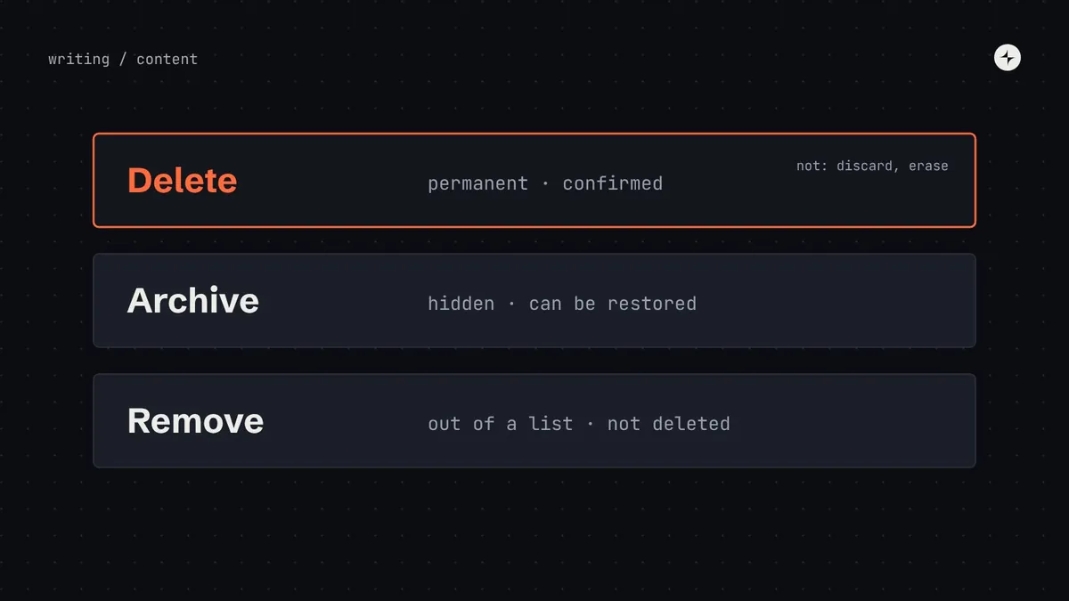
A vocabulary entry: "Delete = permanent, always confirmed. Archive = hidden, recoverable. Remove = taken out of a list, not deleted." Three words, three meanings, used everywhere.
Content design (often called UX writing) is designing the words in an interface: labels, messages, instructions and help, chosen for clarity and consistency, not decoration. In a design system, it's the content guidance every component and pattern shares.
The four parts of content guidance
How it sounds
A few adjectives for the voice, and how the tone shifts for success, errors, warnings and destructive actions.
What words mean
The product's words, their meanings, and the words to avoid. Plus a handful of formatting rules.
Reusable shapes
A simple structure for each common message type, so anyone can write a good one quickly.
Ready to translate
Room for longer text, whole sentences with placeholders, plurals and locale formats. See localisation and RTL.
Voice and tone
Think of the difference between personality and mood. Your voice is your product's personality: it stays the same everywhere. Your tone is the mood: it adapts, the way a good colleague speaks differently when celebrating a win and when delivering bad news. A voice of "clear, calm and helpful" might adjust like this:
| Moment | Tone | Example |
|---|---|---|
| Success | Brief and warm. Don't over-celebrate routine tasks. | "Invoice sent to Acme Ltd." |
| Error | Calm and specific. Never blame the person. | "We couldn't process this payment. The bank declined it. Try another card." |
| Warning | Clear about the consequence, and what to do. | "This invoice is 14 days overdue. Send a reminder?" |
| Destructive action | Serious and explicit. Name exactly what will happen. | "Delete this customer? Their 12 invoices will also be deleted. This can't be undone." |
| First use | Encouraging and practical. Point to the next step. | "No invoices yet. Create your first one to get paid faster." |
Jokes in error messages. "Oops! Something went wonky!" might feel friendly in a design review. To someone whose payroll just failed, it feels dismissive. Keep personality for calm moments; in stressful ones, be clear and kind.
A shared vocabulary
The single most useful content artefact is a simple list: the words your product uses, what they mean, and the words to avoid. Keep it next to the components in the documentation, not in a separate document.
| Use | Meaning | Don't use |
|---|---|---|
| Delete | Permanently remove. Always confirmed. | Destroy, erase, discard |
| Archive | Hide from the main list; can be restored. | Hide, store |
| Customer | A business you invoice. | Client, account, buyer |
| Workspace | Your company's area in the product, shared by its team. | Organisation, tenant, account |
| Sign in / sign out | Start or end a session. | Log in, login, log out |
| Due date | The date an invoice must be paid by. | Deadline, payment date |
Small rules that add up
Decide a handful of formatting rules once and put them on one page next to the vocabulary: sentence case or title case for headings and buttons (we recommend sentence case: "Send invoice", not "Send Invoice"); how dates are written; whether numbers use words or digits; how currencies are shown; and whether you address people as "you" (we recommend it).
Formulas for common messages
Most interface text falls into a few types. Giving each type a formula means anyone can write a good message in the product's voice, quickly. Put each formula on the documentation page of the component that carries it.
| Message | Formula | Example |
|---|---|---|
| Button | Verb + object | "Send invoice", "Add customer" |
| Error | What happened + why (if known) + what to do | "Payment failed. The card has expired. Update the card details." |
| Field error | What to enter, specifically | "Enter an amount between ₹1 and ₹10,00,000" |
| Confirmation dialog | Question naming the action + consequence; buttons repeat the action | "Delete 3 invoices? This can't be undone." [Delete invoices] [Cancel] |
| Empty state | What will appear here + how to start | "Your payments will appear here. Connect a bank account to get started." |
| Success | What happened, briefly | "Customer added." |
Delete?
Are you sure you want to continue?
[Yes] [No]
Delete 3 invoices?
This can't be undone. The customers won't be notified.
[Delete invoices] [Cancel]
Writing for everyone
Good interface writing is accessible writing. Plain words, short sentences and clear structure help everyone, and matter most for people reading in a second language, people with cognitive or learning disabilities, and anyone tired, stressed or in a hurry.
- Plain words: "use", not "utilise"; "start", not "initiate". Explain jargon or avoid it.
- Front-load meaning: "Invoice sent", not "We have successfully sent your invoice".
- Descriptive links: "View payment history", not "Click here". Screen reader users often navigate by a list of links.
- Meaningful image text: describe what an image tells people; mark decorative images so screen readers skip them.
- Inclusive language: avoid assumptions about gender, ability or culture; use "they" when you don't know; avoid idioms that don't translate.
- Don't rely on direction or colour: "click the button on the right" fails for many people, and in right-to-left languages. Name the thing.
Who owns the words?
In larger companies, content designers own the voice, vocabulary and formulas, just as system designers own the visual foundations. In smaller ones, it's often a senior designer or product manager with a little protected time. Either way, treat content guidance like any other part of the system: it has an owner, it's versioned, changes are announced in the release notes, and teams can propose improvements through the normal contribution model.
Put the words where the work happens. A writing section on each component's documentation page ("what the label should say, with examples") gets read; a separate content style guide usually doesn't. Some teams also add realistic default text to Figma components, so designers start from good copy instead of "Lorem ipsum".
The short version
- Words are part of the interface; inconsistent words confuse people as much as inconsistent buttons.
- One voice, with the tone adjusted to the moment. Calm and specific when things go wrong.
- A short vocabulary list and six message formulas do more than a long style guide.
- Confirmation buttons repeat the action.
- Give content an owner, a version and a place on every component page.
Frequently asked questions
Should content guidelines be part of the design system?
Yes. Words are part of every component and pattern. Keeping content guidance in the system, next to the components, means it's maintained, versioned and actually read.
What's the difference between voice and tone?
Voice is the product's consistent personality. Tone is how that personality adapts to the moment: brief for success, calm and specific for errors, explicit for destructive actions.
Sentence case or title case for buttons?
We recommend sentence case ("Send invoice"). It's easier to read and simpler to apply consistently. Whichever you choose, choose it once for the whole product.
Do we need a content designer for this?
It helps at scale. In smaller companies, a senior designer or product manager with protected time can own a vocabulary list and message formulas well.
Further reading
- GOV.UK Design System patternsPatterns that include the words to use.
- Form design patternsError messages in context.
- Localisation and right-to-left in a design systemGetting the words ready for other languages.