
The short answer
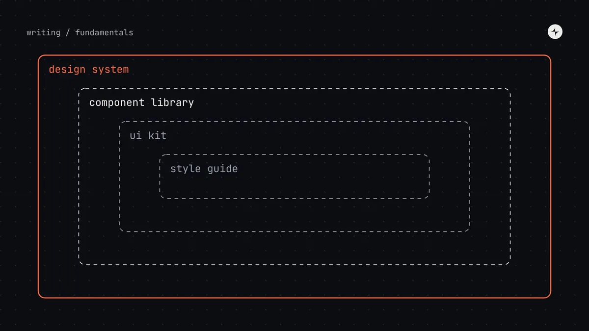
A style guide records visual and brand rules. A UI kit is a set of reusable components in a design tool like Figma. A component library is the same idea in code. A design system contains all of these, plus the tokens that connect design and code, the patterns that combine components, the documentation, and the process for owning and changing it.
- Each term is a smaller part of the one above it, not an alternative to it.
- Most teams that say "we have a design system" actually have a UI kit or a component library. That's a normal stage, not a failure.
- The gap between them is usually tokens and agreements: one source of truth for decisions, and a way to change it.
Why the difference matters
This sounds like a question about vocabulary. It's really a question about what you're missing. If your team calls a Figma library a "design system", you'll wonder why engineers keep rebuilding components, why the product drifts after every sprint, and why nobody can tell you which version of the button is right. Those are symptoms of the missing layers, not of bad components.
Getting the words right helps in three practical ways:
You can scope the work
"Build a design system" is a vague brief. "Turn our UI kit into a system by adding tokens, code parity and a contribution process" is a plan.
You can set expectations
Leadership funds a "design system" expecting faster delivery everywhere. A UI kit alone won't deliver that, because it never reaches code.
You can hire for it
A UI kit needs a designer. A component library needs engineers. A system needs both, plus someone who owns decisions.
The comparison at a glance
| Style guide | UI kit | Component library | Design system | |
|---|---|---|---|---|
| What it is | Rules for visual and brand style | Reusable components in a design tool | Reusable components in code | Decisions, parts and agreements for building the whole interface |
| Typical contents | Logo, colours, fonts, tone of voice | Buttons, inputs, cards with variants | The same components, with props, states and tests | Tokens, UI kit, component library, patterns, docs, governance |
| Lives in | PDF or web page | Figma, Sketch | npm, Swift, Kotlin packages | Design tool, code, docs site and team rituals |
| Main users | Brand, marketing, designers | Product designers | Front-end engineers | Everyone who builds the product |
| Keeps design and code in sync? | No | No | Only the code side | Yes, through shared tokens and names |
| Says how to change it? | Rarely | Rarely | Through pull requests | Yes: requests, contribution, releases |
How they fit together
The clearest way to see the relationship is as boxes inside boxes. Each inner box is useful on its own, but it only becomes a system once the outer layers exist around it.
What is a style guide?
A style guide is a set of rules about how things should look and sound. In most companies it starts as a brand guideline from marketing: the logo, the brand colours, the typefaces and the tone of voice. Some product teams extend it with UI rules, such as "primary buttons are blue" and "headings use 24px".
A style guide is valuable because it records decisions. Its weakness is that it records them as instructions that people must read, remember and re-implement by hand. Nothing enforces it, so it drifts. Six months after a style guide says "our blue is #1C75D6", you'll find five blues in the code.
Brand guidelines are usually made for marketing and print, not for interfaces. They rarely say anything about states, focus rings, error colours or contrast. Treat them as an input to your foundations, not as the foundations themselves.
What is a UI kit?
A UI kit is a collection of reusable components in a design tool: a Figma library with buttons, inputs, checkboxes, cards and so on, each with variants. Designers drag them into their files instead of drawing them from scratch.
A good UI kit speeds up design work a lot and makes mock-ups more consistent. But it lives entirely on the design side. If the engineers don't have the same components in code, every handoff becomes a translation exercise: the designer uses the kit's button, the engineer builds or picks something that looks roughly similar, and the two drift apart a little more with every release.
What is a component library?
A component library is a set of reusable UI components in code, usually published as a package that product teams install. Each component has an API (its props or parameters), handles its own states and, if it's well built, its own accessibility: keyboard behaviour, focus, labels and screen reader announcements.
Component libraries are where most of the speed-up from design systems actually happens, because adoption happens in code. But a library on its own has two gaps. It doesn't connect to the design tool, so designers and engineers can still mean different things by "the button". And it rarely includes the decisions underneath: if colours are hard-coded inside each component, a rebrand still means editing every one of them.
Pattern library is a term you'll also hear. It usually means a collection of larger, reusable solutions (a login form, a filter bar, an empty state) rather than single components. In a design system, patterns sit on top of components.
What makes something a design system?
Three things separate a design system from a well-stocked UI kit or component library:
One source of truth for decisions
Colours, type, spacing and other foundations are stored as design tokens that both Figma and code read from. Change a token and design and code change together.
Parity between design and code
The same components exist on both sides, with the same names, the same variants and the same options. "Button, secondary, small" means one thing to everyone.
Agreements about how it's run
A named owner, a way for teams to request and contribute changes, a release process and documentation. This is what keeps the first two true over time. See design system governance.
Which one do you have? A quick self-check
Answer these honestly. The first "no" tells you which layer to work on next.
- Our colours, type and spacing have names, and those names are used in both Figma and code.
- Our most-used components exist in both Figma and code, with matching names and options.
- A new designer or engineer can find documentation that says when to use each component, not just what it looks like.
- There's a named owner who can decide whether something goes into the system.
- Teams know how to ask for a change, and changes are released with notes.
| First "no" at… | What you most likely have | Next step |
|---|---|---|
| Question 1 | A style guide, perhaps with a UI kit | Name your foundations as tokens and use them in code |
| Question 2 | A UI kit or a component library, not both | Build parity for the 10 most-used components |
| Question 3 | Shared libraries without guidance | A page per component: usage, do's and don'ts, code |
| Questions 4–5 | A system with no operating model | An owner, one front door for requests, release notes |
| All yes | A design system | Measure adoption and keep it current |
When to move from one to the next
None of these stages is wrong. A five-person startup with a style guide and a themed open-source component library is in a perfectly healthy place. The question is whether what you have still matches the size of the problem.
Two or more designers keep redrawing the same components, or reviews keep catching small visual inconsistencies.
Engineers on different teams are building the same components, or accessibility bugs keep reappearing in the same kinds of controls.
Design and code have visibly drifted apart, a rebrand or dark mode is coming, or more than about three teams depend on shared UI.
Requests pile up, decisions get re-opened, or teams start forking components because changing the originals is too slow.
For a fuller decision framework, see do you need a design system?
The short version
- Style guide: rules. UI kit: parts in design. Component library: parts in code. Design system: decisions, parts and agreements together.
- The difference that matters is whether design and code share one source of truth, and whether there's a way to change it.
- Most teams are somewhere in the middle. Use the self-check to find your first gap, and close that one first.
Frequently asked questions
Is Material Design a design system or a component library?
A design system. Material Design 3 publishes principles, foundations, colour roles, tokens, components, patterns and guidance. There are also component libraries that implement it, such as Material Web and the Material components for Android and Flutter.
Can a design system exist without code?
Not really. Without code, design decisions have to be re-implemented by hand every time, which is exactly the drift a design system exists to prevent. A design-only "system" is a UI kit with good documentation.
Is a brand guideline a style guide?
Usually, yes: it's the brand's style guide. But brand guidelines are written for marketing and print, so they rarely cover what an interface needs, such as states, focus, error colours and contrast.
Do I need a component library before a design system?
You need components in code as part of a design system, but you don't have to build them yourself. Many teams start by theming an open-source or headless library with their own tokens.
What's the difference between a pattern library and a component library?
A component library holds single building blocks such as a button or a text field. A pattern library holds combinations that solve a recurring problem, such as a sign-in form or a filtered table.
Further reading
- What is a design system?Our full guide: the layers, examples, value and how to start.
- Atomic DesignBrad Frost. A classic model for how components build into patterns and pages.
- Design SystemsAlla Kholmatova, Smashing Magazine. On functional and perceptual patterns, and how systems differ.
- Most design systems are just expensive UI librariesLayer One on Medium. The opinion piece behind this comparison.